Welcome to My Works in Progress Page
This page is designed to share my creative process and inspiration in the hopes that it will inspire and help my students reflect better on their own works and process. Questions? Contact me!
Latest Peek at My New Sketchbook
|
If you are looking for more inspiration, I recommend exploring the works of Maurice and Edward J. Detmold. They were late 19th century, British illustrators.
Want more inspiration? A special thanks to a former client of mine who brought this online collection to my attention : |
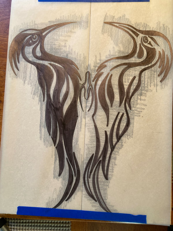
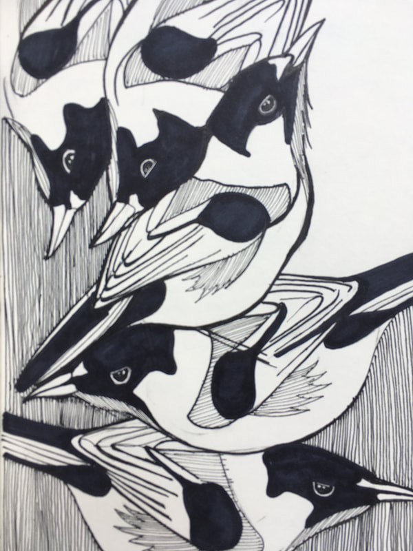
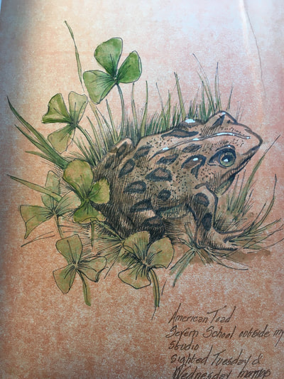
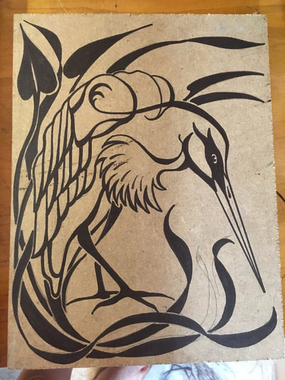
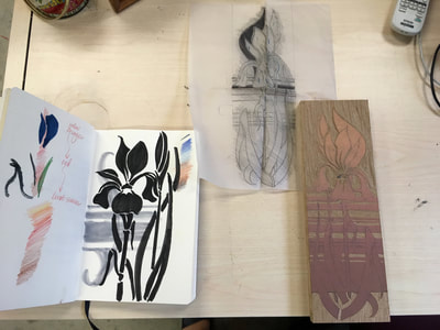
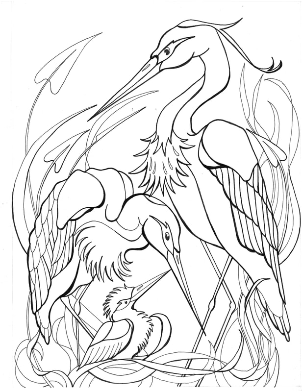
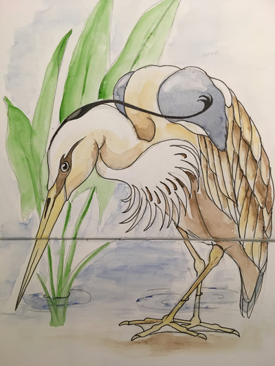
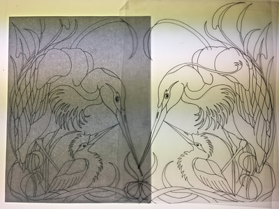
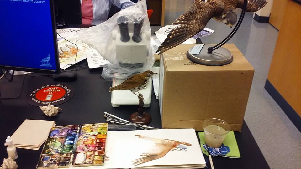
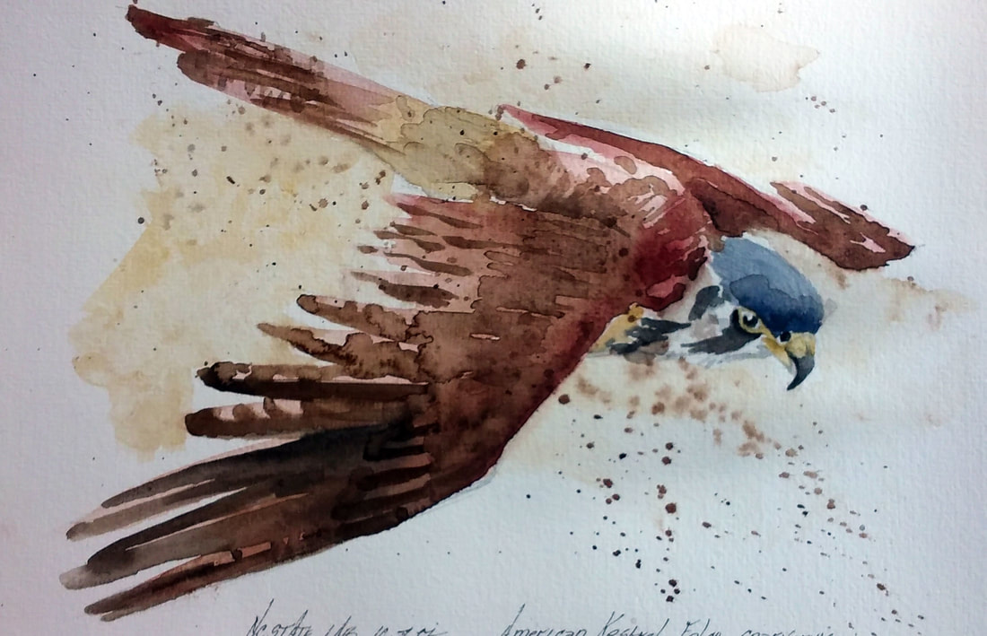
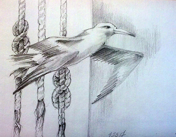
My new working environment has provided me the opportunity to deepen my love and appreciation of birds. Being on the water daily, I have the chance to observe in close proximity them flying, nesting, diving, and even their interactions with each other. I'm particularly fond of sitting quietly during a break an watching them in the marsh. Egrets and herons have an inherent grace, particularly among the reeds and emerging water flora this time of year.
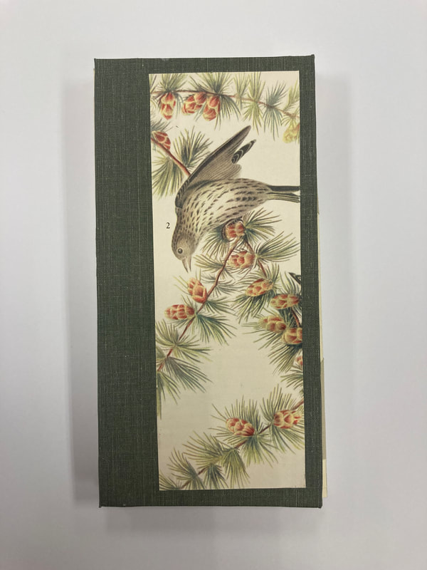
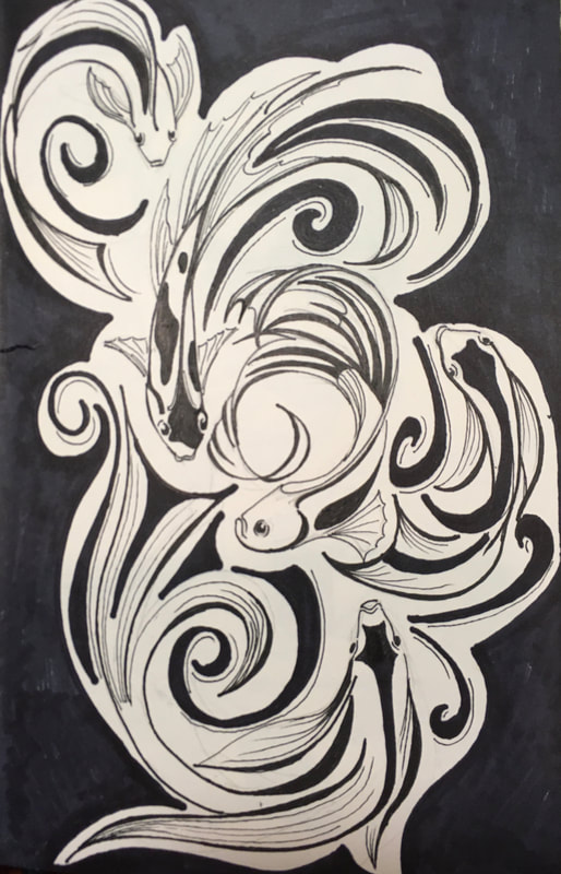
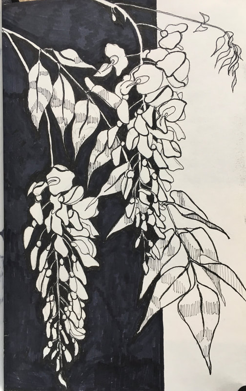
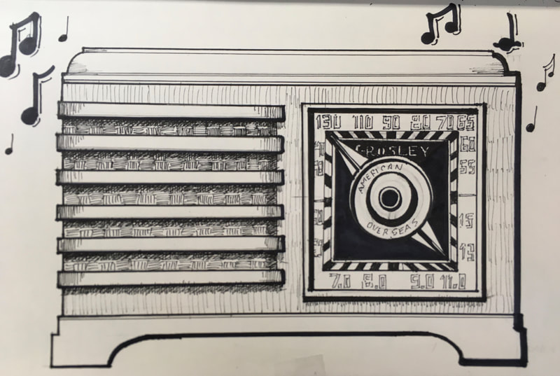
I decided to keep it simple and I'm using an Moleskin brand blank according sketchbook, sketching in 2H pencil and refining in Sharpie marker. I sketch out what I observe in pencil during the day and refine the images at night, usually what relaxing and watching tv or listening to music. If you decided to try this yourself, I recommend a sheet of thick blotting paper behind the page you are working on. The Moleskin paper works well with Sharpie in holding the edges of lines but, it can bleed through to pages below. This book is more about avian grace and the flow of their movements in the natural environment than being purely representational. Kind of new territory for me but, exciting non the less! |
Two Little Books and
My First Try at Letterpress
|
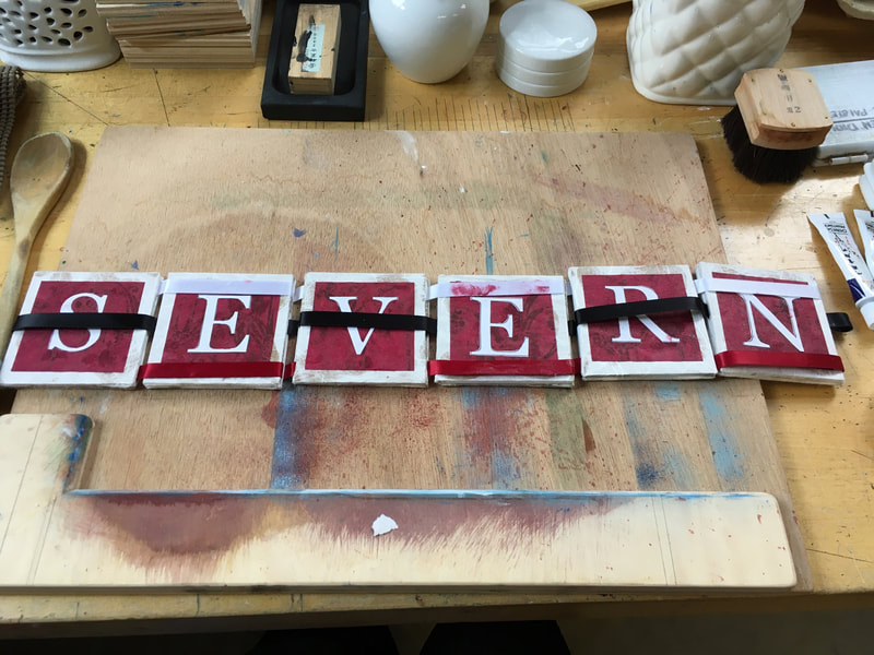
It's been a real joy these past months to have the time and energy to enjoy artistic exploration with friends. Recently, I attended two workshops: Making Dos-a-Dos Books and the other (and now for something completely different!) Letterpress.
There can be a wonderful magic to just throwing yourself into new media and techniques. And a lovely chemistry to working in a coop studio space. And making with friends is always a wonderful way to deepen a friendship! The bookmaking introduced me to the fun of making paper beads. Something I had never done before and may indeed use again in future book making projects. My father-in-law used to say that he thought it was sometimes more important to know what you don't want than what you do want. With regards to the Letterpress workshop, I found I didn't enjoy writing group poetry very much despite loving poetry very much. (part of the problem is that I never think of myself as a capable poet). And although I have always loved fonts, and experimenting with letter forms and learned I didn't love typesetting. Two wonderful days with friends that taught me much about new media, techniques, and myself! |
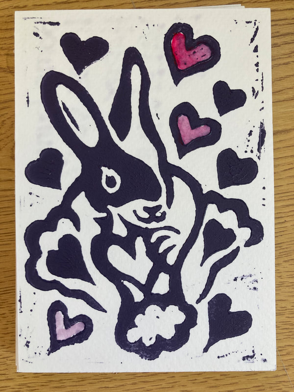
Valentine 2024
Experiment with an Accordion Book and Stamp Pad Printing
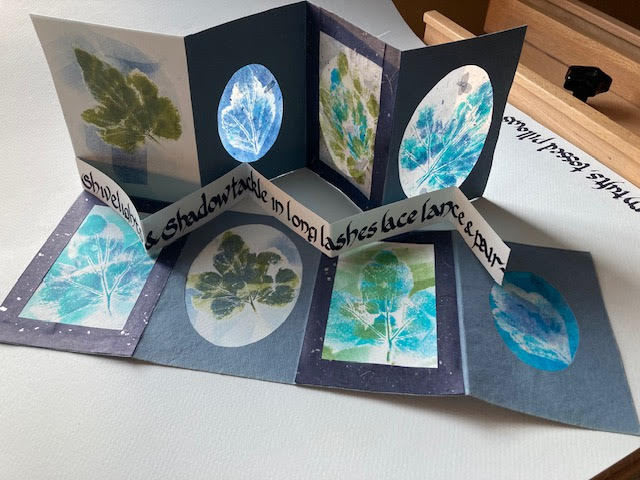
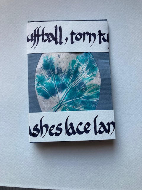
Wonderful workshop with Maria G. Pisano of the Center for Book Arts in NYC entitled "Haiku Miniature Accordion Book."
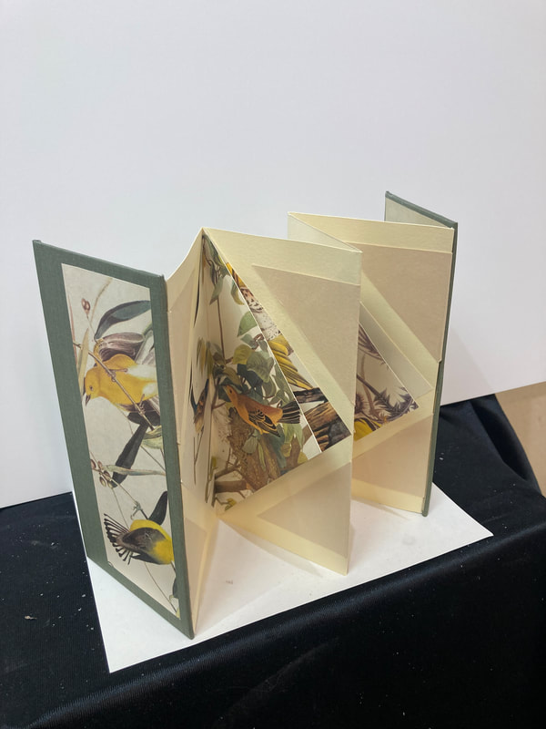
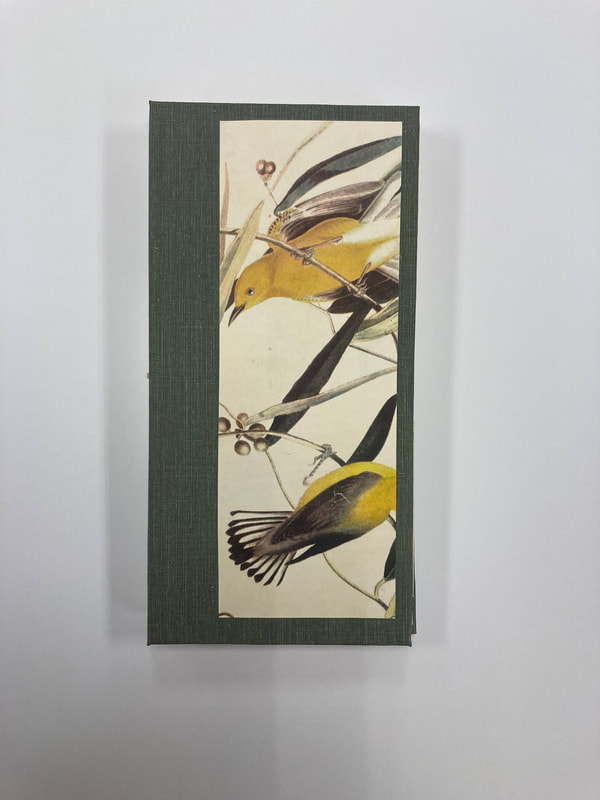
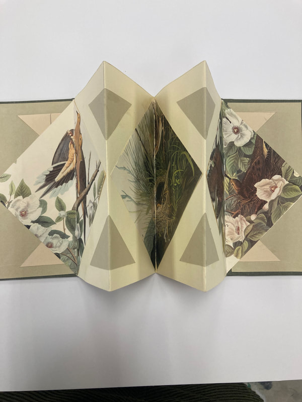
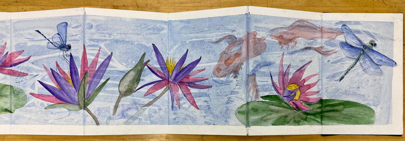
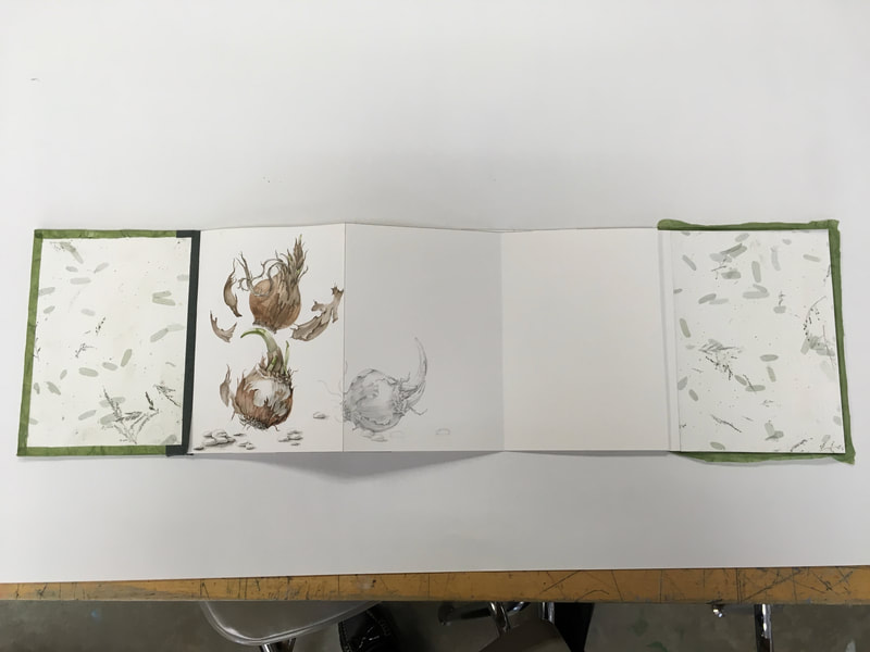
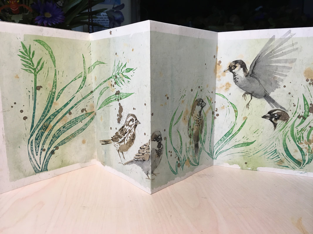
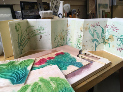
Since I had made accordion books before, I went a bit off the rails in this workshop using a quote from a Gerard Manley Hopkins poem instead of a haiku and a slightly more complicated accordion book form. I've been thinking a great deal about combining calligraphic forms, book making and printing recently and this workshop was the perfect opportunity to "play" with some different ideas and just see what happens for a few hours. I truly enjoyed using the recommended stamp pads and cosmetic sponges as well as direct printing using leaves and other natural objects. Initially, I was doubtful of this but, it was really only a matter for a bit of practice and finding the right paper, which turned out to be a sumi-e rice paper. I used archival ink stamp pads and coordinated the colors. Here is the result:
Since I had made accordion books before, I went a bit off the rails in this workshop using a quote from a Gerard Manley Hopkins poem instead of a haiku and a slightly more complicated accordion book form. I've been thinking a great deal about combining calligraphic forms, book making and printing recently and this workshop was the perfect opportunity to "play" with some different ideas and just see what happens for a few hours. I truly enjoyed using the recommended stamp pads and cosmetic sponges as well as direct printing using leaves and other natural objects. Initially, I was doubtful of this but, it was really only a matter for a bit of practice and finding the right paper, which turned out to be a sumi-e rice paper. I used archival ink stamp pads and coordinated the colors. Here is the result:
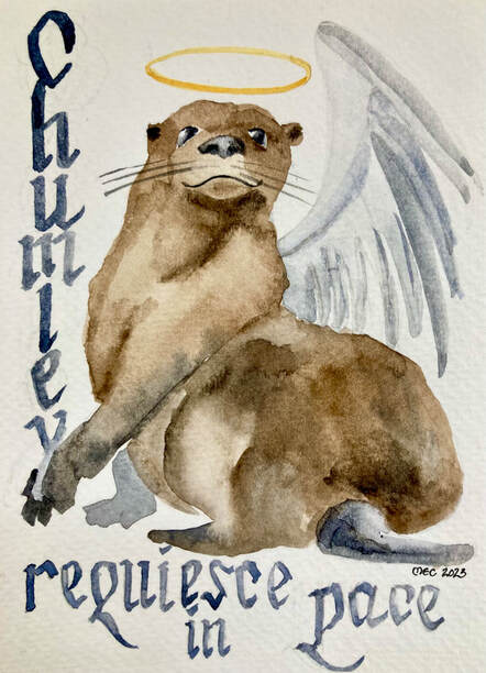
Remembering a Much Loved Otter
Four Color Wood Block Print
|
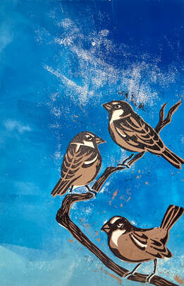
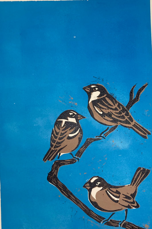
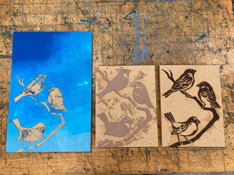
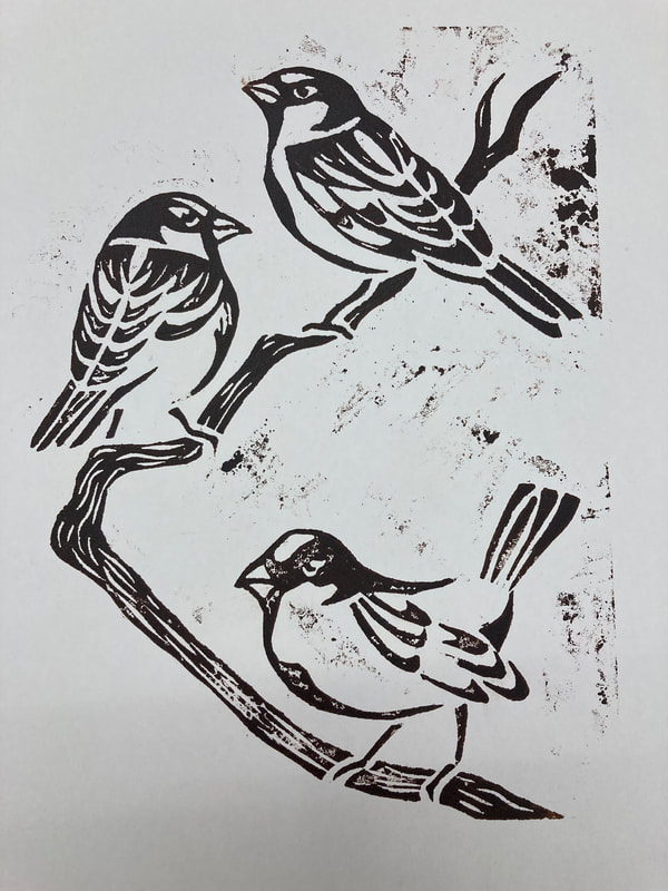
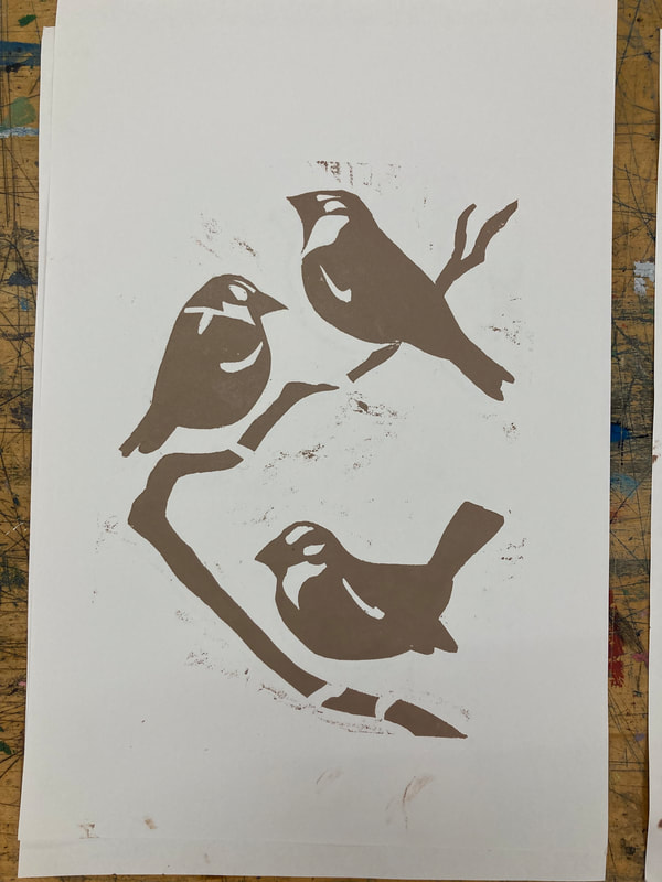
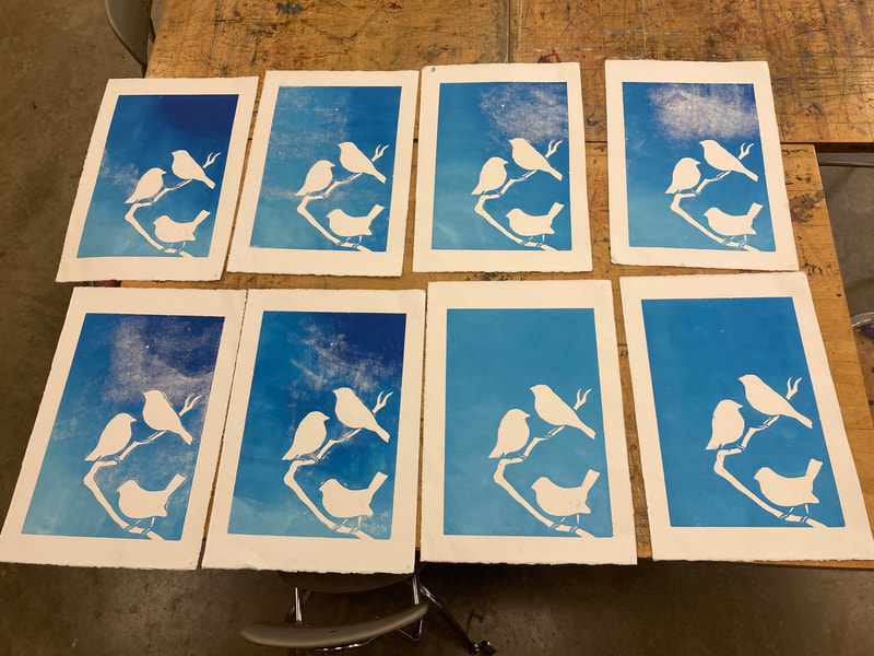
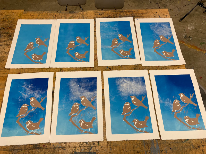
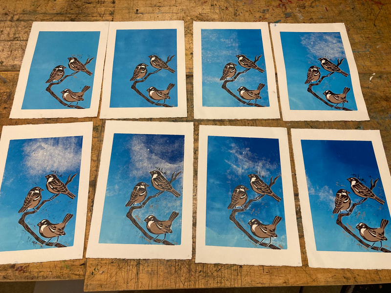
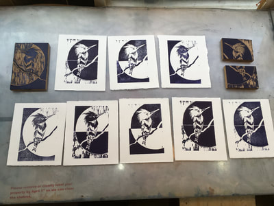
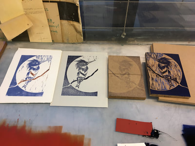
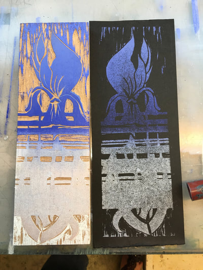
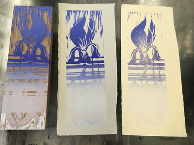
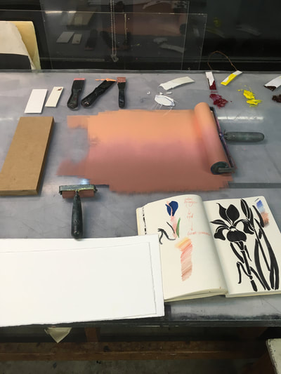
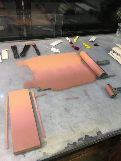
Here is a series of eight prints I created as a class demonstration for multiple color printing with woodblock. These prints were registered simply by aligning the lower right hand corner. Inks were oil based by Gamblin. I experimented with different techniques with the sky to get various value shifts and changes in order to create the impression of clouds.
|
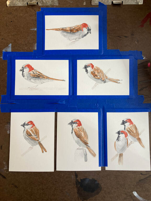
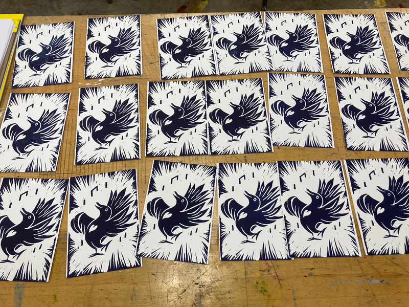
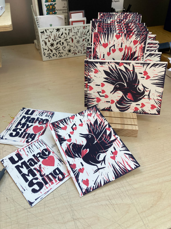
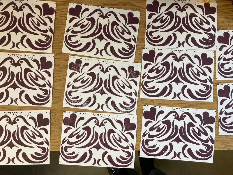
Seven Little Birds, Six Little Cards
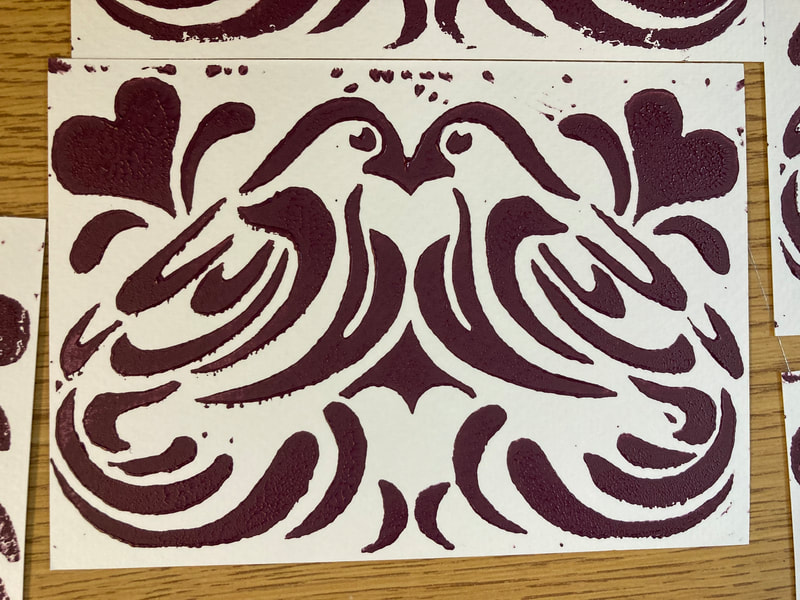
The 2023 Valentine!
Cyanotype Sketchbook Covers
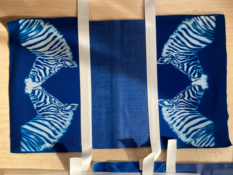
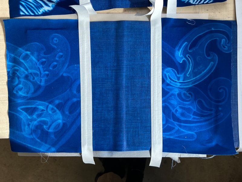
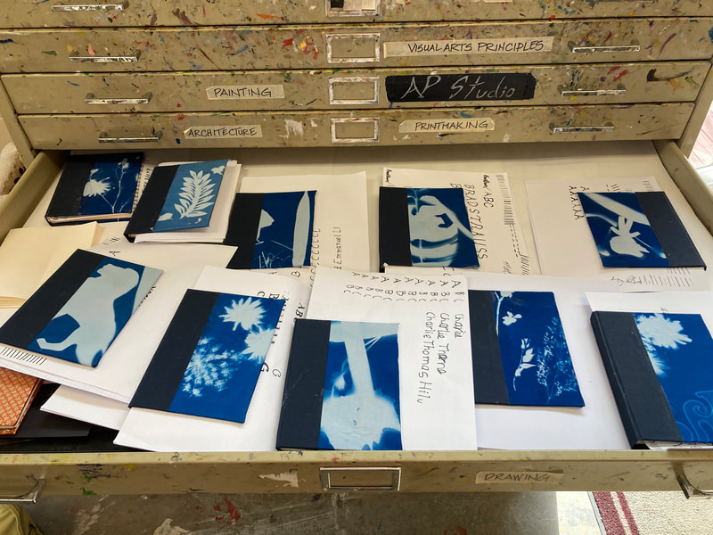
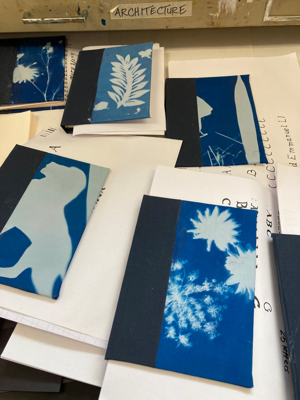
I enjoyed the cyanotype process so much working with my students, I decided to try it for myself. The acrylic french curves made wonderful masks since stacking them at random created interesting shapes and variations in value. The zebra was a simple ink drawing on an acrylic sheet. I experimented with exposer time as well. I found I preferred a longer exposer time for sharper images.
Cyanotype Book Cover Experiment with My Students
Professional Development: Bookbinding Fundamentals with Karen Hamner
So excited to have the opportunity, thanks to my employer, to study with a professional book binder/book artist. Check out the gallery below to follow my learning. Be sure to check out my teacher's website at the link below as well!
Book of Firsts!
|
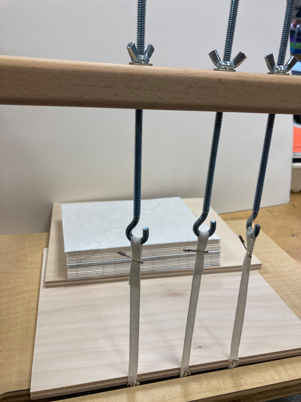
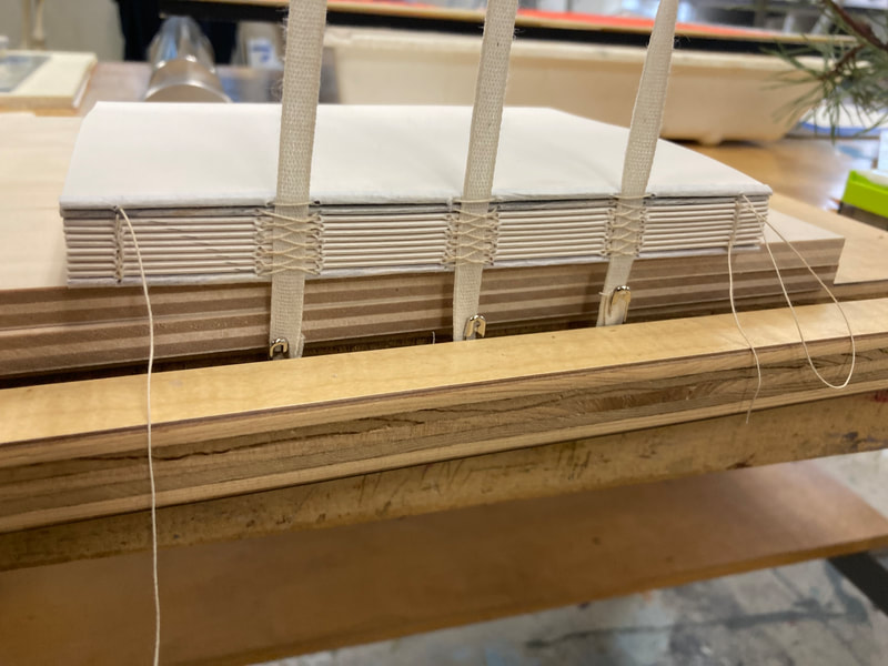
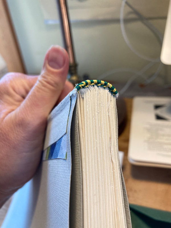
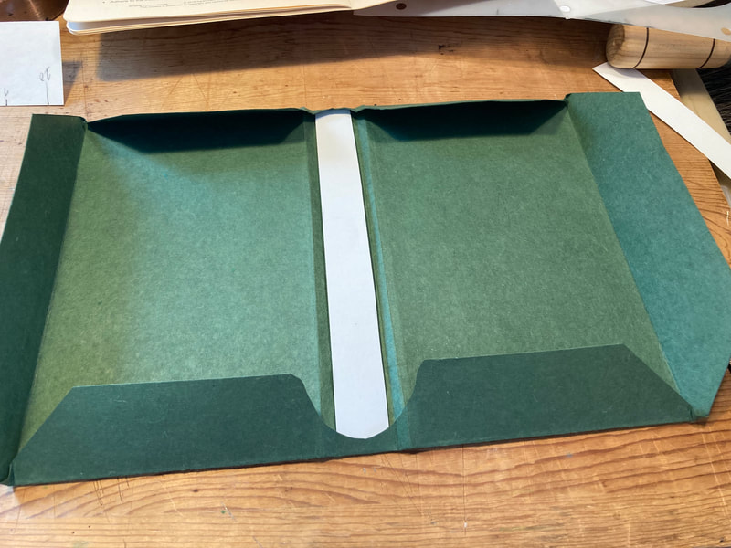
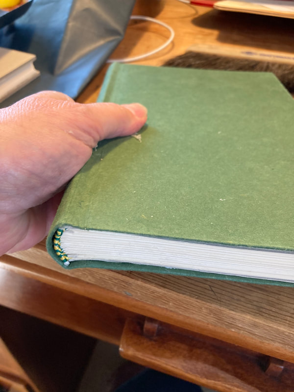
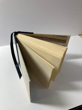
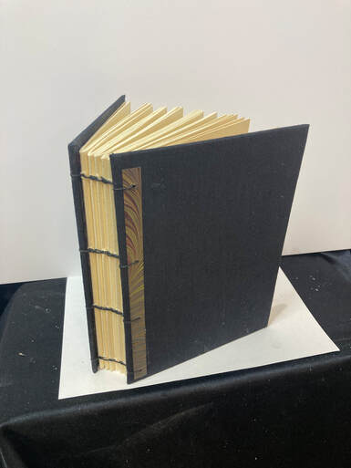
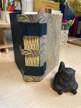
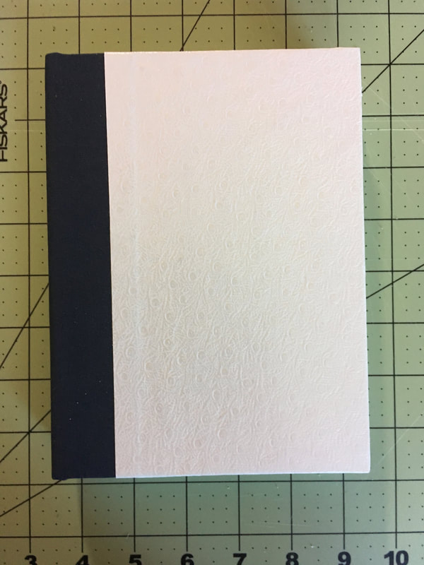
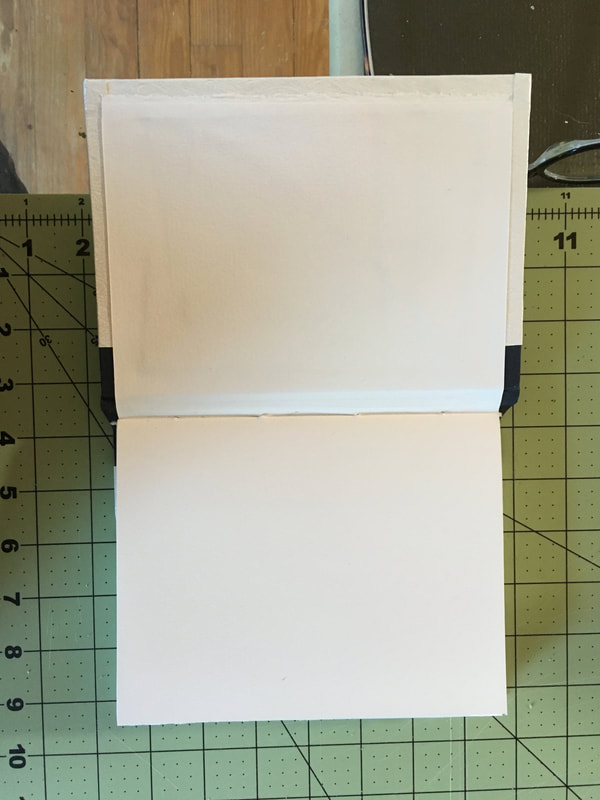
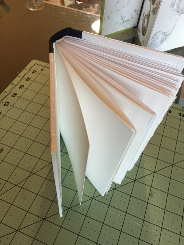
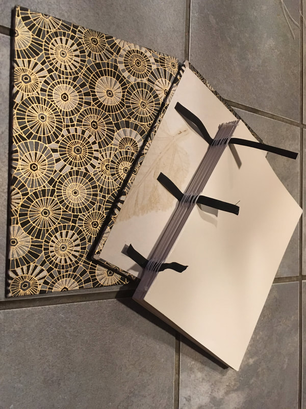
I'm truly excited to share this little book here. It is a kind of book of firsts for me. My first multiple signature rounded spine book. My first book with a built in bookmark. and stitched binding that includes linen tapes. It's a sturdy little volume and I'm particularly pleased with my craftsmanship on this one...practice makes one better it seems!
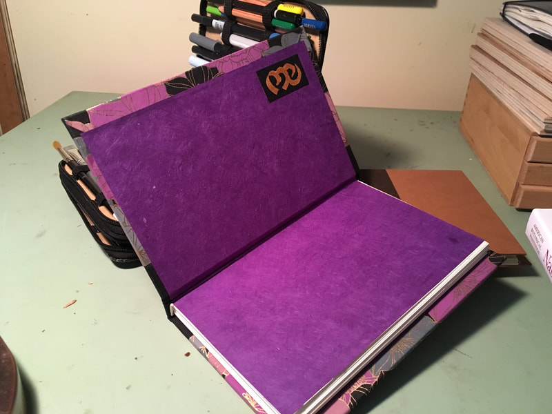
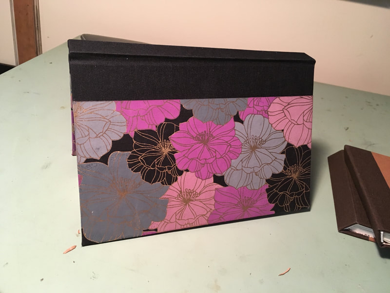
What better yet is that I'm finally starting to be able to visualize various book structures and stitching. The book cloth was donated to me, so I don't know the source but, it's a lovely quality paperbacked linen (both colors). The paper is a standard weight text paper that has a subtle flecking and I tried to draw it all together with some Thai marbled paper from Dick Blick. It has a fun stone cross-section look to it. The overall size is 4"x6." |
"Secret" Belgian Binding
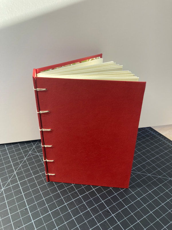
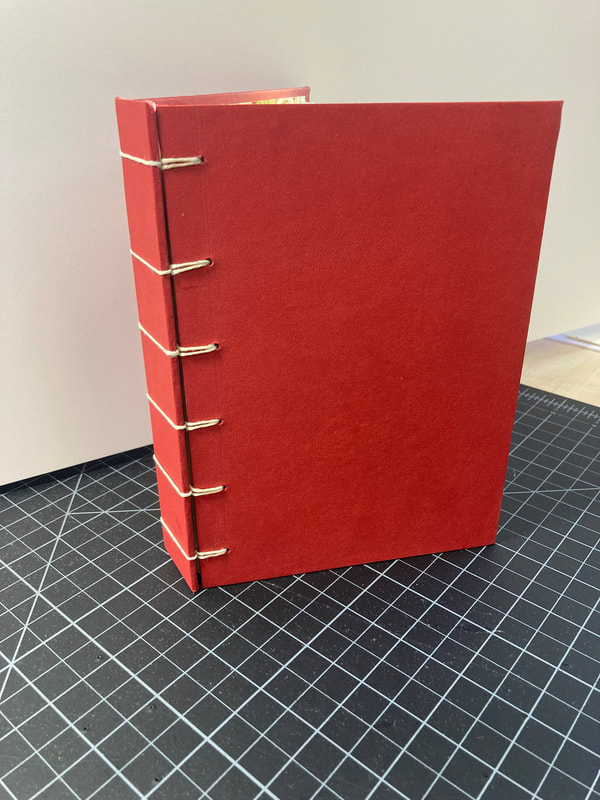
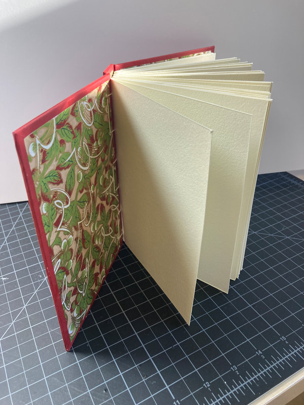
Another book inspired by the text Making Handmade Books by Alisa Golden. The author recommended making folio pocket pages, but I opted for using watercolor paper (the binding is perfect for accommodating thick papered blocks). I think it will make a good sketchbook since it lies flat without the pages closing. Mixed a bit of East and West in my design. Used a faux red leather exterior cover with the end papers Japanese Chiyogami.
The Winged Book and First Coptic Binding
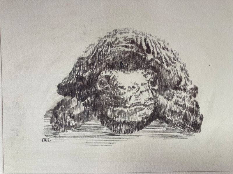
Acrylic Plate Etchings: Tortoise and Hare
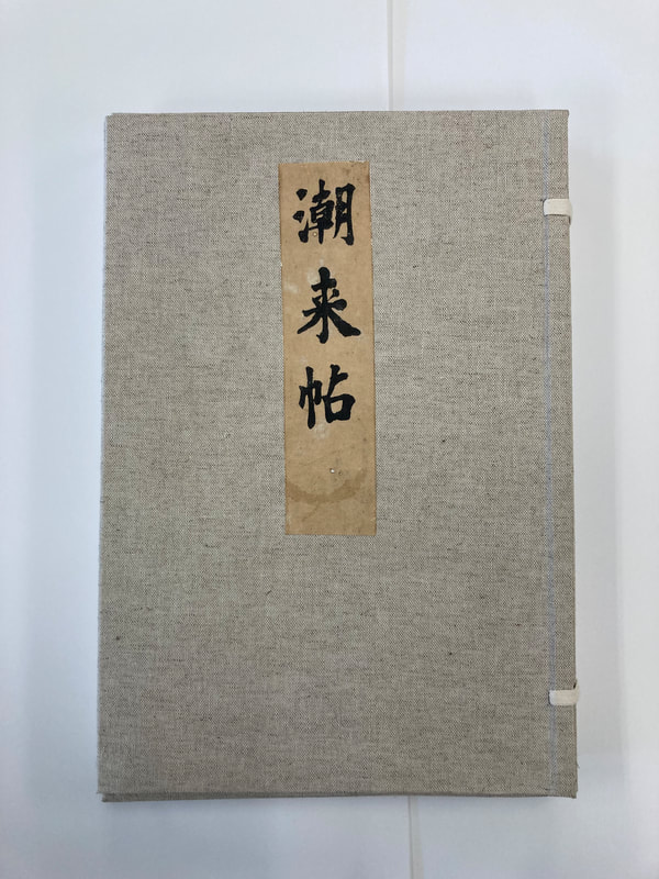
Restoration Bookbinding Project: Japanese Painting Monograph
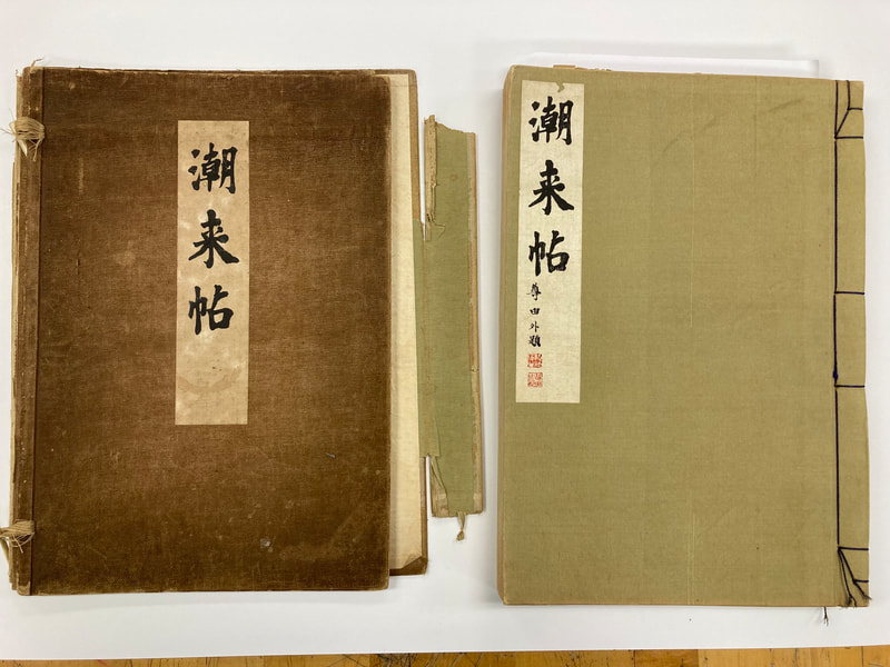
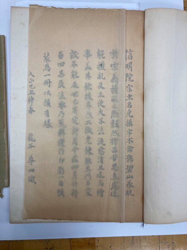
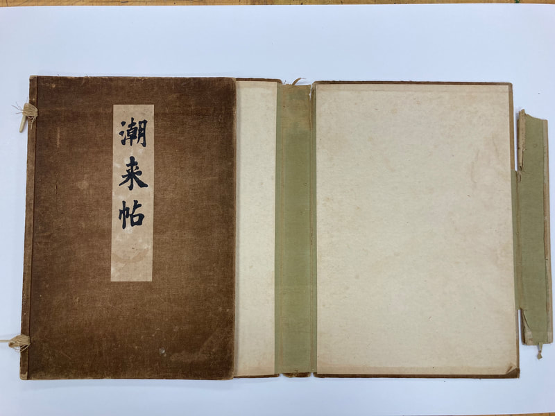
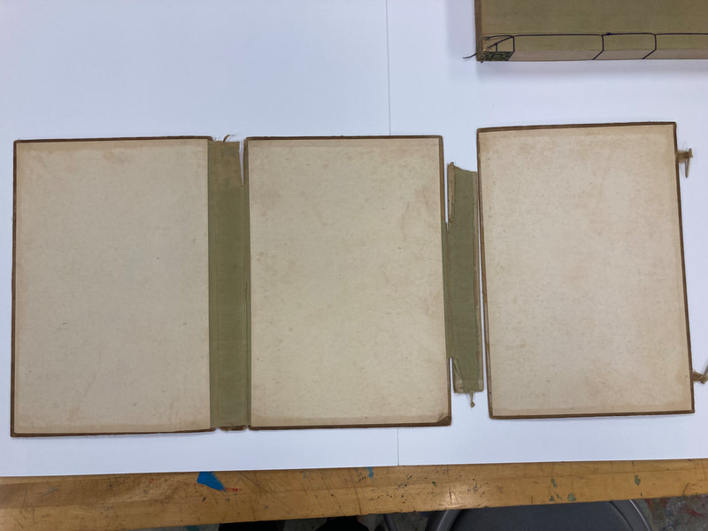
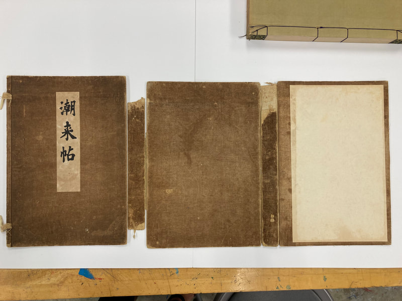
I found this beautiful book in a local antique shop. Seeing its sad state of repair and having spent the summer teaching myself Japanese book binding techniques (see my summer blog post). I decided to take the plunge and try to repair the text to the best of my abilities. Below are the photos documenting the condition in which the book came to me. More about the book and my process to come!
Before:
After:
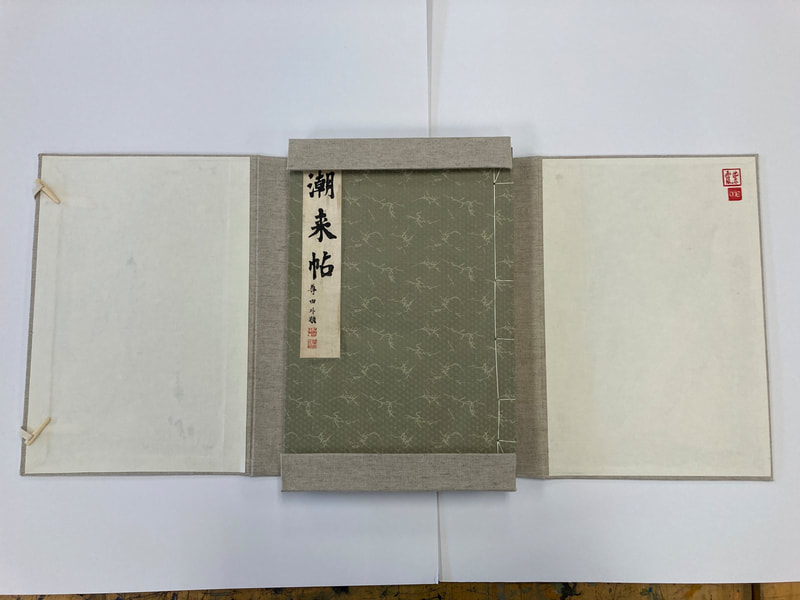
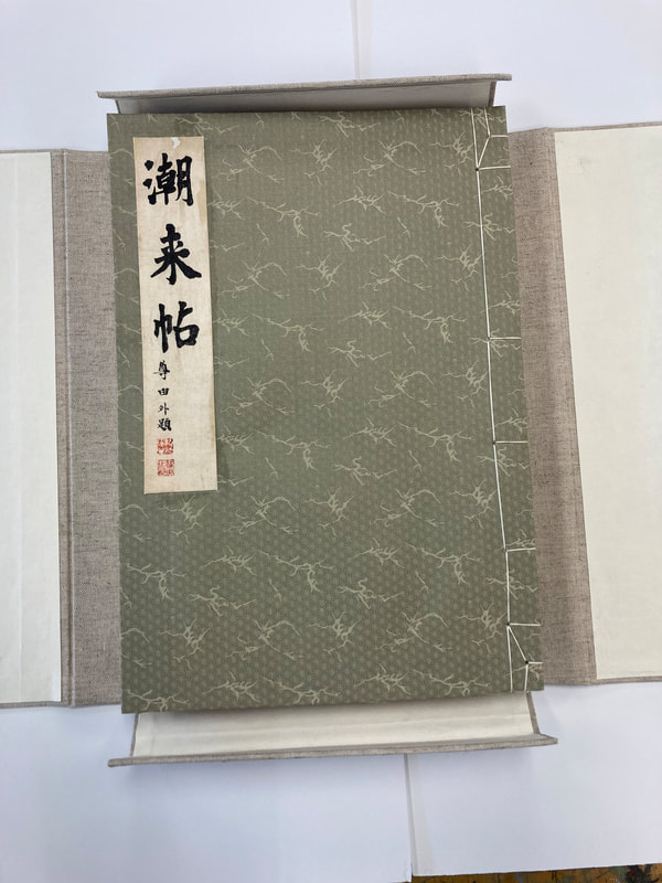
The guiding principle of restoring this book and its case was to keep it as close to the original design and use intent as possible while still protecting it from use and age.
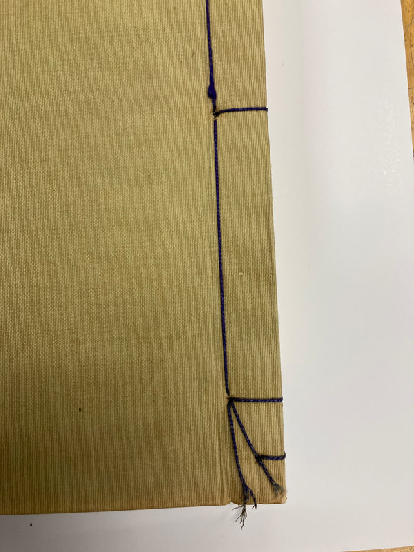
All labels are from the original box and book. I was able to remove them fairly easily by carefully soaking them off (rice paste releases easily) with a clean sponge. I then dried them, pressed them and attached them to a thin piece of new rice paper to reinforce them. The original binding, or I believe I should say the binding as it came to me actually had two nails in it. This led me to believe that the book had been repaired once before and the nails were added where the original inner binding thread should have been. All this was replaced with high quality silk thread. The cover is silk backed paper of similar hue. Only one page needed to be replaced, the thin page with the character for "introduction" on the insider of the cover. I was able to keep the original printed character and mounted that on a new piece of thin rice paper. Repairing the original rice paper sheet was beyond my abilities and appeared extremely difficult since it was severely folded, torn, and the edge damaged in many places making it almost impossible to turn the page without further tearing. The rice paper I use to replace it with the mounted original character is slightly thicker to hopefully stand up to use.
You may notice that the book box design is slightly different from the original. When I remade the box I decided to make a four-sided case, instead of the original wrap around case. This was to protect the book's edges, with were showing wear, so much in fact that the silk corner pieces also had to be replaced with a complimentary style pieces of paper backed silk.
My guide book was: Japanese Bookbinding: Instructions from a Master Craftsman by Kojiro Ikegami
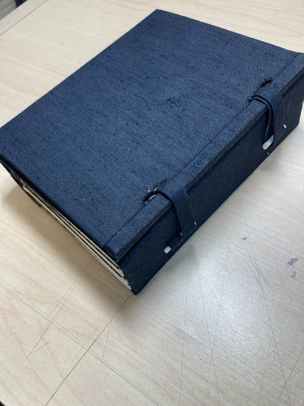
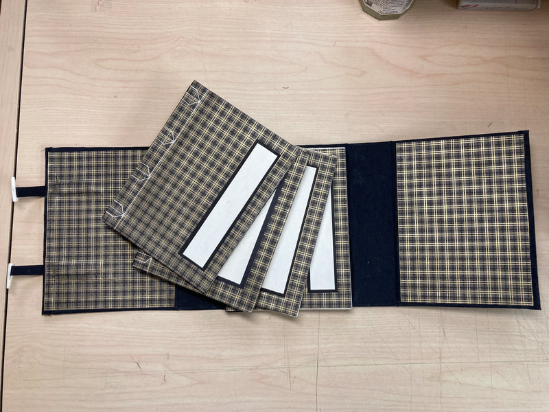
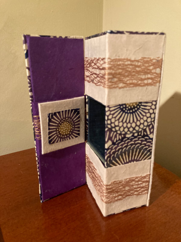
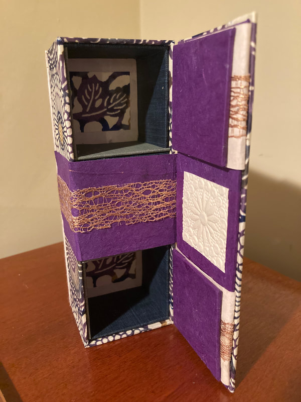
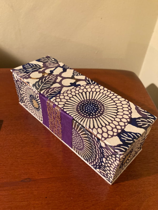
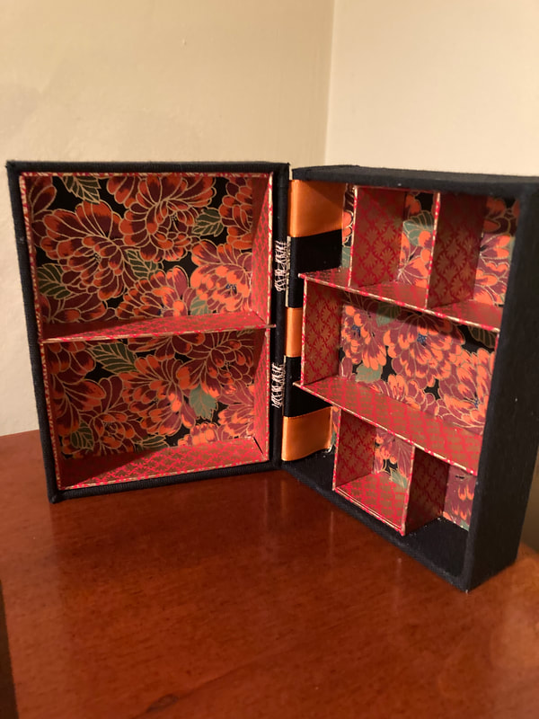
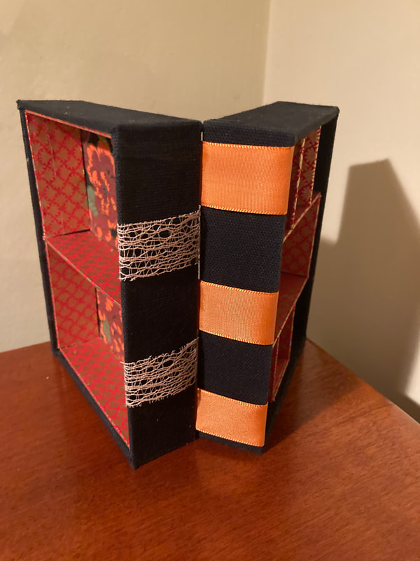
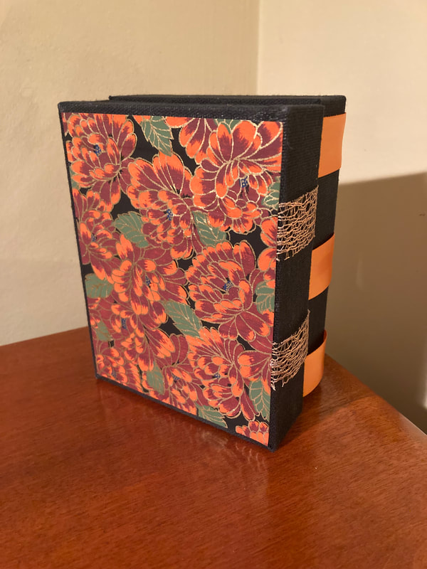
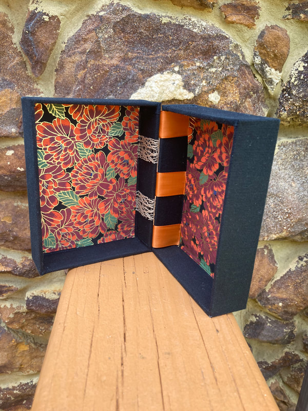
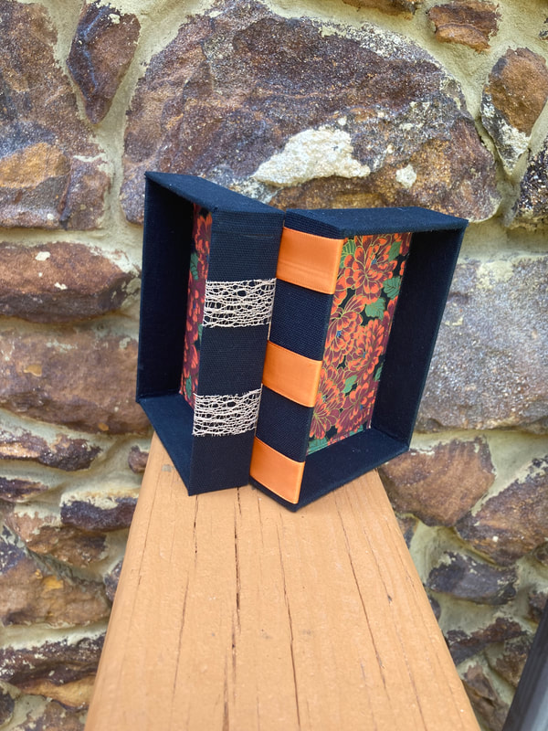
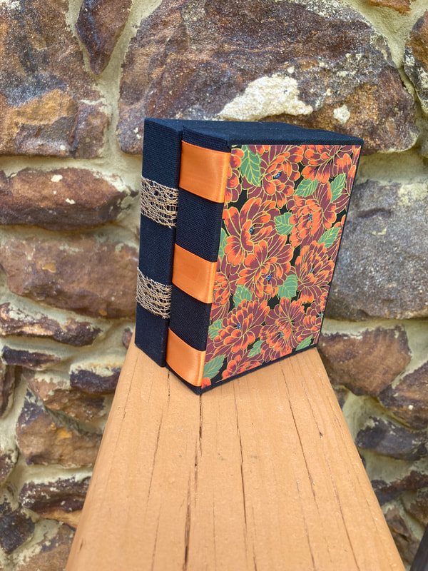
A Box for Lots of Little Books: Japanese Folding Bookcase
Lots of Little Books
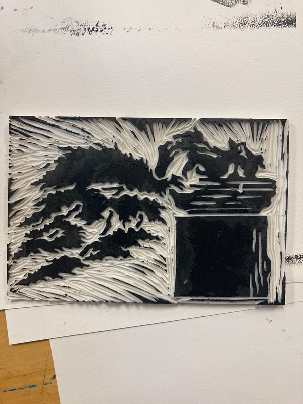
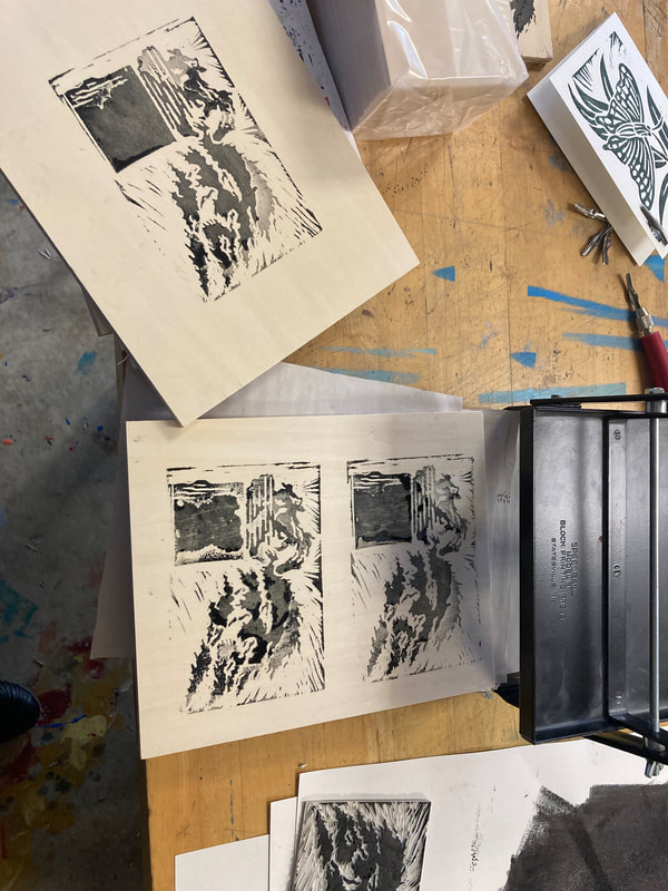
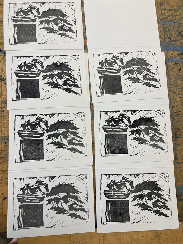
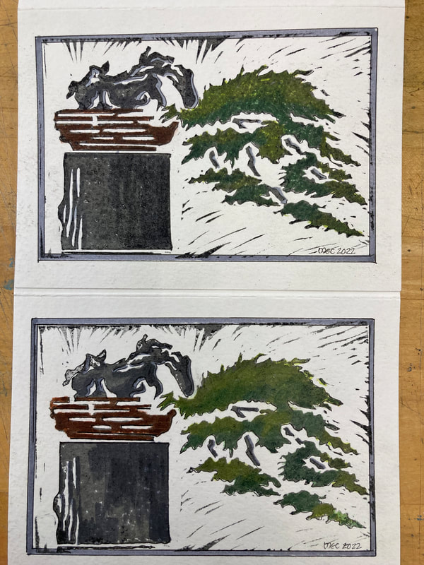
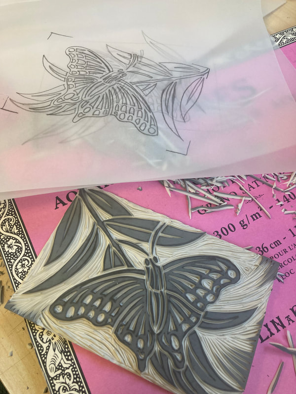
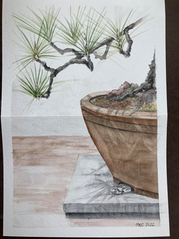
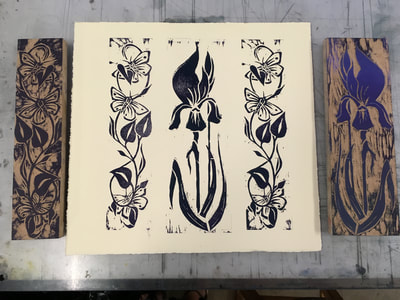
Lino Block Monotype featuring a bonsai
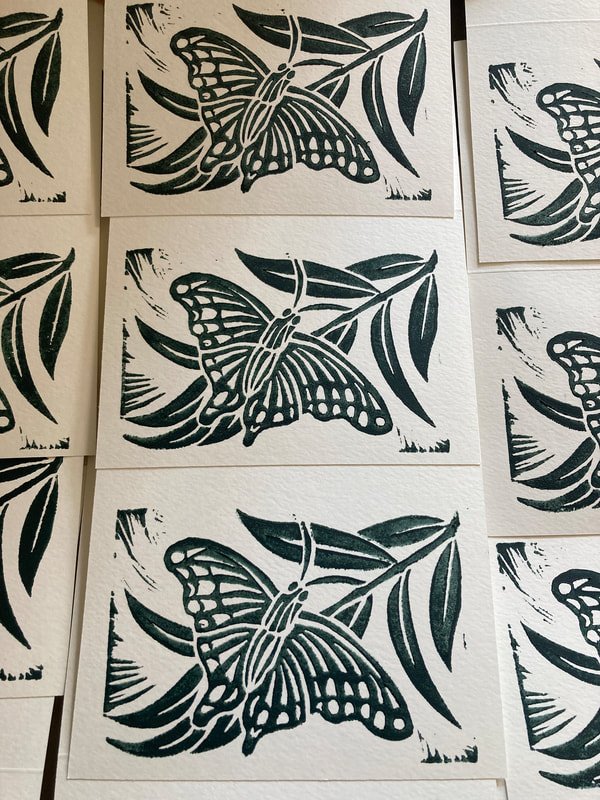
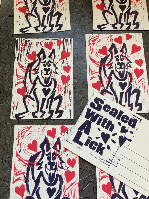
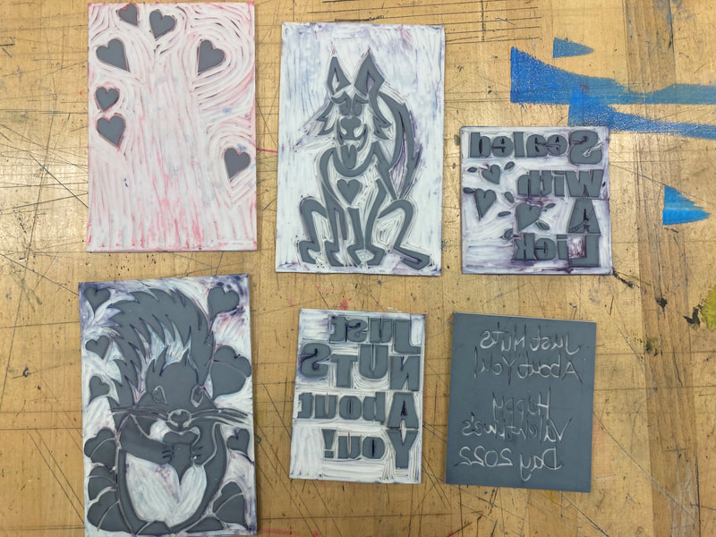
A quick lino block for thank you cards.
I like to make saying thank you to folks special and I'm hoping that a hand printed original lino print can do just that!
Check back for the prints!
Check back for the prints!
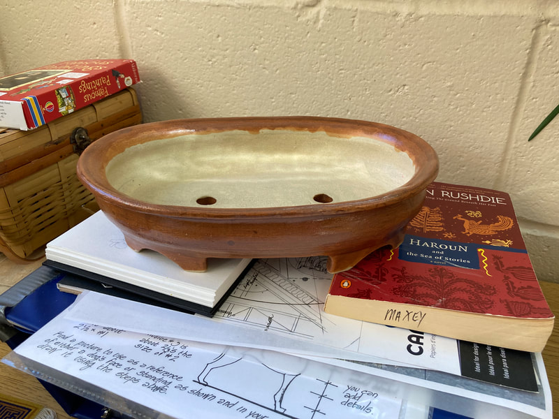
Making My Own Bonsai Pots!
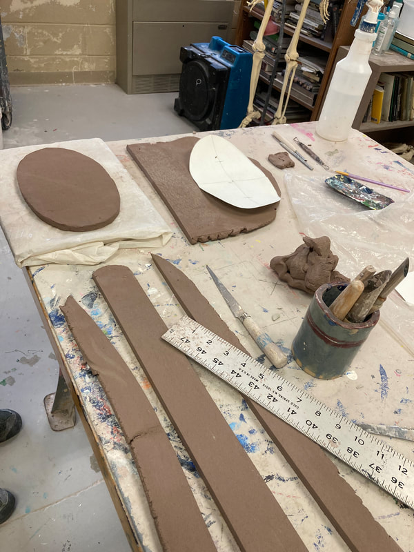
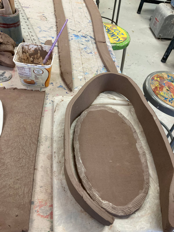
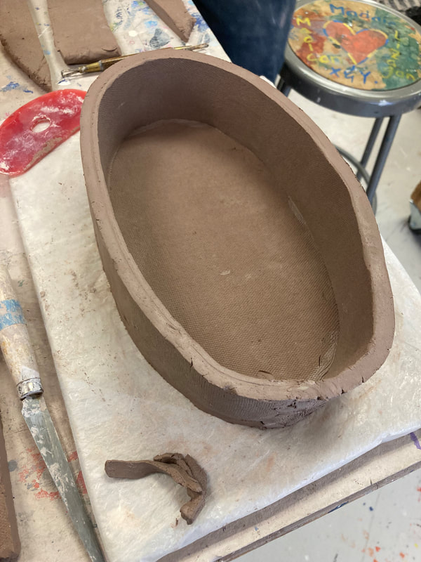
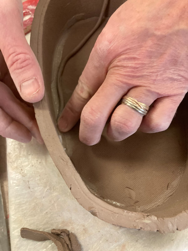
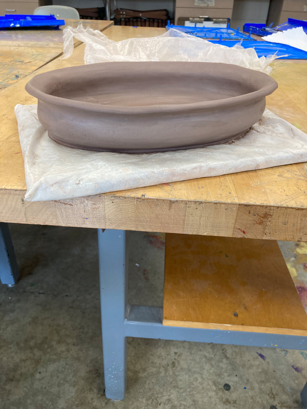
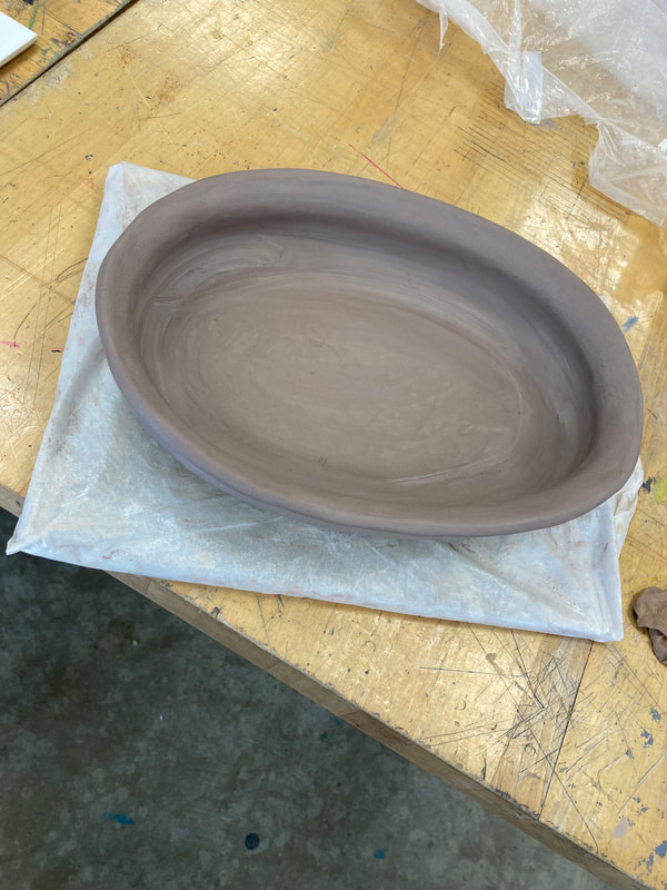
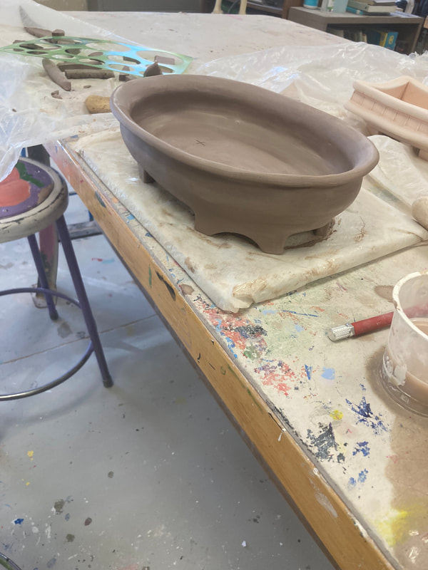
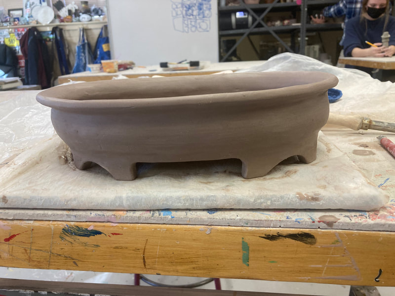
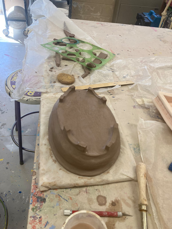
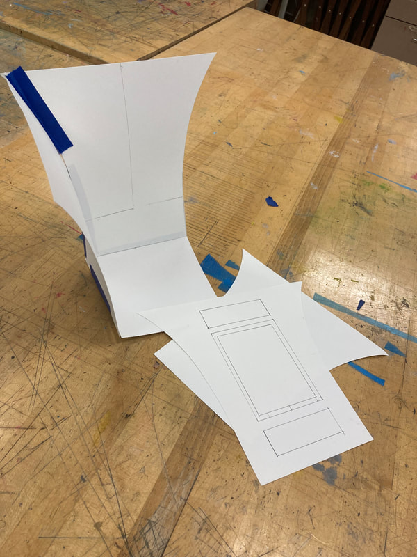
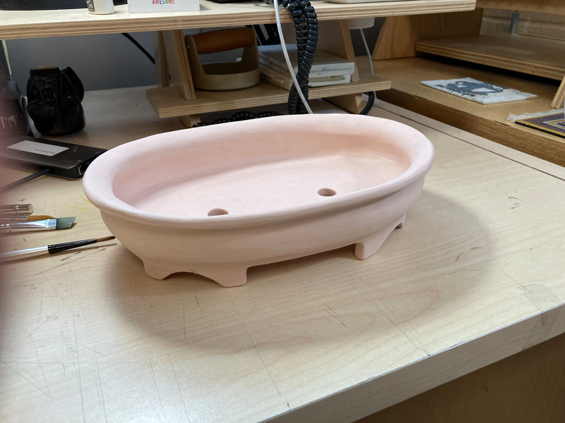
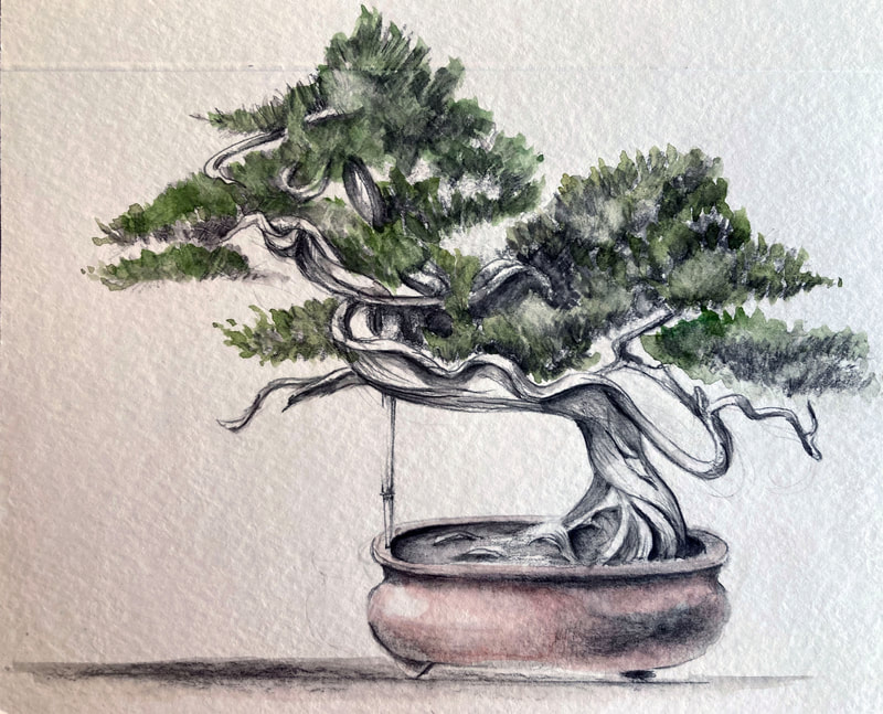
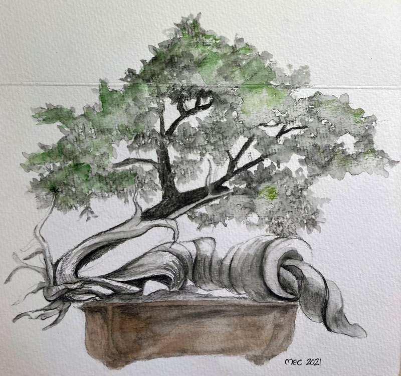
Inspired by a recent lecture on making bonsai pots at the monthly meeting of the Northern Virginia Bonsai Society and supported by my amazingly talented colleague, S. Sensbach, I decided to take the plunge and attempt to design and create my own pots for my bonsai. I'm documenting this because my colleague and I hope to partner on a field trip and project with the painting and ceramics classes this coming spring. Hopefully, these process images and the products will serve as helpful guides to our students!
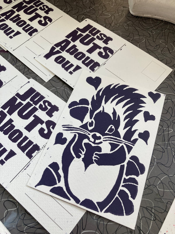
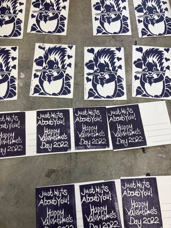
The 2022 Valentine!
Every year I look forward to participating in the Guild of Book Workers' Delaware Valley Chapter's annual handmade Valentine exchange!
A New Magic Box
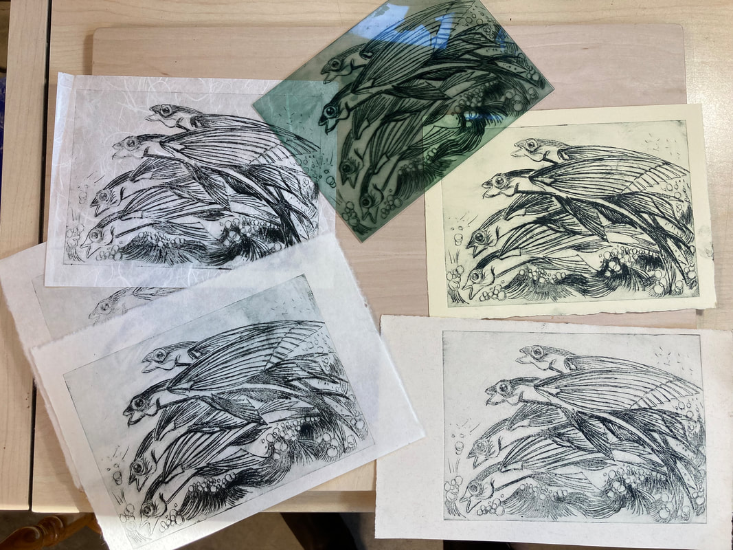
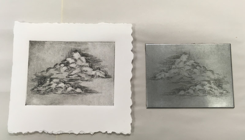
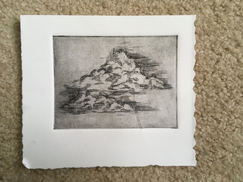
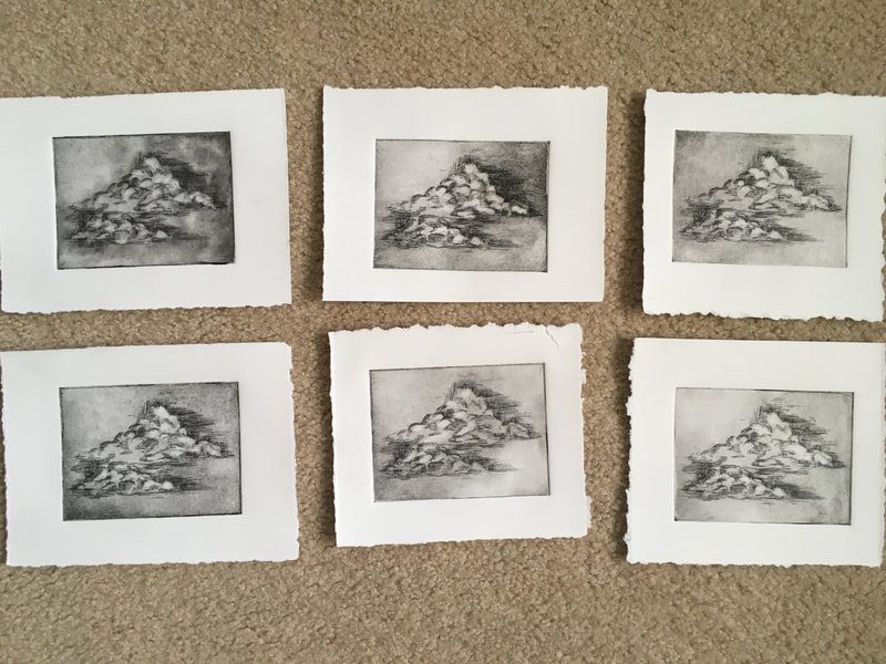
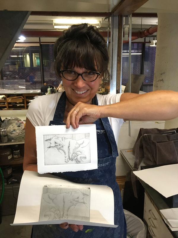
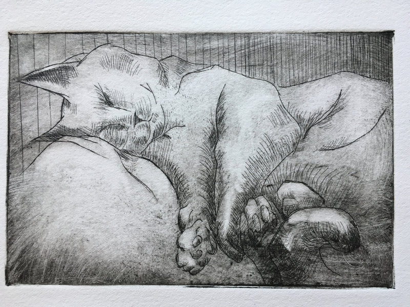
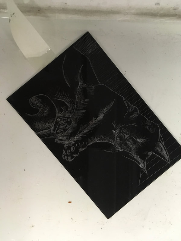
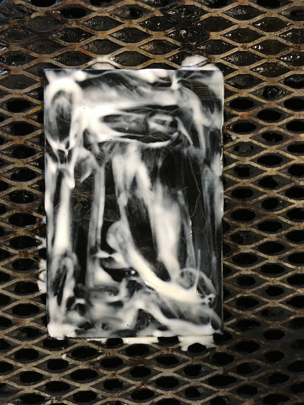
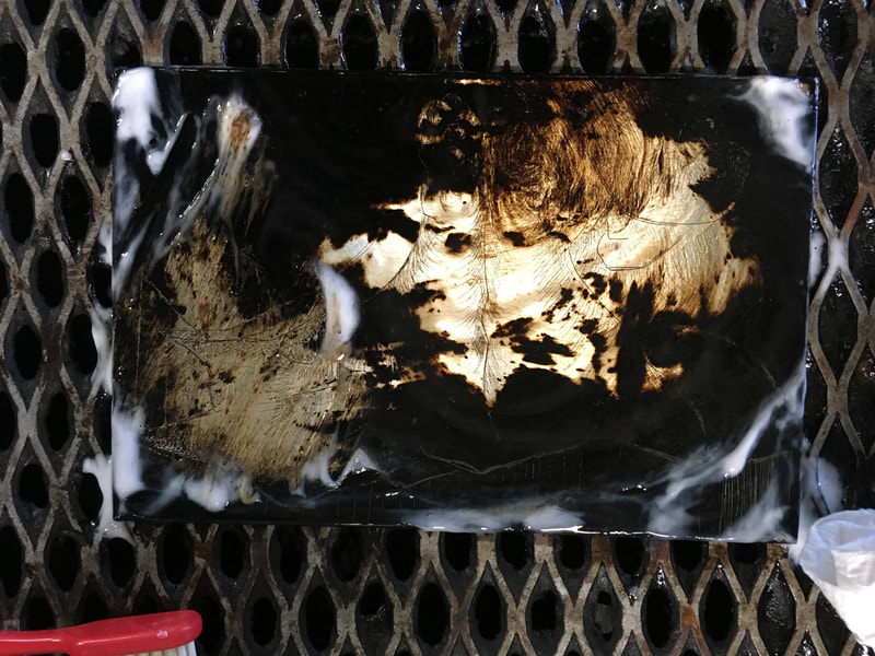
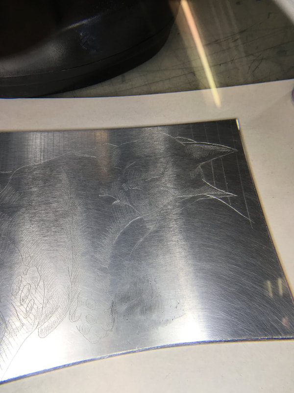
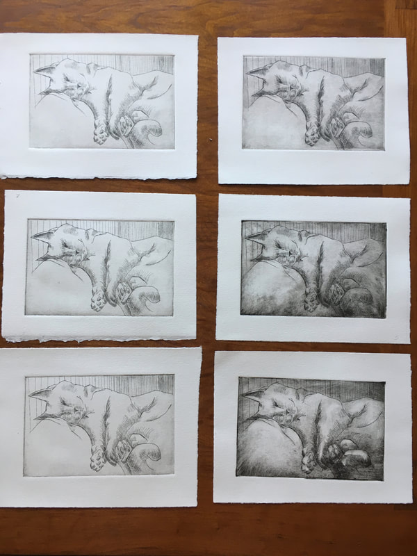
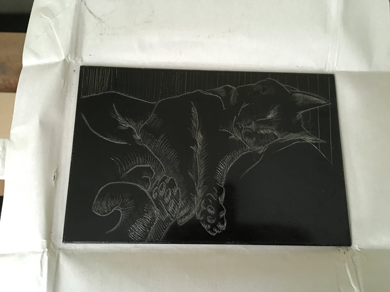
Acrylic Etching
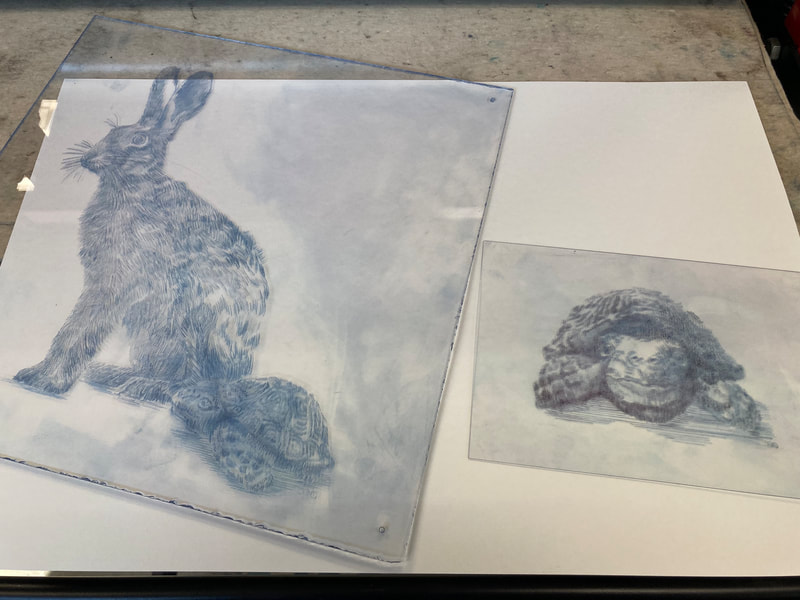
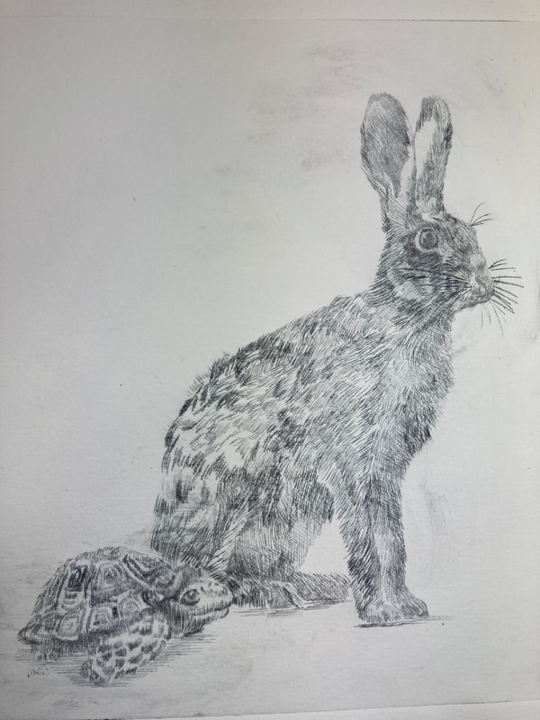
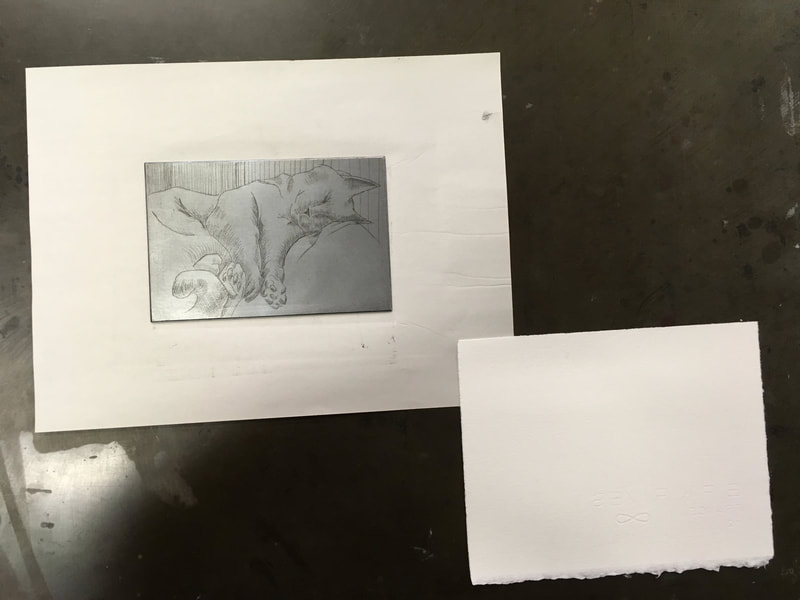
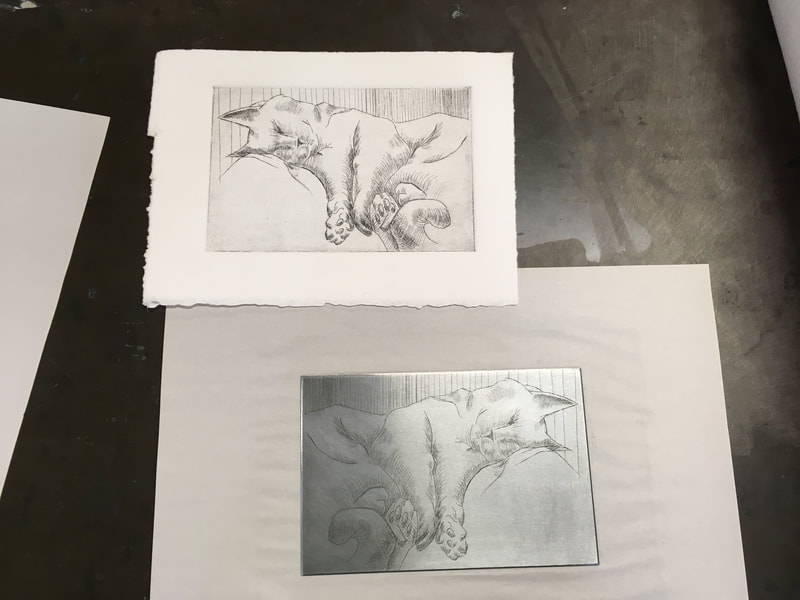
This etching project began with a reduced copy of one of my "Inktober" sketches from last year (see below).
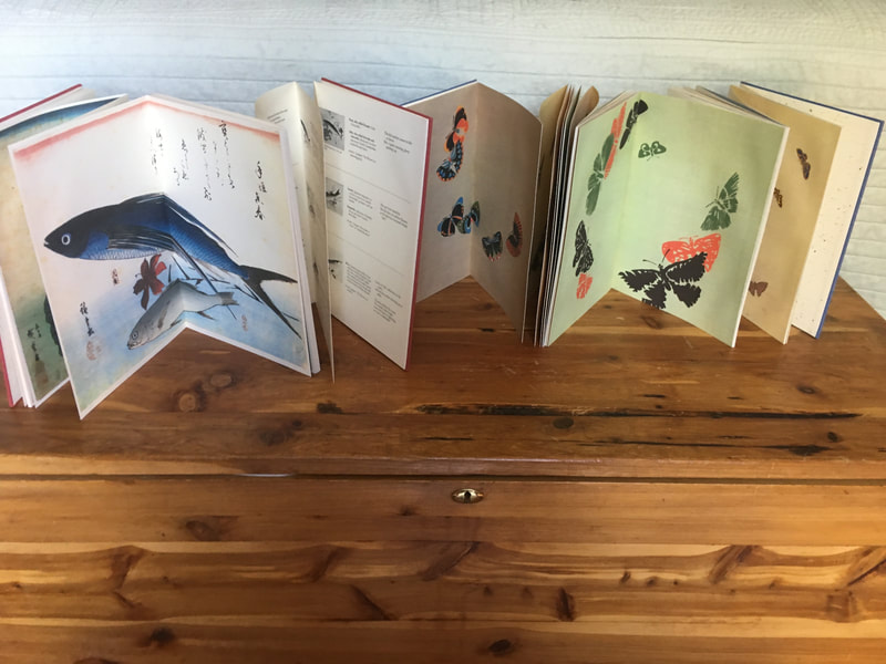
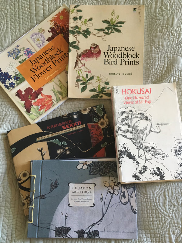
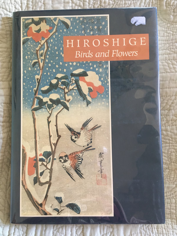
Japanese Album Collection
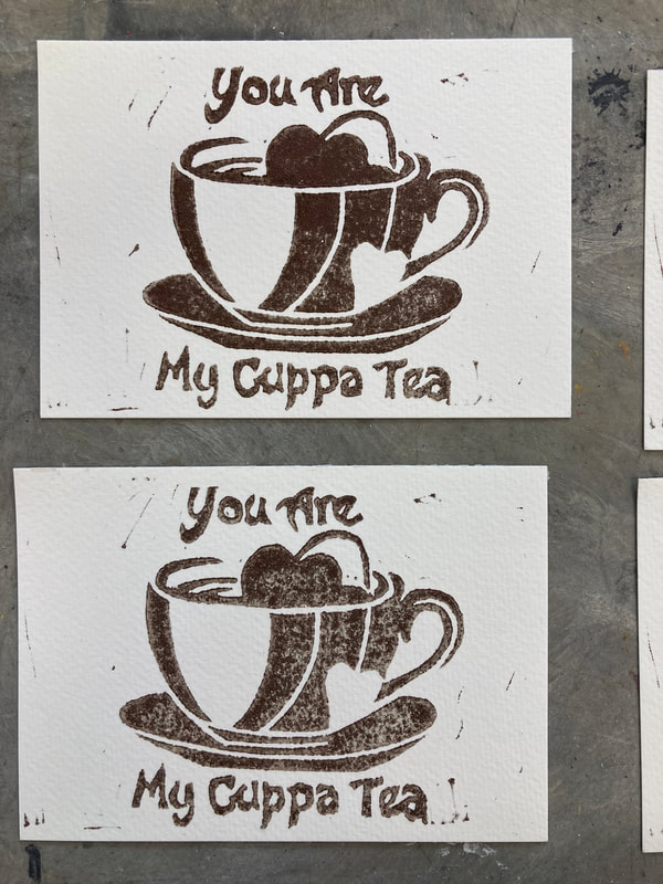
Recent Postcards
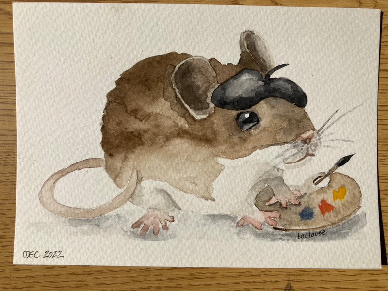
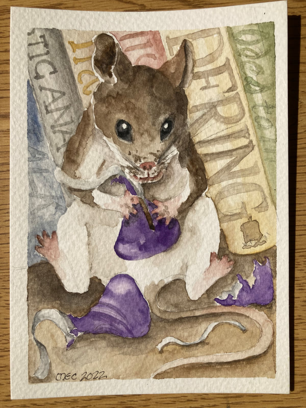
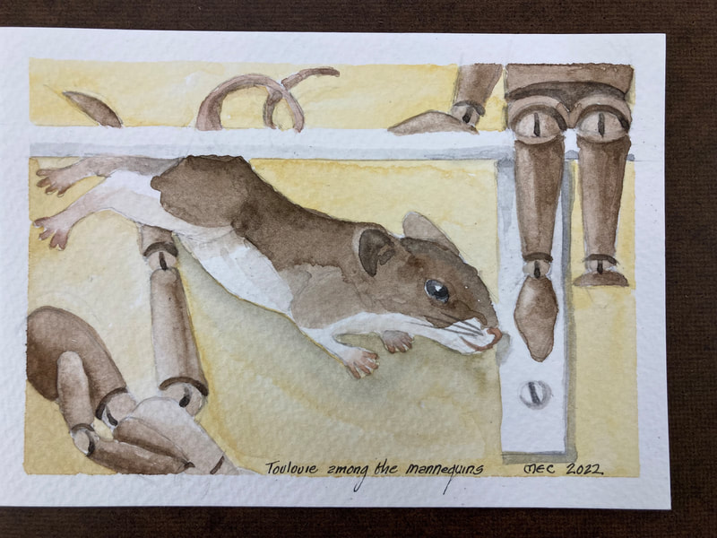
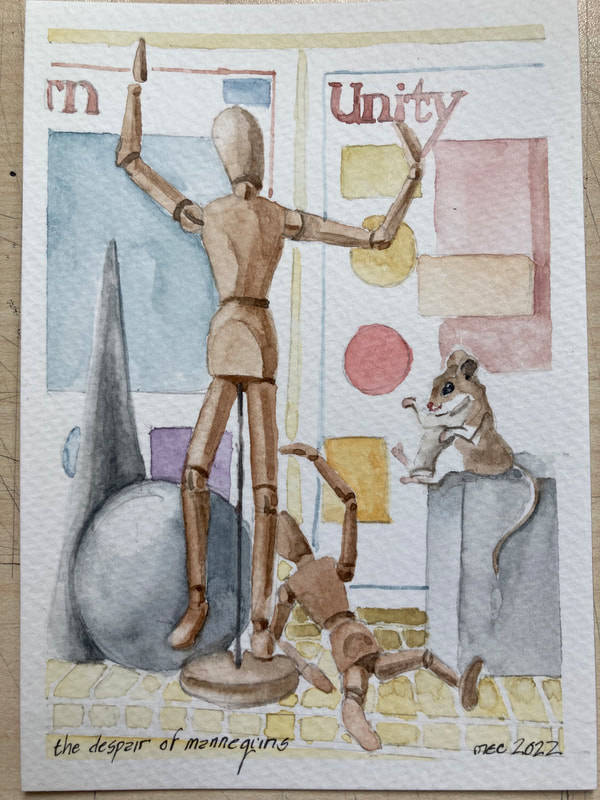
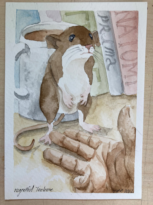
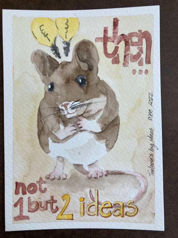
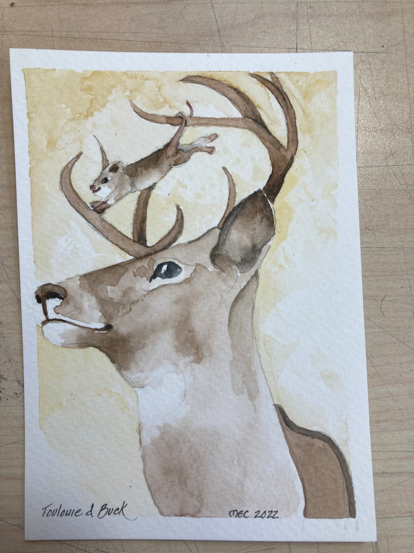
The Adventures of Toulouie
Below is a collection in chronological order of my latest postcards. Please visit again, more to come!
First Magic Box Revisited
The Magic Box Progress Images
For details about this project see my blog post dated 7/1/2021
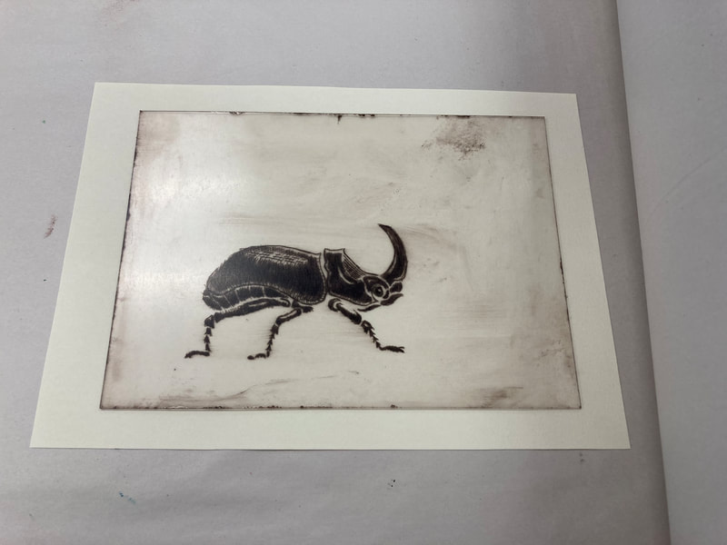
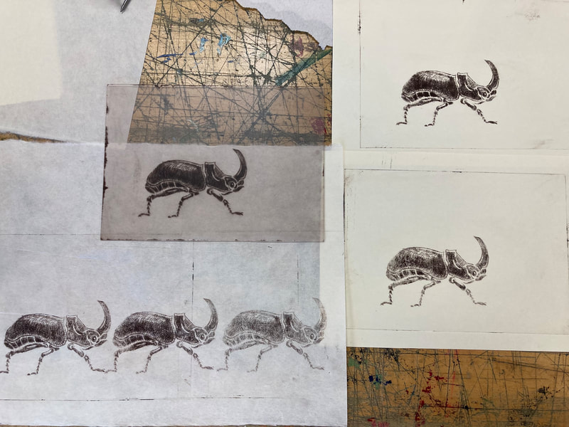
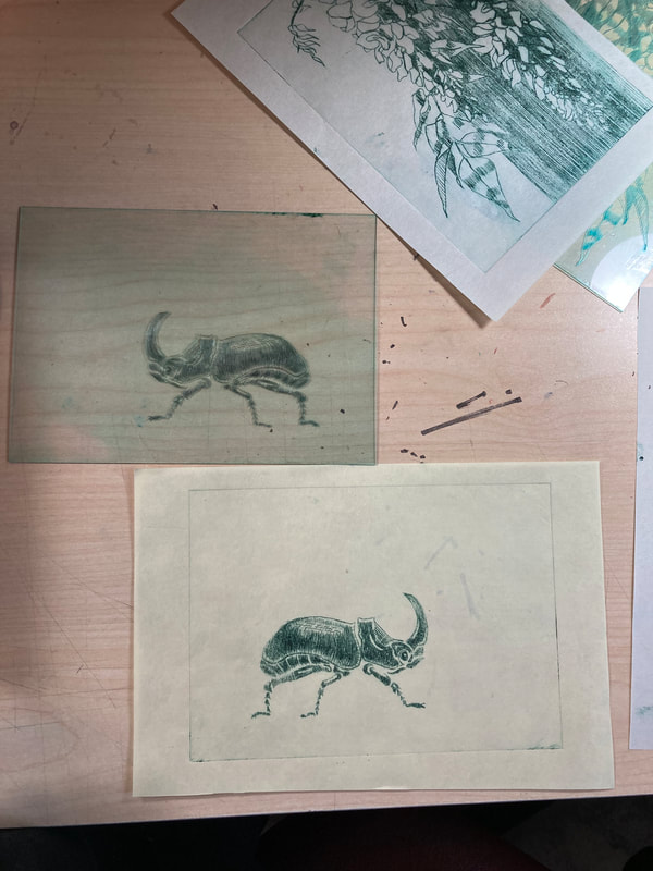
Experiments in Dry Point on Acrylic
The Process
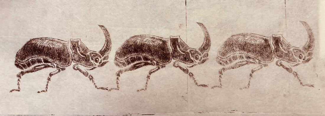
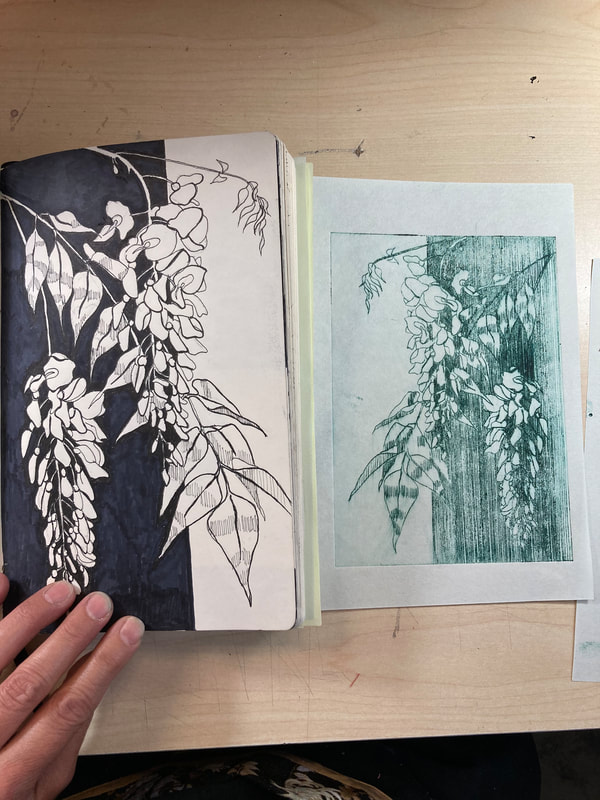
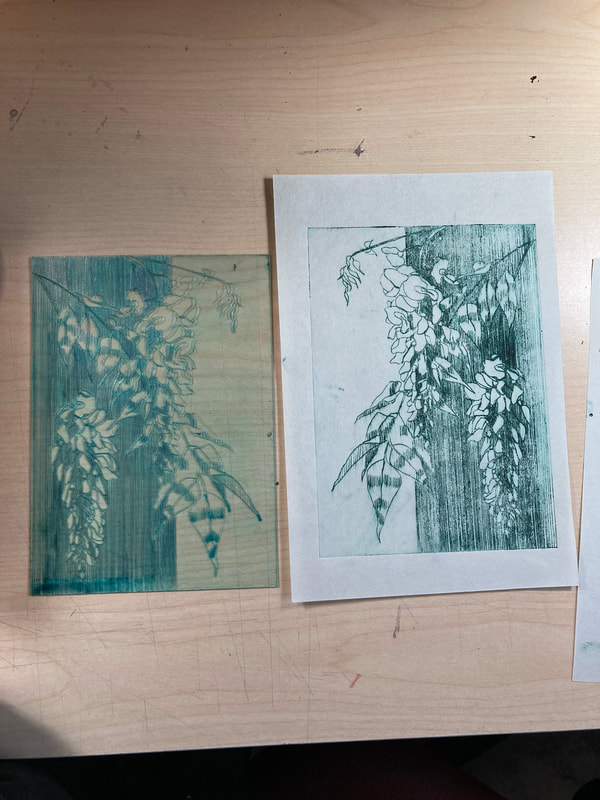
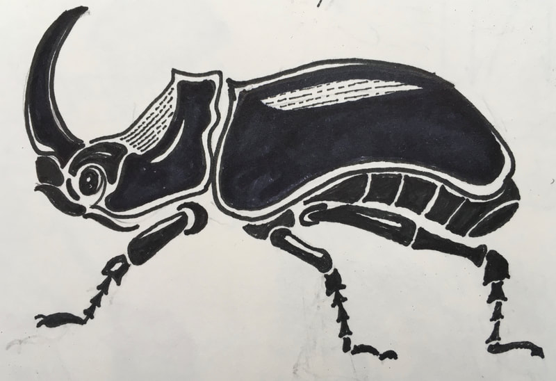
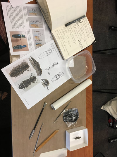
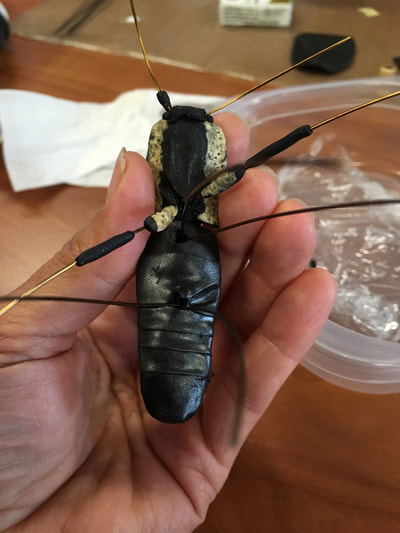
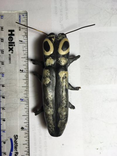
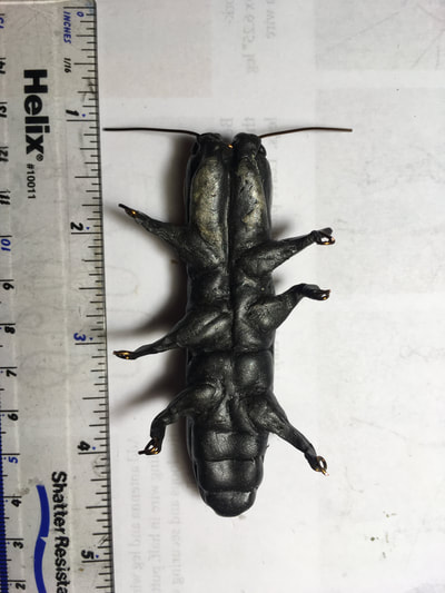
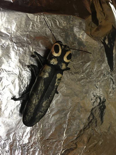
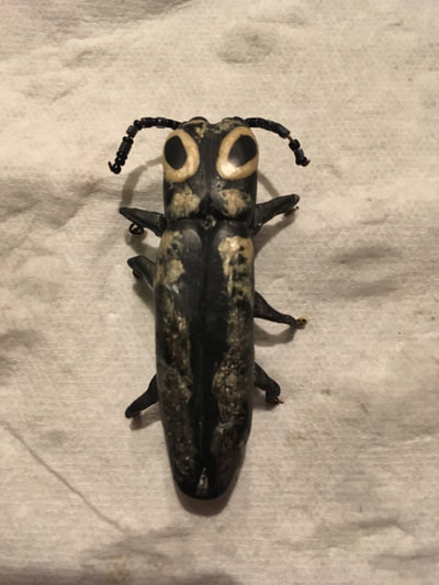
The beetle and the flowers began with ink sketches from my annual Inktober endeavor. I have been enjoying trying different colors and am currently in the process of reworking the values for the flowers in the plate.
The beetle and the flowers began with ink sketches from my annual Inktober endeavor. I have been enjoying trying different colors and am currently in the process of reworking the values for the flowers in the plate.
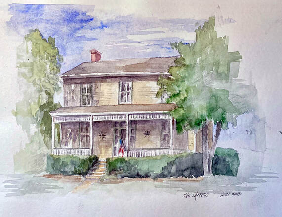
House Portrait in Watercolor
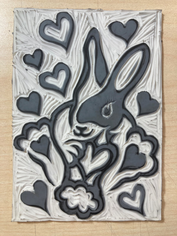
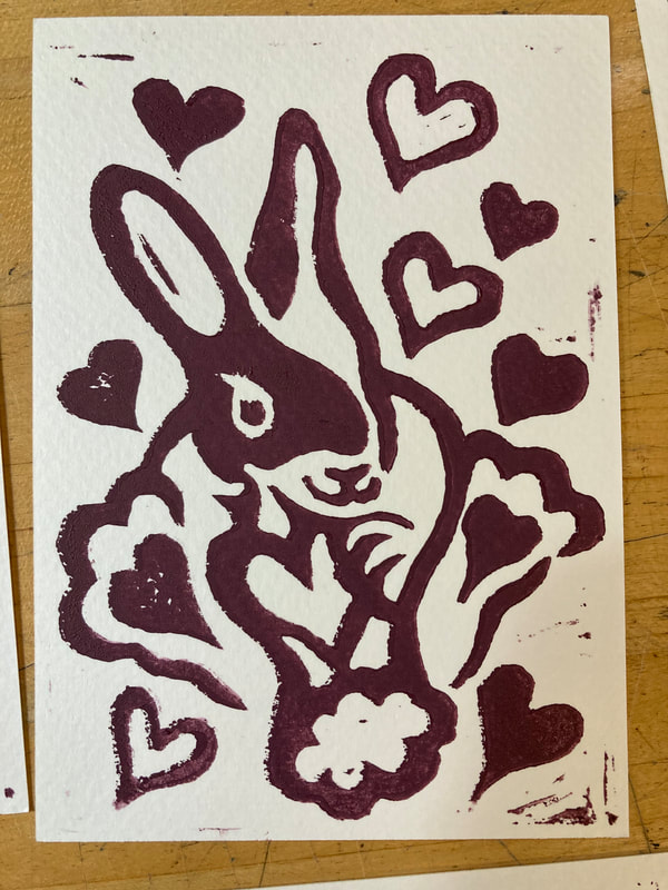
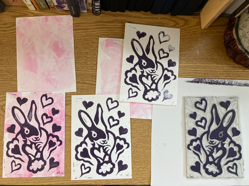
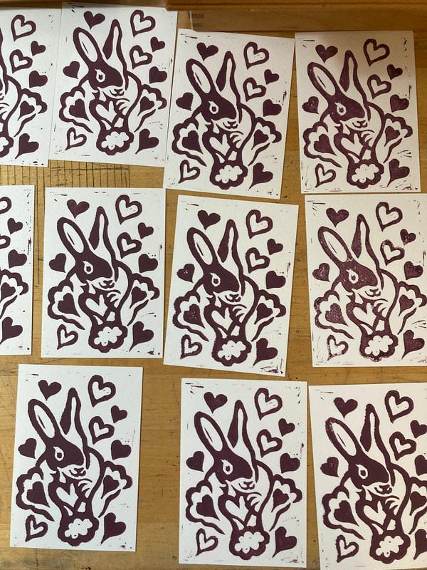
Lino Block Valentine Bonanza! completed: 1/29/21
Participating in three Valentine Exchanges certainly got the creative juices flowing and warmer up the winter months!
Woodblock Birds: as of 2/9/21
Chinese Painting Course
|
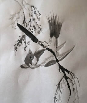
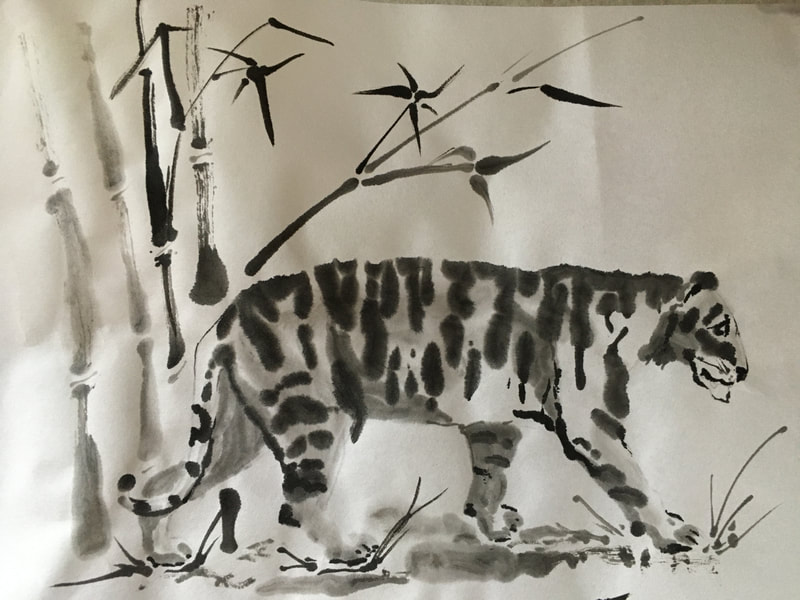
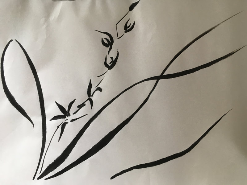
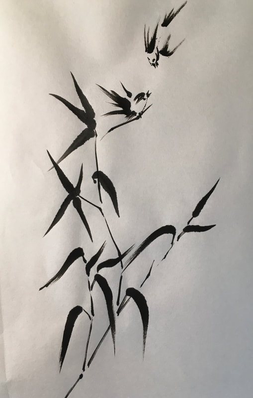
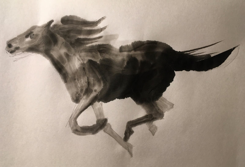
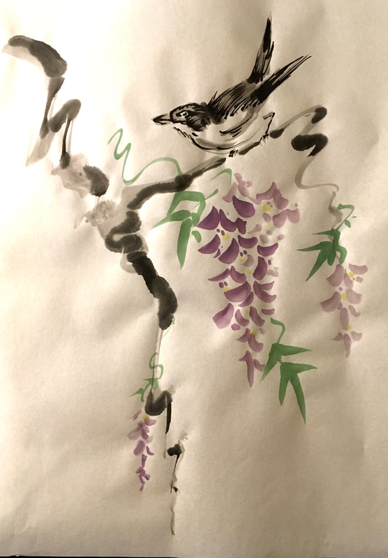
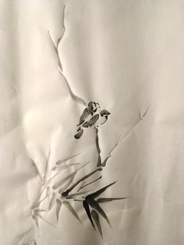
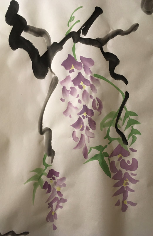
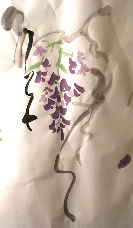
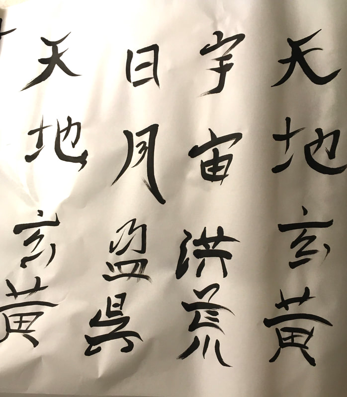
My most current adventure in online professional development has been a ten week course in Chinese Painting through the Art League based in Alexandria, VA. The course is team taught by an experienced calligrapher and a master painter. It has been exciting to after literally decades of saving a beautiful sumi-e brush set from one of my father's colleagues from Japan, to crack open the seals and put the brushes to use. So far, it has been one of the highlights of my week not only for what I am learning, but the pleasant company of my teachers and classmates. It's kind of fun too to have "art homework." I am so happy that I have taken this course because it has truly expanded how I look and use line and value, and consider the relationship between writing and painting. It has also made me much more deliberate about my entire artistic process. Below are my in class works and home works...all works in progress...like me!
|
Inktober 2020
Trying to do a drawing a day!
Pebbles Portrait
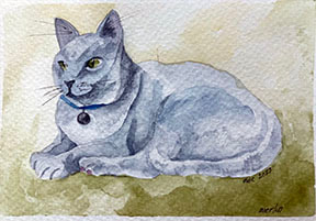
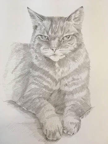
I don't usually do portraits, even of animals. But, I couldn't say no to my own Mom! Here is a pencil portrait of her cat. It was good to scrape some dust off my proportion and anatomy skills, but I have so much more to learn and practice!
Iguana Complete!
|
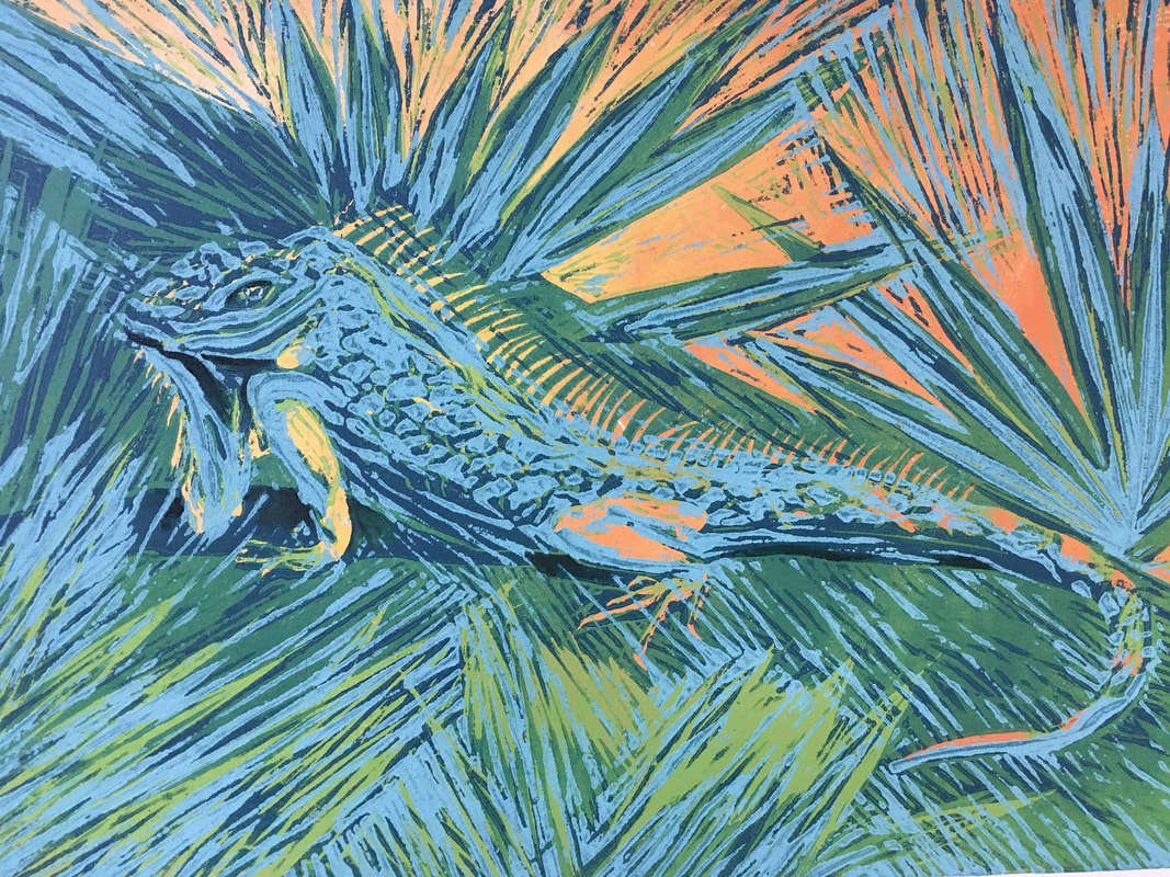
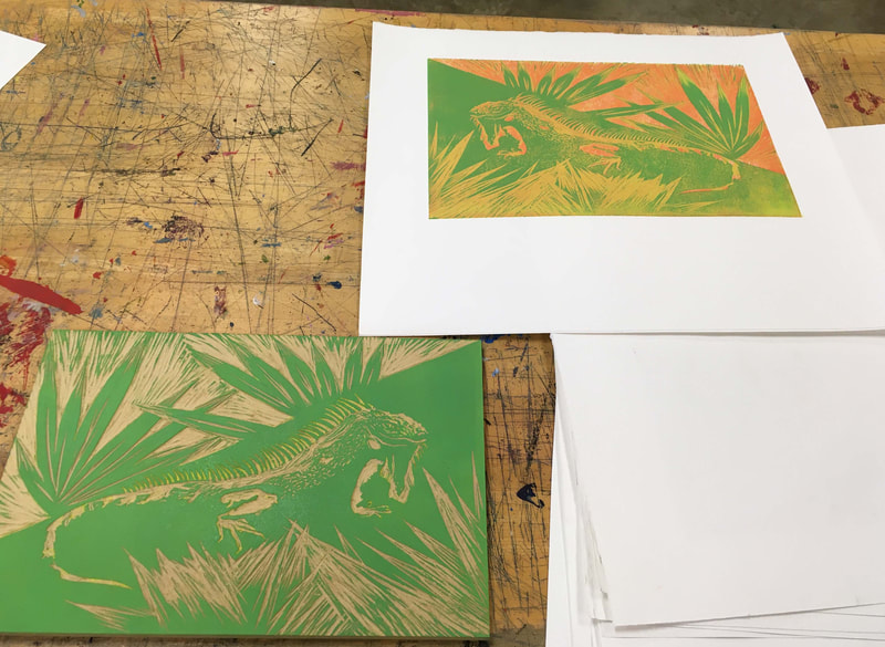
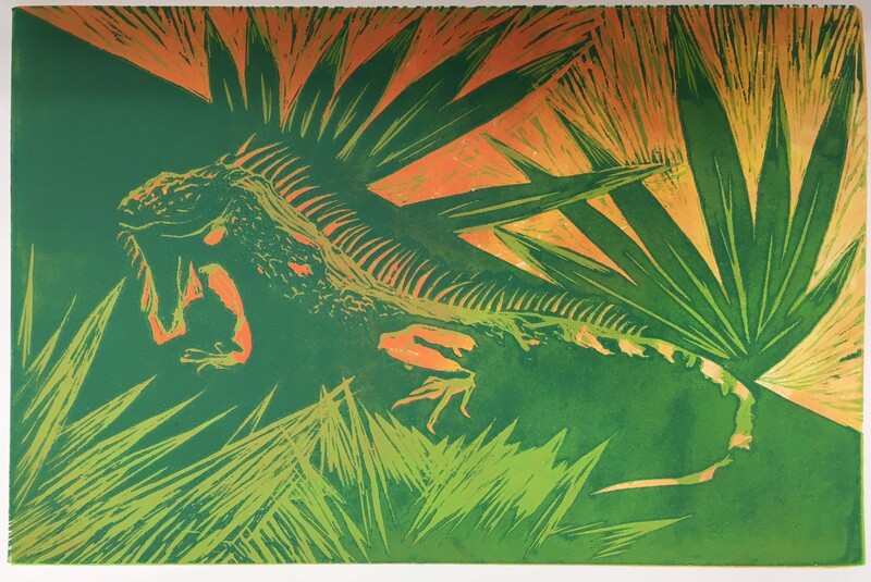
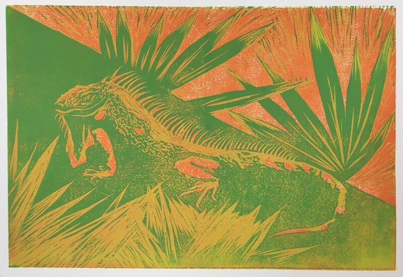
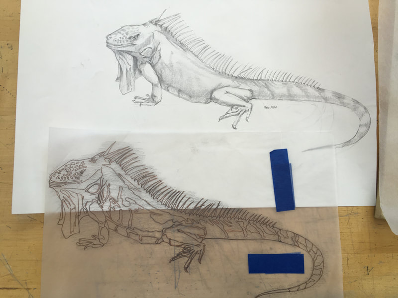
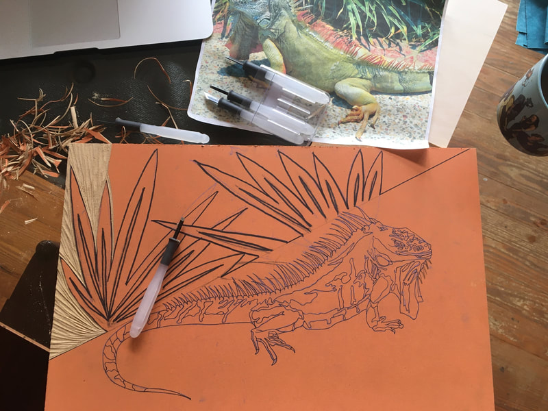
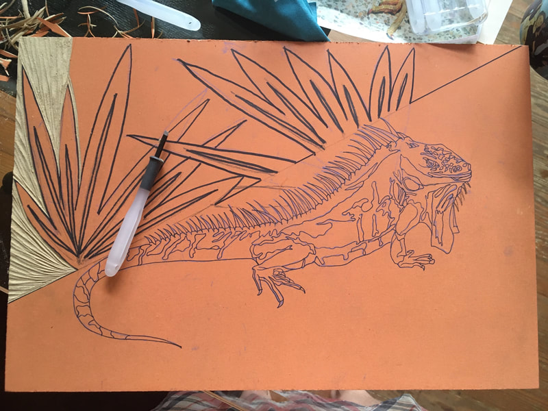
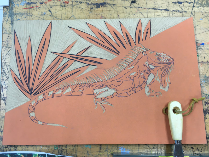
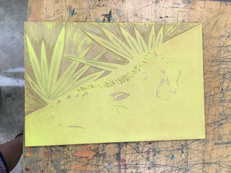
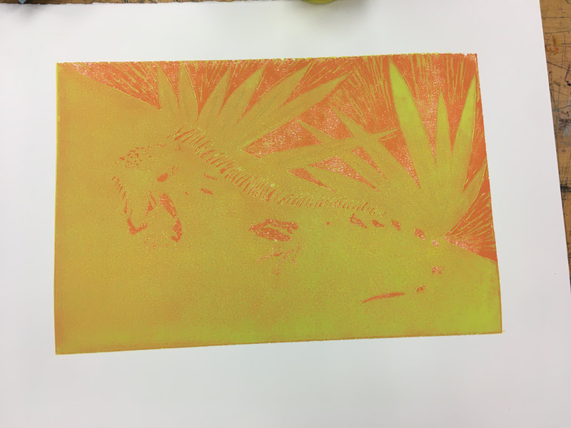
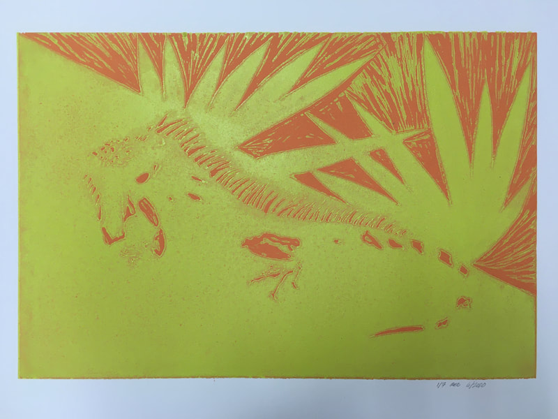
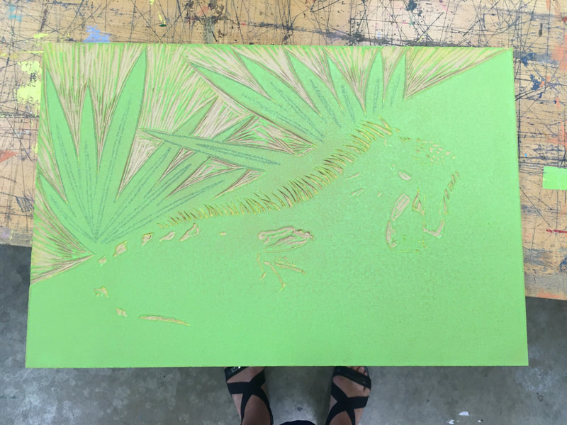
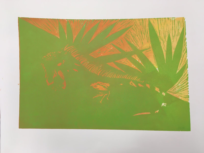
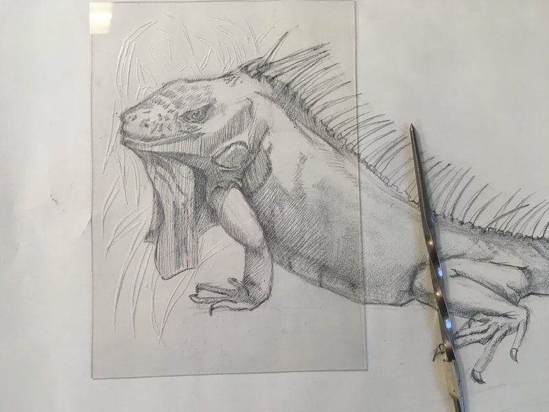
This work started as a demo sketch during my Spring full remote classes. Later the drawing became the basis for a five color wood block reduction print with monotype highlights and additional dark values. There are 14 prints in all. This is my favorite. I learned great deal about controlling chatter and the layering of colors and values. This was the first time I used this technique without planning it out ahead of time. It was fun, but scary because of the amount of time and effort invested in each layer.
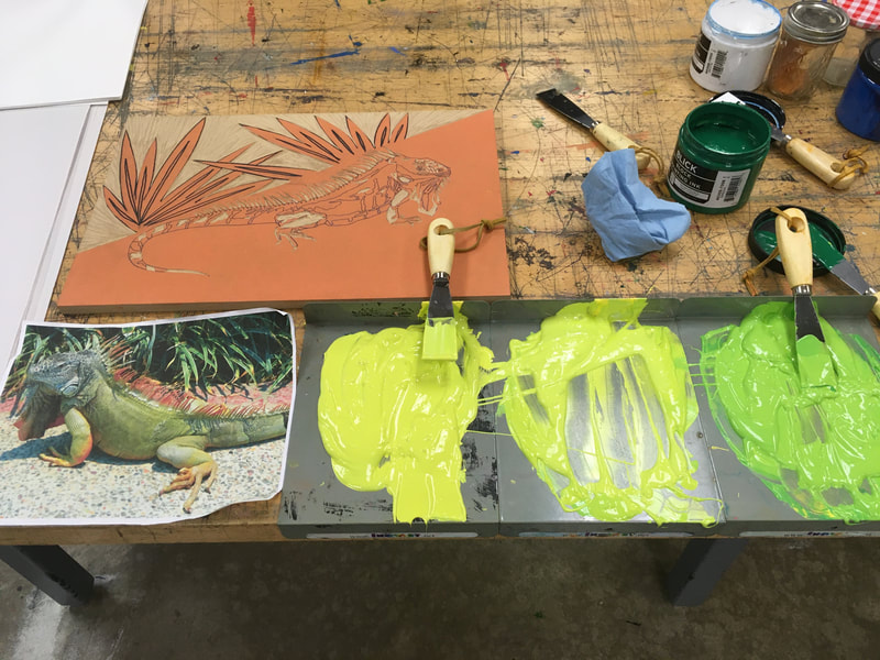
The inks are Dick Blick water soluble block print inks which had some challenges because of the fast drying time. The benefit is the easy cleanup. Looking forward to framing this guy! |
Summer Works Beginning to Wrap Up
Bookbinding Workshop: Exposed Stitch Binding with Mokuhanga Prints on St. Armand (cover), Rives BFKText pages) and various Japanese Papers (as dividers).
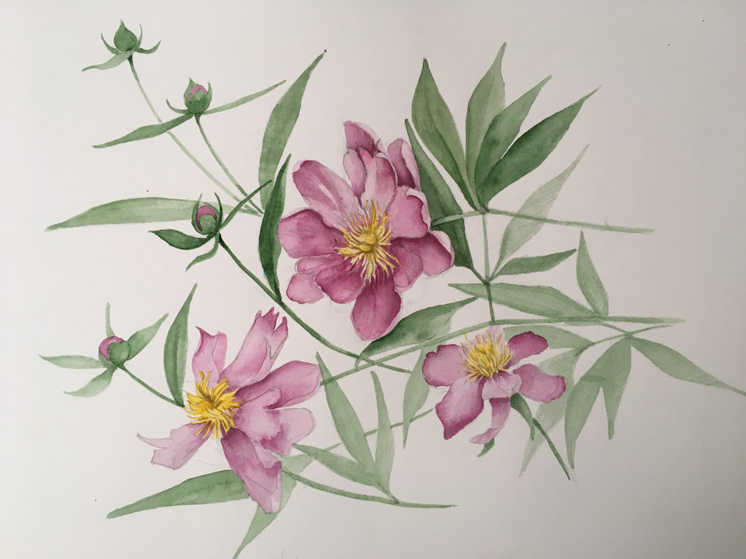
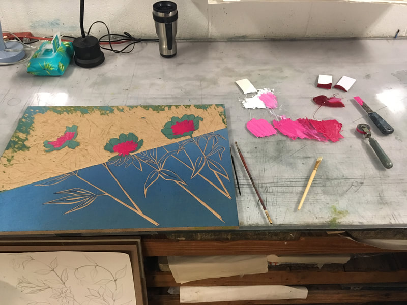
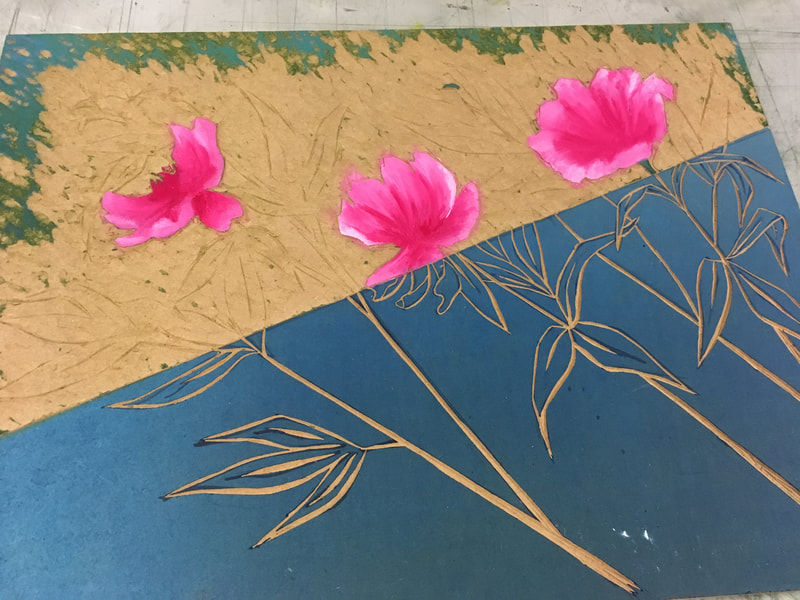
Color for the Peonies
Another Layer of Carving and Color for the Iguana
Summer Grasses: Woodblock Print
Summer Projects
|
I love summer! Well, let me qualify that statement. I'm not a fan of the humid heat waves of the Mid-Atlantic States, but I am a fan of the expanse of time to think, see, reflect, and engage in creative play. Yes, play. As a lifelong Trekkie, (classic Star Trek, meaning the kitchy 60's original series) I am fond of joking that all the philosophy I really ever needed to know to navigate life I learned watching Captain Kirk and Crew adventure through the galaxy. Although I'm being tongue in cheek when I say that, I did in fact learn quite a bit from the ground breaking series (you Knew I was going to point that out didn't you?). A series which is credited with the first culturally and racial inclusive cast, interracial kiss, and despite many goofy scenes (recall Captain Kirk wrestling the Lizard Commander on the dessert planet) and some now weird and awkward gender issues (consider the uniforms and Captain Kirk's, ah, er...expertise at finding a girlfriend on nearly every planet in the galaxy...now that's having the "kavorka" to quote Seinfeld!) it introduced many complex issues and questions into my grade school mind such as: How does one treat others with true dignity and respect? How can I honor cultures I don't understand? How do I confront my own fear and prejudice? Not bad, for a low budget tv sci-fi show that had only three seasons.
|
Coming from a seriously strong work ethic family, I was delighted to learn during episode 15 of the first season of Star Trek entitled "Shore Leave" that play was only a necessity not only for children but, for everyone. It's nice to know that the writers of Star Trek read the 16th century French philosopher Montaigne, as well as the founder of psychoanalysis, Sigmund Freud. Not only has science found that play releases endorphins which not only makes us feel good, but many studies have shown that play actually helps us heal and function better physically, emotionally, and provides us with an overall long lasting sense of hope and well-being. I would also like to add that in this hyper-achievement based and materialistic culture play is a safe place to fail and a place in which delight can be found quite inexpensively. Think now of the trends in "forest bathing" and the sheer popularity of walking/hiking groups as well as the uptick in nature journaling. It seems a good pair of walking shoes, a pad of paper and a pencil can pave the road to better health and well being. This is not to mention simply enjoying the company of others or even the quiet of you own mind.
So as with most of my summers, I've been walking, sketching, biking, reading. But, due to the pandemic I've been keeping all that closer to home. I have also been enjoying keeping in touch with others by making and sending cards. I have been able to have some access to the new printing press at my school. This has been a great opportunity for me to try different printing techniques and design lessons that have as much of the frustration factor removed for my students as possible. As I said, play is a safe place, nobody is watching and nobody cares, not even me, if every print doesn't come out perfect and it gives me the fun opportunity to ask why? and what if? Which I think is the best part of all when playing!
Below are my current works in progress. I hope you enjoy looking at them as much as I have enjoyed making them so far!
The Iguana!
So prior to three months ago I knew next to nothing about iguana. Reptiles and amphibians just have never been a real interest to me before. My adventure with the iguana began while I was teaching remotely and developing a new lesson plan : "How to Draw and Paint Your Dragon" for my drawing and painting students. First, we learned about bird anatomy and then drew birds together. Second, I thought it would be interesting to draw a lizard. So I looked at hundreds of images of different lizards and was intrigued by the color and form, (reminiscent of dinosaurs) of the iguana. One of the few creatures on this planet that seems to look both comic and ferocious at the same time. My students delighted in informing me that there are iguanas in Florida. A fact that still excites me: to think such a fun creature inhabits the Continental US! As adults we are so seldom truly surprised, it's fun to have that sense of wonder and discovery sometimes! And it reminds me that this is what I aspire bring to my students as often as possible. So what started as a class demo has now taken on a life of its own!
Below are a series of images describing the beginning process of taking the original sketch and turning it into a woodblock reduction print. This has been a terrific opportunity for me to become accustom to using the school's new printing press as well as water soluble inks for woodblock. What you see have are Dick Blick brand. Since I work with young people, using water soluble inks is much simpler and just makes sense. However, I am finding that they behave slightly differently. Chiefly, they dry much faster and it is important to keep the process moving as you can end up with a "sticky" printing block. I am also learning about which types of brayers work best.
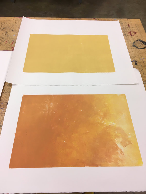
If you look carefully you will notice I experimented with two kinds of backgrounds and two different colors for the first layer. Although there are 14 prints in all there are two sets: 7 with yellow/green on orange and 7 prints with lime green on a variegated orange-white background. Right now, I'm preferring the latter. But, I'm excited to see how they all turn out. Right now, I'm really not sure as to how many colors (printings) I will be doing as this is the first time I've done a reduction print without a color sketch to guide me. I'm just using photo references and trying to use my sense of color as I go along (which maybe a good thing or not!) as guides. Funny enough, I'm enjoying the "not knowing."
The Iguana Strikes Again!
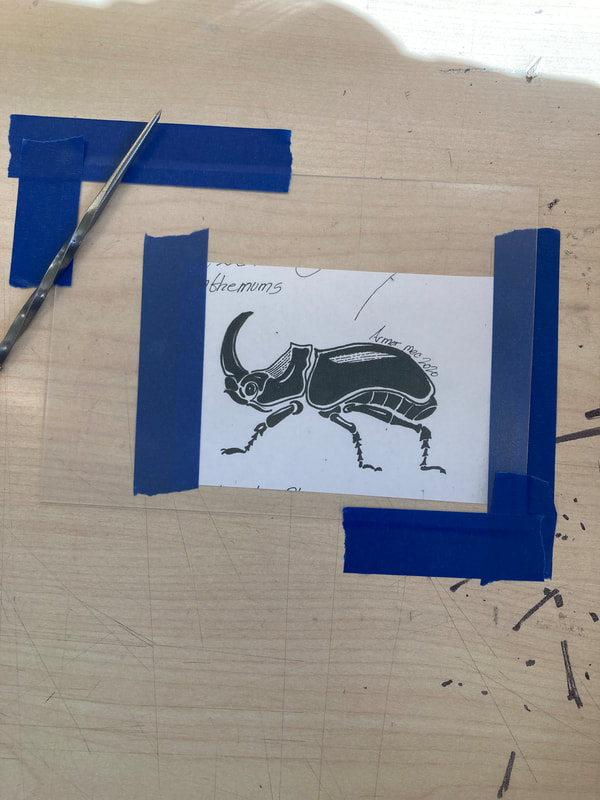
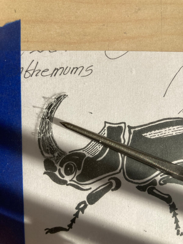
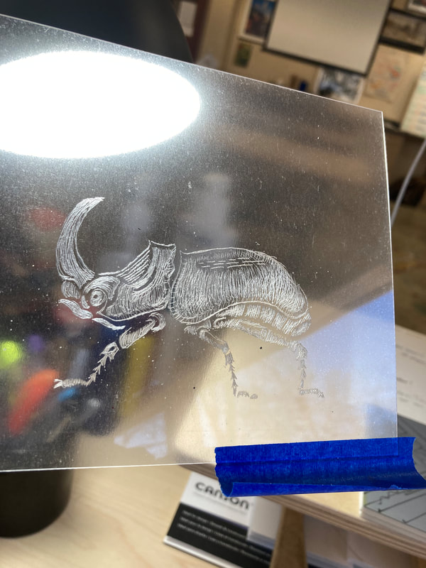
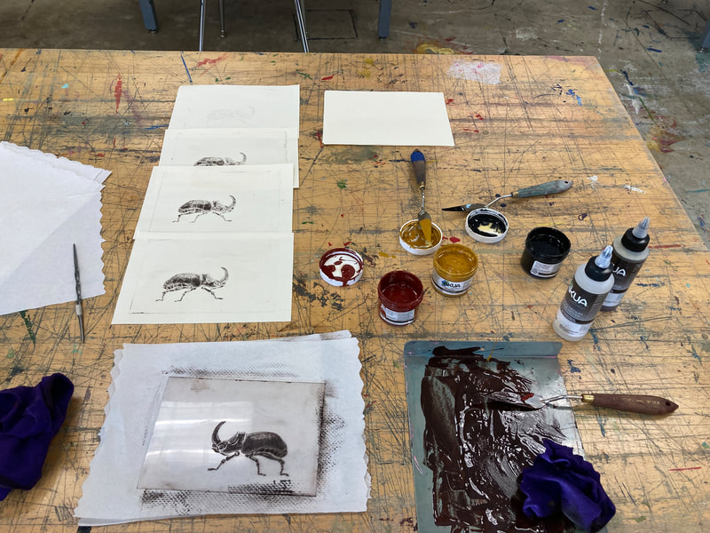
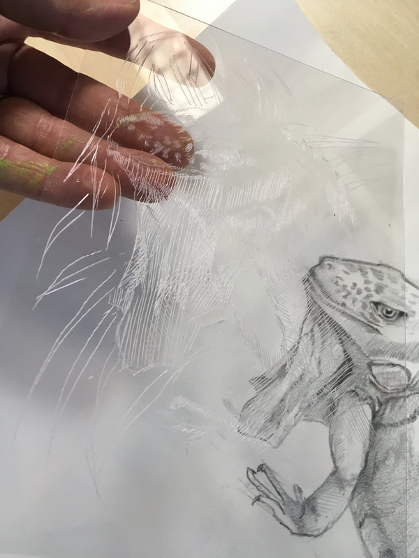
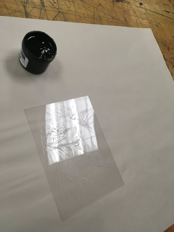
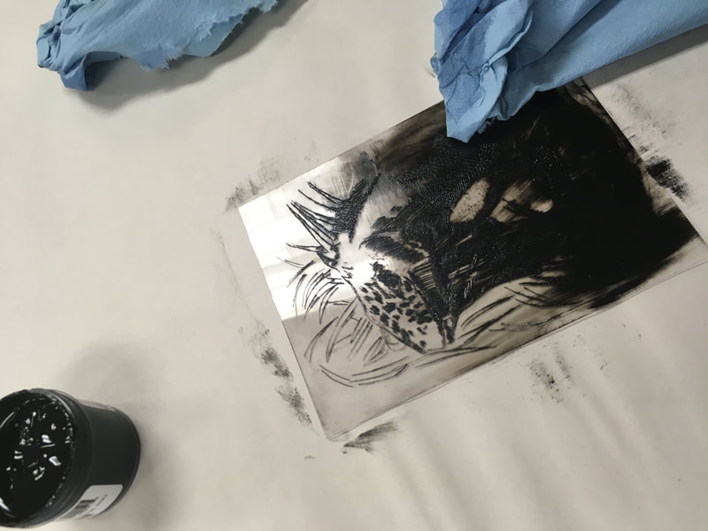
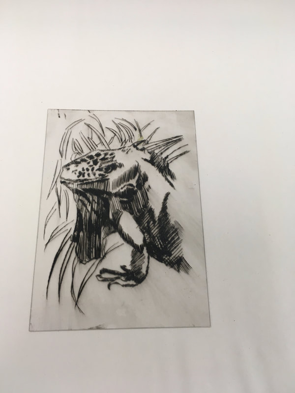
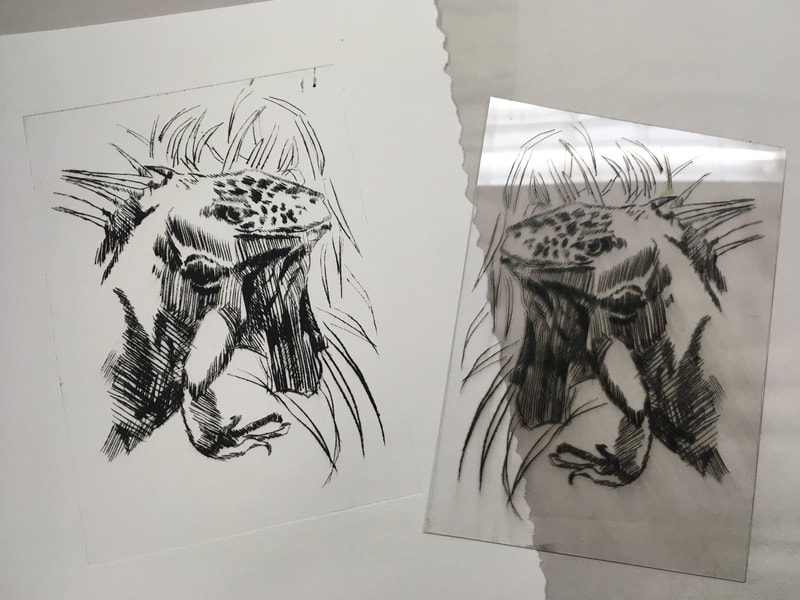
I was taking a break in the school studio and my eye fell on some acrylic sheets that I ordered last year for a dry point etching project with my students. Unfortunately, due to our hiatus from the studio we never got to try it out together. This seemed like the perfect time to tryout this technique that I learned about last summer while working at the Art League. It also was the chance to practice my skills at changing the settings on the press to accommodate a much thinner printing plate. So I grabbed a sheet of acrylic, and a jar of Akua brand water-based printing ink, a stylus, and the nearest drawing which happened to be my now old friend the iguana. Here's what happened below. I am super excited to try more. By the way, I did make sure the paper (Rives) was slightly damp and it made for remarkably sharp prints. I am super excited to share this with my students, it was fast, easy, and the results much better than I imagined!
Last, but not Least...one more woodblock print
|
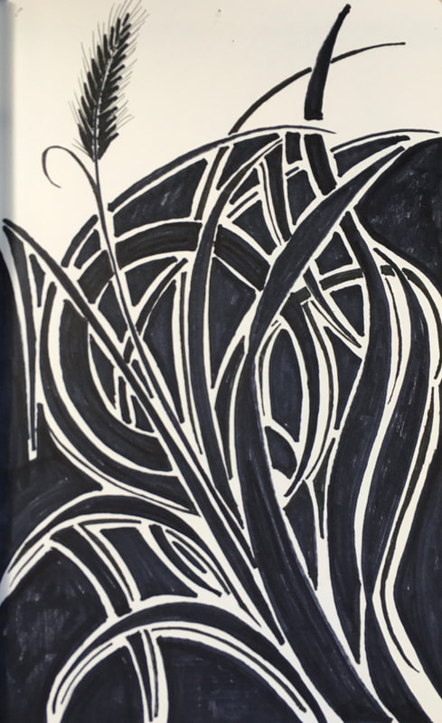
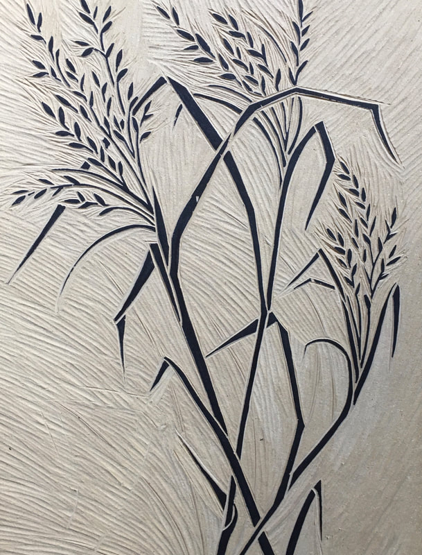
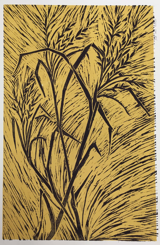
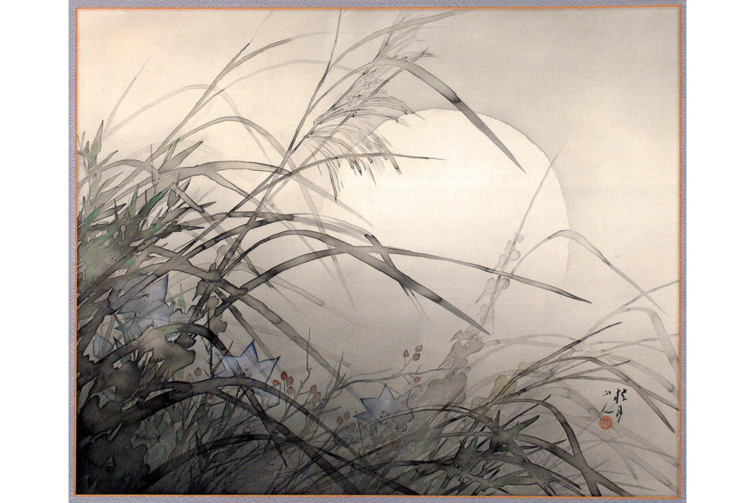
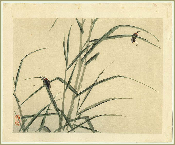
I guess all artist have weird little obsessions. Mine is summer grasses. I love their graceful line, their delicate seed heads, and their graceful movement. They often appear, without my really even thinking about it in many of my works. Sometime ago I ran across these small paintings to the left. There are works I think that every artist sees from time to time that fill you with a sigh and longing hope that is more like a prayer: maybe one day perhaps I could make a work as lovely. That is how these two works make me feel.
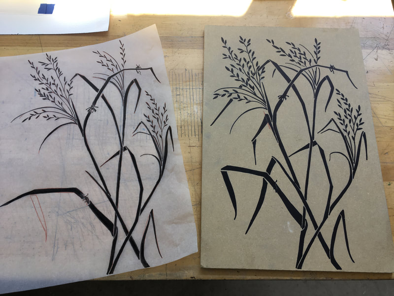
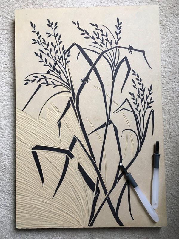
So one morning walk I sketched and took pictures of some grasses. That sketch became the preparatory drawing for yet another block print. I truly loved the little fireflies, but the MDP board was giving me trouble with getting that kind of detail. So I decided to leave a void where some the fireflies will go. I am thinking that I will carve several different fire flies, each on individual blocks and then print them in different places. So same background (which is still to be determined) and same grasses (colors still to be determined too) and then adding the fireflies. Kind of a woodblock monotype-ish technique. Remember I'm just playing around so, I'll see what happens. If you want to see too, please check back soon and thank you for reading! |
Zoom Bookbinding
|
One of the best things about quarantine has been the increased opportunities for on-line learning. As a new member of the Delaware Valley Chapter of the Guild of Book Workers, I was excited to learn more about both traditional and less traditional book structures through two on line workshops for members. The first workshop in long stitch was taught by Rosae Reeder. The second by Tara O'Brien. Since I got into book binding because of my printmaking, I decided to repurpose an old unfinished painting on heavy watercolor paper as well as an extra block print for my new books. As I've mentioned before, making books is a terrific way to make use of extra prints. I learned a great deal about the relationship of the materials to the book structure as well as the importance of planning ahead for color coordination of materials and overall stability.
Of course , to true benefits of workshops are making connections with other like minded creative folks, learning from them, and sharing ideas. One of the wonderful new resources I was introduced to was the Artist's Book Collection at the University of Wisconsin Library. |
|
The other fantastic resource I learned about was the text Woven and Interlocking Book Structures by Clair Van Vliet and Elizabeth Steiner. Because of the great expense, both monetary and in human effort and craftsmanship in producing this text, it is available on line at the link below. In the workshop with Tara O'Brien, we made Designating Duet (which I'm filing under "Bindings Never to be Made Again" ;-)Gioia (which I LOVED), and Aunt Sallie's Lament without and with flags. These structures challenged me aesthetically, technically, and in my perception of what a book could be. All in all it was three Saturday afternoons well spent!
|
Below is a short video showing all the books "in action" that I made in these workshops. I hope you enjoy seeing them!
Experiment with Collagraphy
There is an old adage that says, "Desperate times call for desperate measures." I can't say that moving my Printmaking and Typography class on line was a desperate situation. My students after all had taken their supplies home. But, I will say that remote learning has caused me to work out some creative muscles over the past eight weeks. I think it's interesting too that most professional physical trainers will tell you that it takes about eight weeks of a regular exercise and diet routine to begin to see results. Today was the day I saw some unexpected and happy results.
|
A wonderfully creative colleague of mine introduced me to some fun, incredibly simple printmaking techniques using only cardboard, and hot glue earlier this year. So, when I ran across the chapter on the Collograph in Ann D'Achy Hughes and Hebe Vernon-Morris's The Printmaking Bible (which by the way for contemporary printing techniques and examples it Is The Printmaking Bible) I was super excited to try. The chapter opening image was by the British artist Carolyn Trant. (seen to the left here) One quick Google search and I was instantly a Fan Girl!
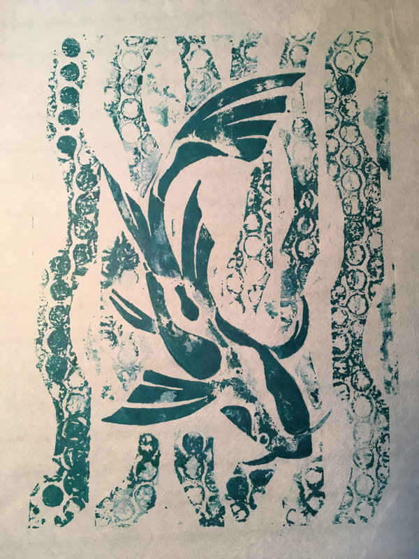
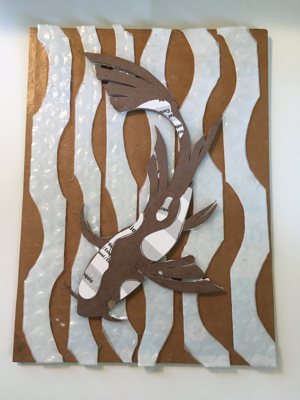
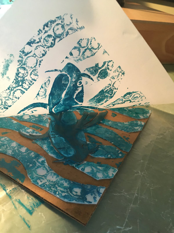
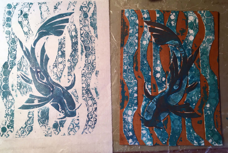
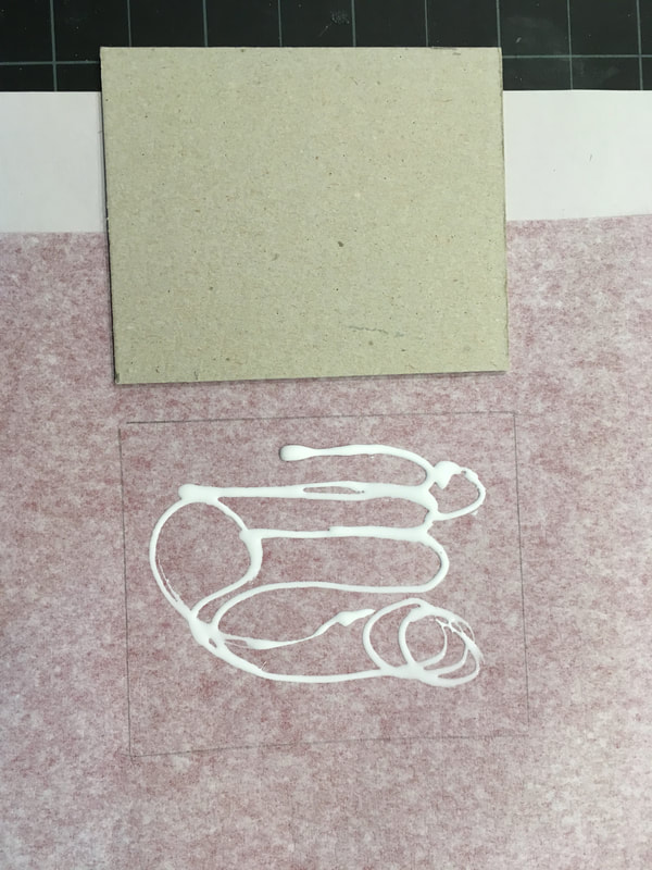
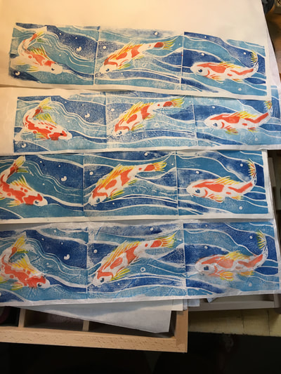
As our final project for the year I wanted to try something new. I told the students this was my first time for this project and thankfully they seemed undaunted. The great thing was no household was at a lack of potential printing materials. With the onslaught of on line shopping, everyone has more cardboard, packing materials, and bubble wrap than they know what to do with. And who doesn't love making art from recycled materials? To start with, you might have already guessed that the Collagraphy is a more contemporary, actually 20th century, printmaking technique. The name comes from the Greek, "colla" meaning "to glue." Think of it as a printable collage where you take advantage of different materials for their textures and thicknesses in order to create, that is glue together, an intaglio plate. |
|
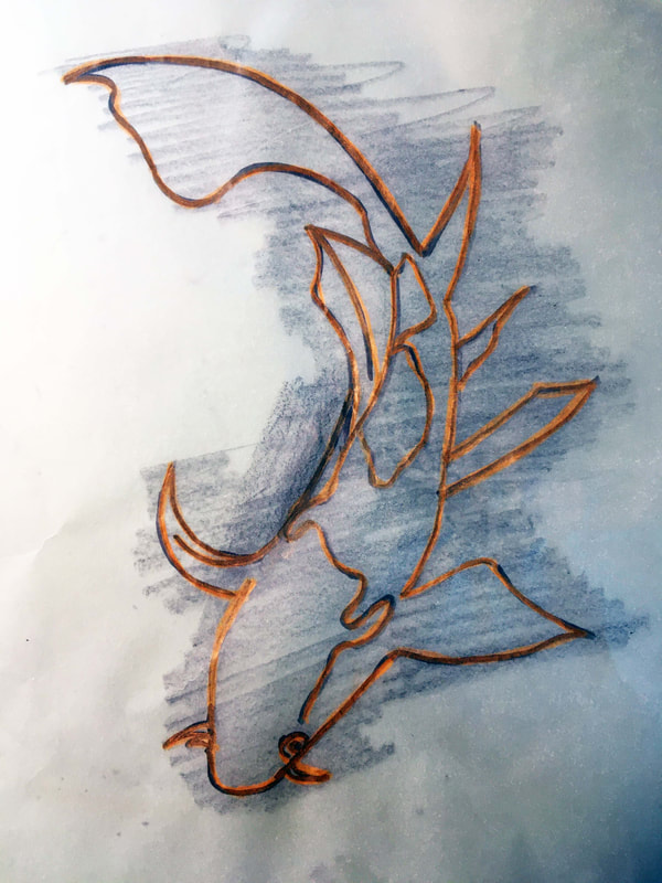
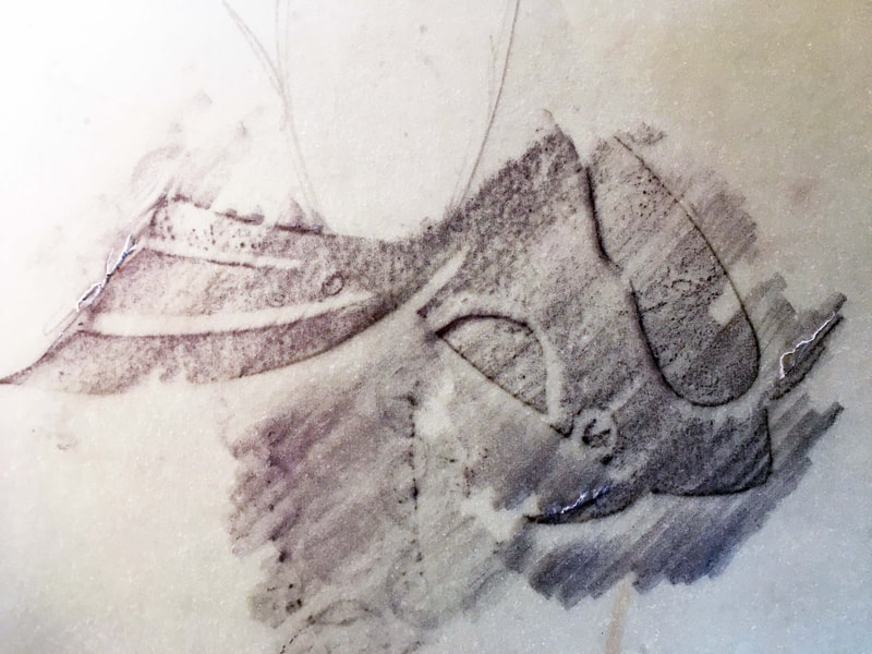
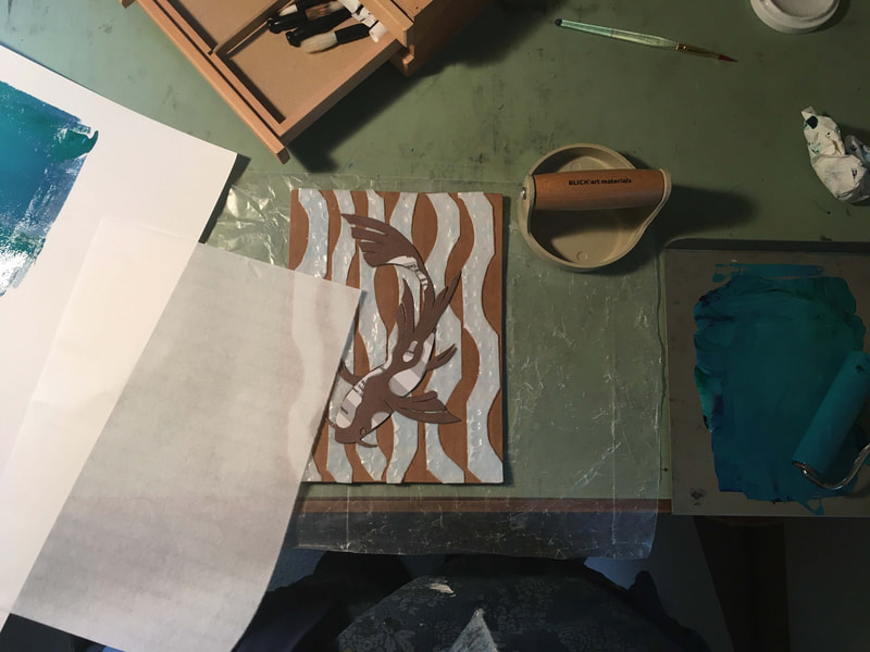
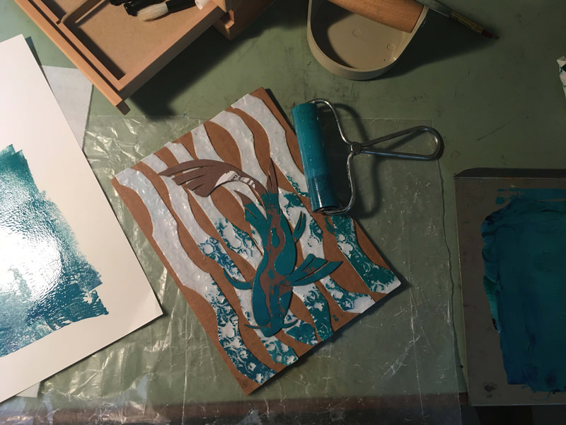
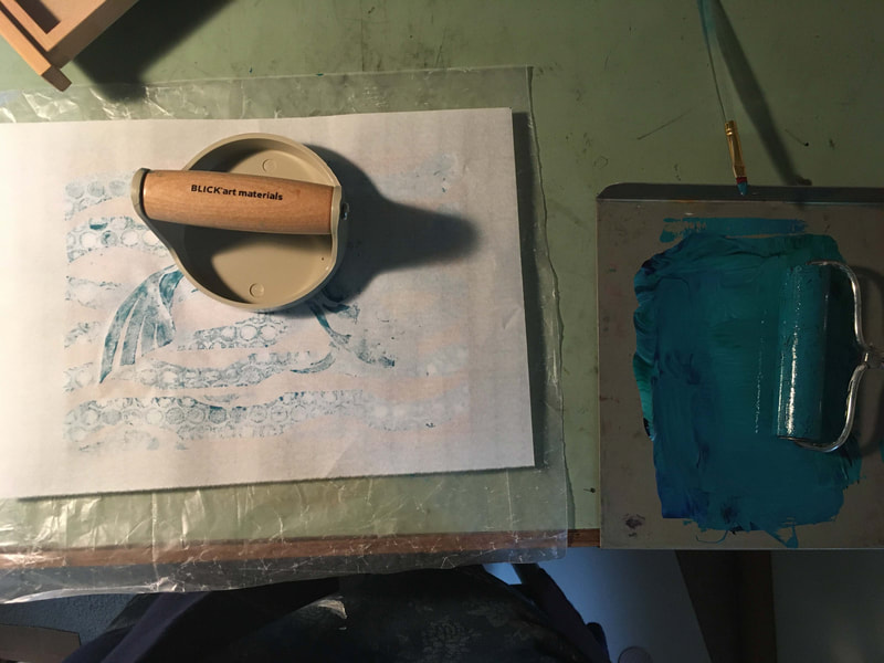
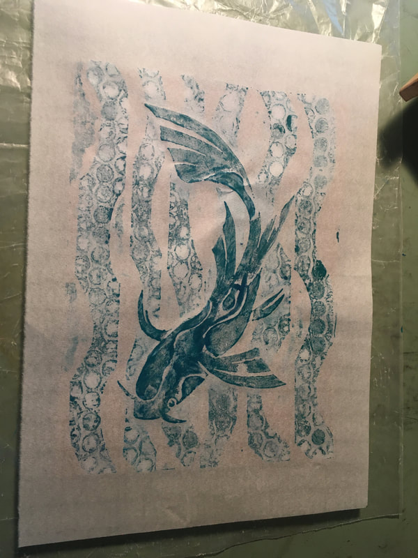
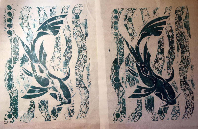
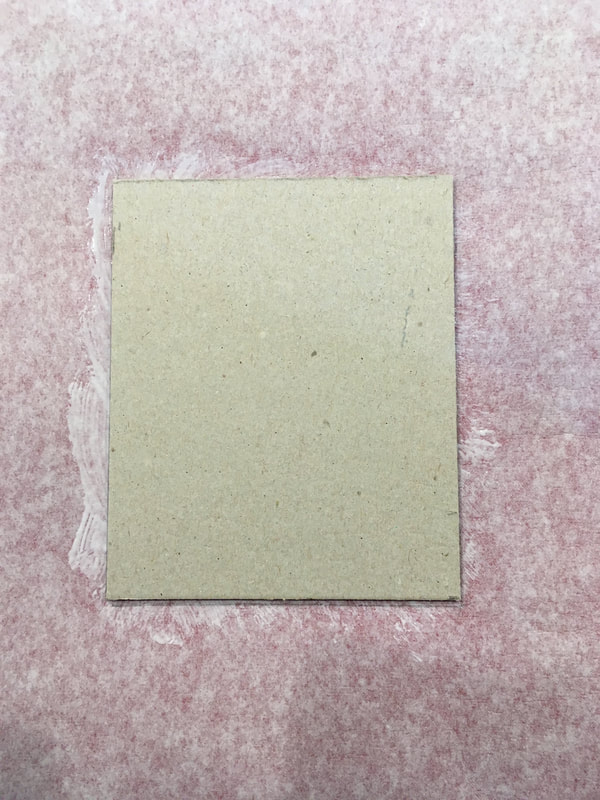
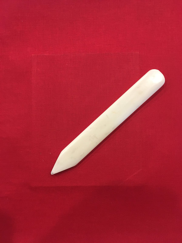
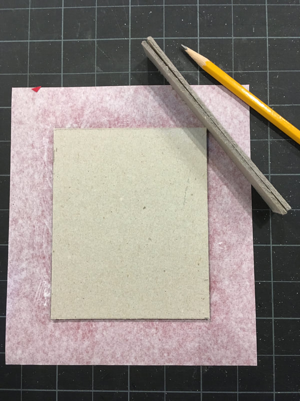
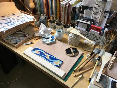
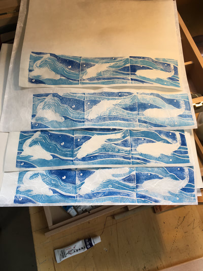
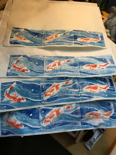
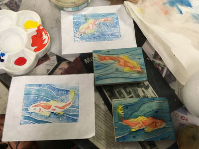
Now had we been in the studio, we could have made more durable, value subtle, and possibly more intricate plates using plexiglass and carborundum grit. But, since I'm a high school teacher, I tend to lean toward processes that are simpler and don't involve potential messes on a grand scale. So the process you see below is my class demo printing plate. It is composed of all salvaged materials (packing materials and the back and cover of a tracing paper pad). First, I found a sturdy piece of corrugated cardboard as my printing plate foundation. Then, I created a simple drawing. My defaults are usually birds or fishes, this time I went with a Koi. Then, I transferred the drawing on to cardboard. As I created the composition elements, I played with different textures, and thicknesses of elements. Occasionally, I would create partial "rubbings" of my assemblages to test how the materials were reading. Once I got to a composition and arrangement of materials I found pleasing I glued everything to the corrugated cardboard using white glue. I placed the now assembled plate between some waxed paper and let it dry over night under a heavy weight just to be sure that the plate did not warp or buckle. Once it was dry I added a thin layer of slightly diluted white glue (PVA, aka Elmer's) over the entire plate being sure to allow the glue to fill any gaps between materials that I would not want the ink to enter, but being sure to keep it thin. Thankfully, the glue layer was thin enough that it did not warp the board and once thoroughly dry I was ready to print! For these prints, I used Akua brand water soluble intaglio inks on rice paper. The results are to the right and the process below.
|
I very quickly learned that it was possible and desirable to manipulate the ink on the plate with a brush and thereby creating monotypes. In fact, each one is in some way a monotype because the plate itself behaves differently due to the build up of ink and the glue surface becoming tacky. I was able to clean the plate and intend on giving it a second try, possibly introducing other colors into the fish, but it is clear that collograph plates have a short life expectancy and certainly are the stuff of limited editions!
Jacob's Ladder Book: Part 1
|
|
Several years ago a colleague made arrangements for the advanced art classes to visit the Decker Library's Book Arts Special Collection at the Maryland Institute and College of Art in Baltimore Maryland. It was truly inspiring to spend hours of delight and wonder exploring the ingenious creations of book artists. If you would like to learn more about this collection yourself. Check out the link below:
|
There was one book that truly captured my imagination: the Jacob's Ladder book. You may be wondering what is a Jacob's Ladder. Originally, the term comes from the Bible in chapter 28 of the Book of Genesis where the Hebrew patriarch, Jacob, dreams of a ladder extending between heaven and earth with angels ascending and descending upon it. In the nautical world, it is a ladder of rope with wooden rungs for accessing a ship up the side of the hull. A Jacob's Ladder is also a classic folk toy made typically of slim wooden blocks held together by strings or ribbons. When the ladder is held at one end, the blocks appear to cascade down the strings. This delightful visual illusion, which you can see in the video above, is the result of one block after another flipping over.
In my recent book binding adventures, I discovered a wonderful reference: Alisa Golden's Making Handmade Books 100+ Bindings, Structures and Forms. Here I found the template and instructions for making a Jacob's Ladder book. So I decided to try my hand at it. My hope is that this could be an introductory project sample to inspire my own students in designing and making their own artists' books. You can see my book above and below. I am excited about the possibilities within this project because not only does it provide the opportunity to discuss color palette, contrast, texture, line, and movement but it is a chance to consider text layout and point of view, all important aspects of printmaking. Since working with printmaking I was been experimenting with creating prints and incorporating them as part of a Jacob's Ladder book so stay tuned to see where that creative thread goes!
In my recent book binding adventures, I discovered a wonderful reference: Alisa Golden's Making Handmade Books 100+ Bindings, Structures and Forms. Here I found the template and instructions for making a Jacob's Ladder book. So I decided to try my hand at it. My hope is that this could be an introductory project sample to inspire my own students in designing and making their own artists' books. You can see my book above and below. I am excited about the possibilities within this project because not only does it provide the opportunity to discuss color palette, contrast, texture, line, and movement but it is a chance to consider text layout and point of view, all important aspects of printmaking. Since working with printmaking I was been experimenting with creating prints and incorporating them as part of a Jacob's Ladder book so stay tuned to see where that creative thread goes!
Book Binding Challenge: Rebinding
|
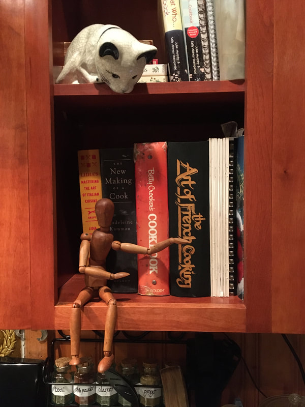
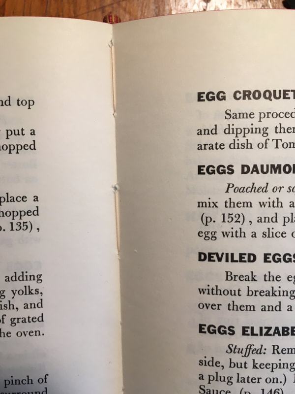
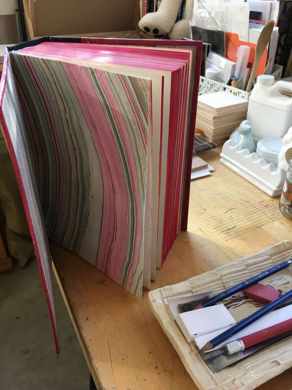
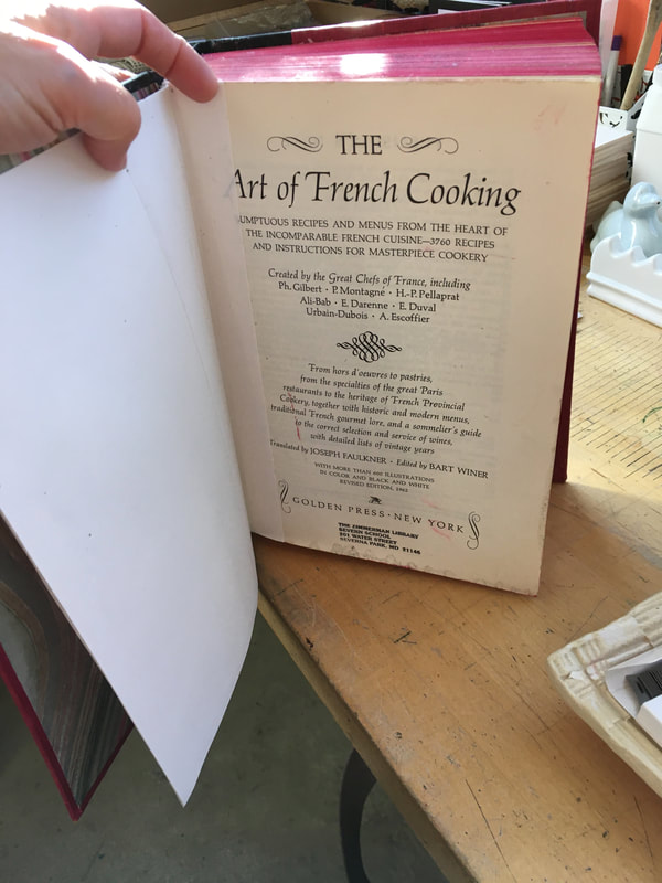
I don't think any one thing has taught me more about patience and precision than art of book binding. After spending the summer learning the fundamentals of the craft under the guidance of some amazing mentors, I've been spending the fall duplicating these efforts on my own. I wanted to do this in order to make sure I really "got it.'" While I was doing this, I had an opportunity to truly test my skills. I came across a lovely, old French cookbook. Sadly, the binding was worn and cracked from use. This book though was a real classic, and most definitely a keeper. It was a keeper not only because of the quality of its contents, but my son in recent years has developed a passion for cooking fine cuisine and fell in love with the book. I thought what a wonderful gift to give him: a new lease on life for a book he loves!
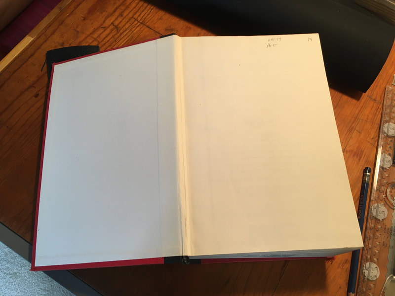
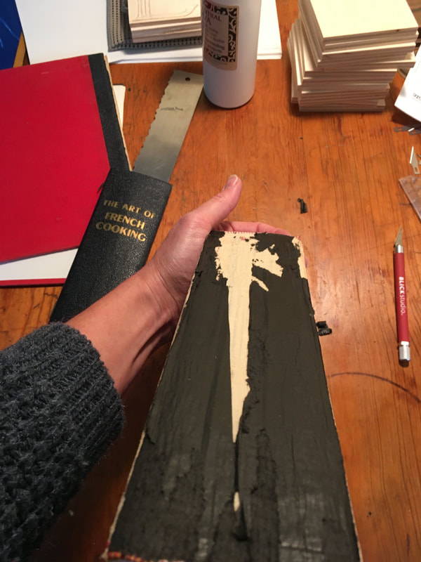
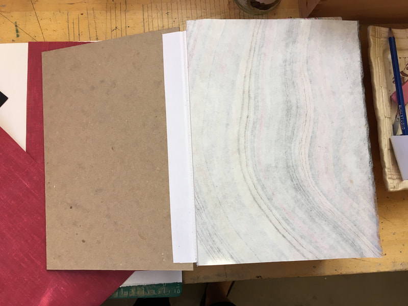
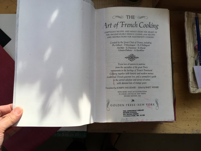
It was pretty nerve racking to strip the cover from the book and be left with just the text block. As a true bibliophile, I kept feeling like I was doing something wrong! But, I soldiered on. Below are pictures of the book as I found it after spending years neglected on a library book shelf. You can see that most of the damage was in the area of the spine of the book and that the text block was still intact and the stitching tight. So basically the project would be giving the book a new cover. |
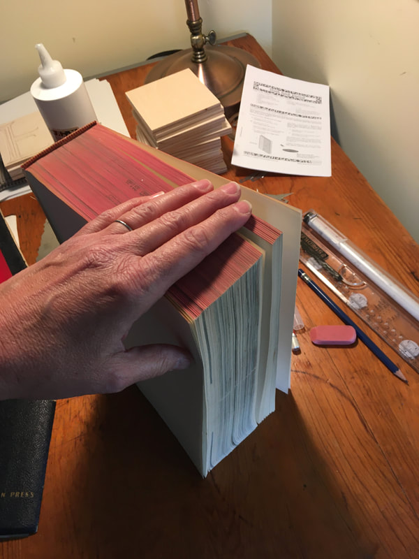
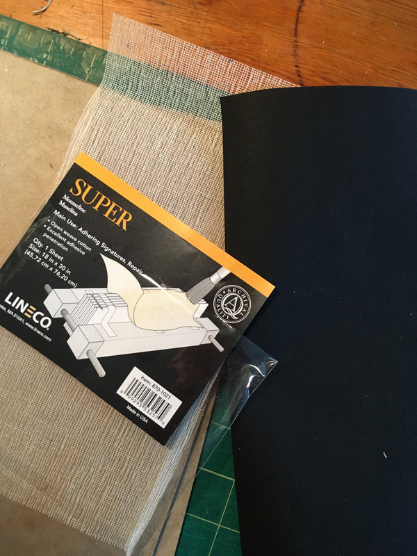
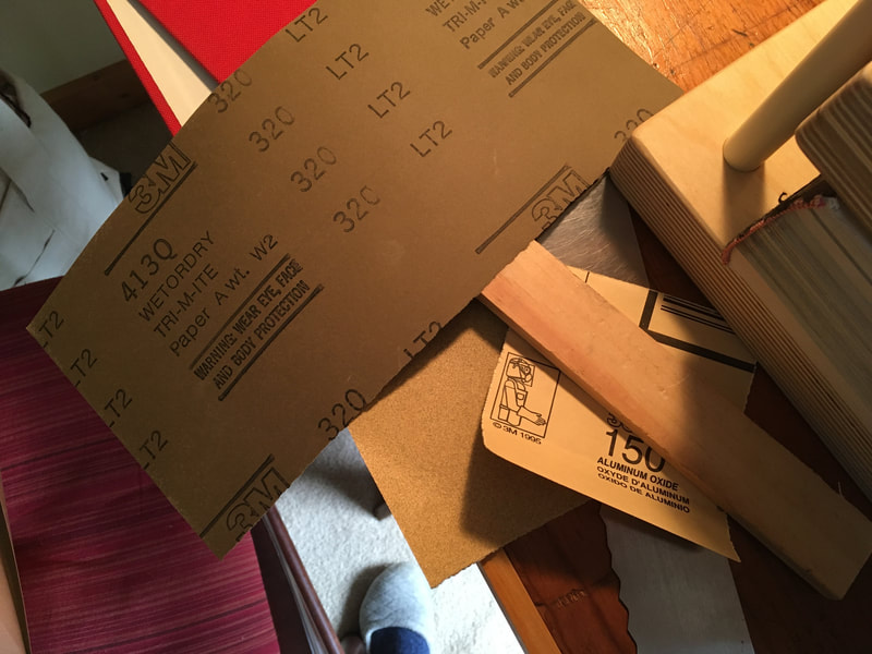
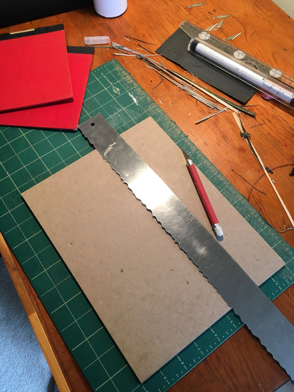
Once I had the text block free from the cover, I decided to give the book a few cosmetic improvements. This would include sanding away, to the best of my abilities, the library stamps on the edges as well as in the interior end papers and title page. For this I used from very light papers, 150-320 grit. I then decided to reinforce the text book at the spine by adding a strip of mousseline to the spine.
I wanted to recolor the text block edges but this called for some experimenting and for that I needed some guidance. So I turned to the text Bookbinding by Edith Diehl. I believe I have mentioned this text before here in my Works in Progress blog, but it is such a terrific resource it bears repeating. This book should be on every serious craftsman's reference shelf and is available in reprints from Dover. You can buy it (albeit rather expensive, but that seldom slows down the True Bibliophile) in the two volume hard back set, just be sure when you buy that you get the copy in the language you are most comfortable reading as it was translated into French and German and I have noticed that many booksellers on line do not prominently note which language their copy is in.
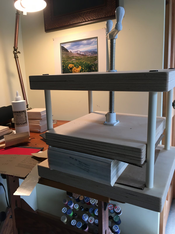
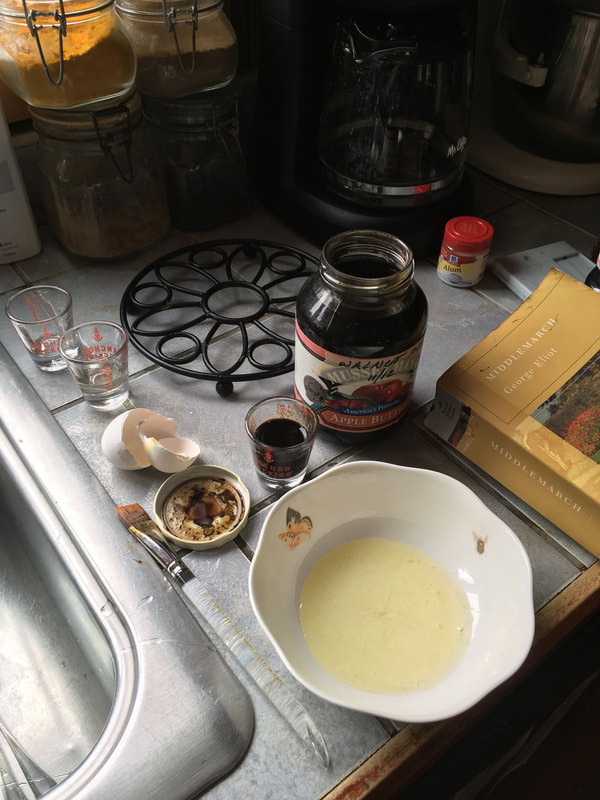
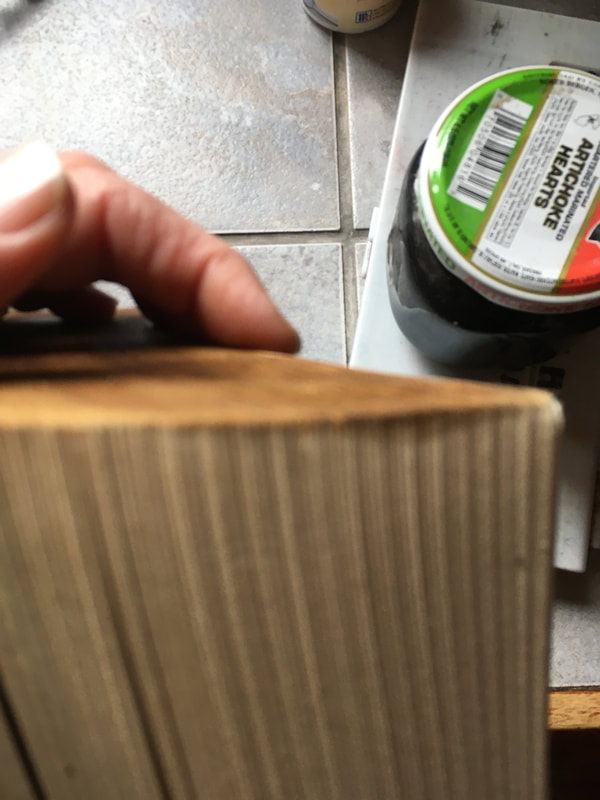
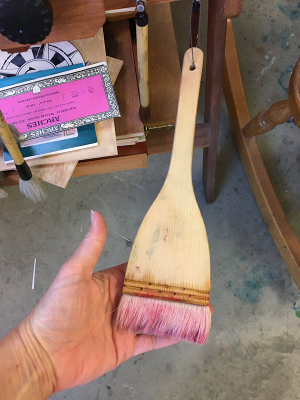
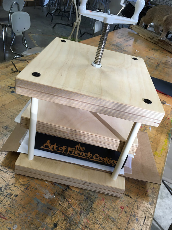
Applying color to the edges of the pages is tricky business I quickly learned so I was sure to have a "sacrificial" text: a paperback of Dickens's David Copperfield. Not my favorite Dickens and since I bought at a jumble sale for less than a dollar if something happened to it it would not be any great loss. Dielh advices that the edges of the pages be sized, dried and then the pigment applied using a brush that is at least as broad as the text block itself to prevent streaking. Basically, its a one shot deal when you apply the color, no pressure, ah yeah. During this entire phase my new book press was an indispensable tool. Not only does the press act as an excellent holder, but I quickly learned that any process that makes the paper damp means time in the press drying for all paper products.
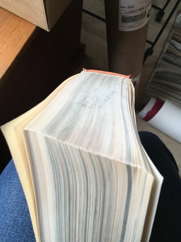
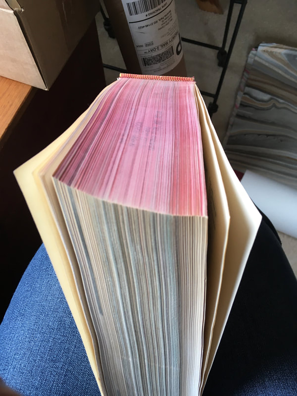
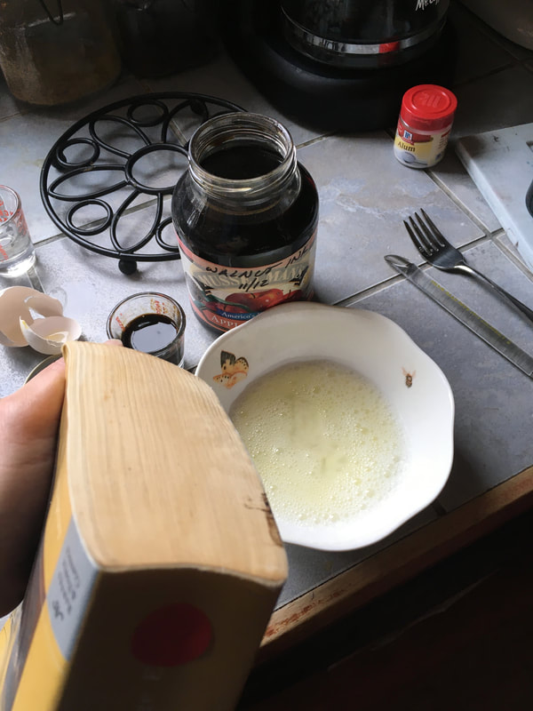
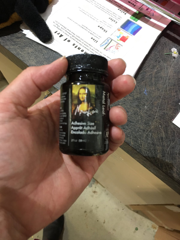
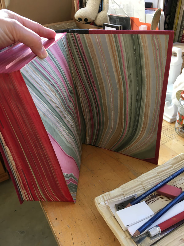
In considering the edge coloring, I tried various sizing agents, e.g. egg white, a solution of alum, and ultimately settled on the same kind of sizing (a dilution of PVA) use for gilding. You may notice from the pictures that originally I was working in a different color palette. At first I was planning a brown binding with bronze, umber and grey end pages with the page edges colored with black walnut ink. There were two problems: the first was that the back walnut ink was too good at coloring the pages, even with the sizing it would seep beyond the page edge to the page itself. The second problem was I discovered that the first cover I constructed I had neglected to take into account the additional thickness of the spine after being reinforced, the addition of end papers, and the addition of binder's linen tape to create an extra strong attachment between the cover and the text block (perfect for kitchen use). So unfortunately, the entire first cover assembly had to be scrapped.
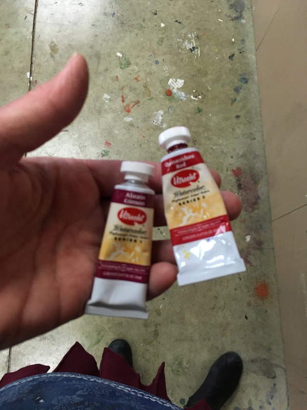
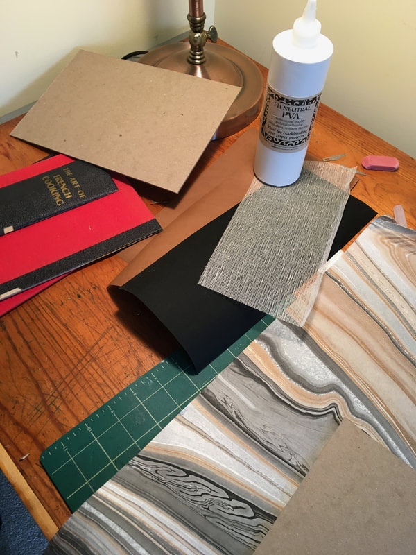
In the gallery below, you can see the progression of the final cover construction and its binding to the text block. I must admit it was frustrating to scrap the original cover assembly and have many failed experiments with coloring the page edges. But, as proof that things usually do work out for the best, I much prefer the alizarin color palette that I used in the end.
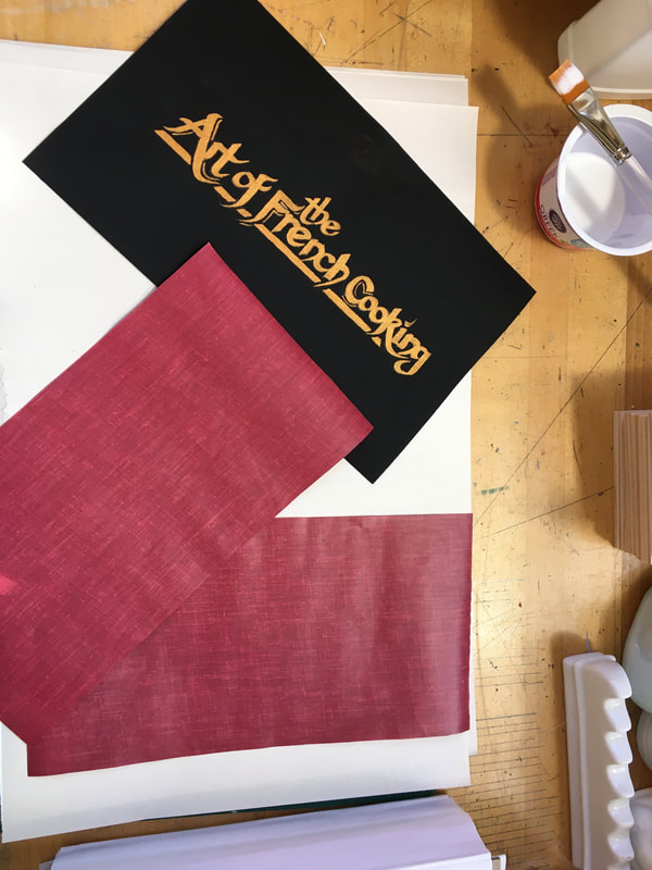
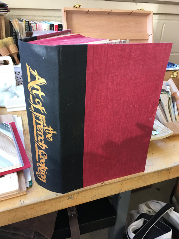
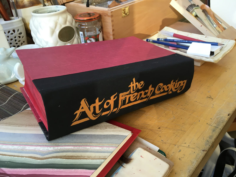
Probably my favorite part of the entire project was painting the title of the book on the spine. For this I used a gold acrylic paint, Jonson brand. This particular paint makes for a terrific faux gild effect, although the linen texture of the book cloth was at times a challenge to maintain neat edges for the lettering. A flat angle edged brush was helpful for that.
You can see the full rebound text in the gallery below. Overall, the entire project took me three or four weeks working on and off. I am so glad I did this, not only does the book have a new life, but I learned so much and in my research to help myself through this project I now have many more wonderful resources!
You can see the full rebound text in the gallery below. Overall, the entire project took me three or four weeks working on and off. I am so glad I did this, not only does the book have a new life, but I learned so much and in my research to help myself through this project I now have many more wonderful resources!
Just in Time for Fall:
Experiments in Black Walnut Ink
Throughout October I began every class with my high school art students with Inktober. For those of you not familiar with Inktober, it was begun by the illustrator Jake Parker. Posting a list of prompts, one for each day in the month of October, the intent is to inspire artists of all ages and ability to develop the habit of drawing each day. The focus is on ink as the medium, but there are really no hard and fast rules, only the hope that artists will share their daily work via social media (#Inktober) to inspire and be supportive of other artists in their practice. To learn more about Inktober click below:
|
Unfortunately, October is a busy month for teachers. Alas, my Inktober started well and finished with disappointed good intentions. That being said. Now that the dust has cleared with the falling of the autumn leaves, I am finding the opportunities to carve out some time to draw again.
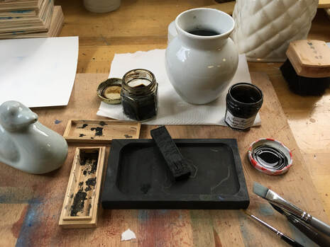
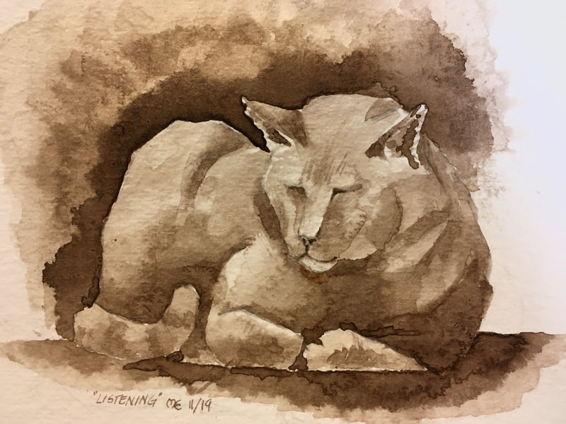
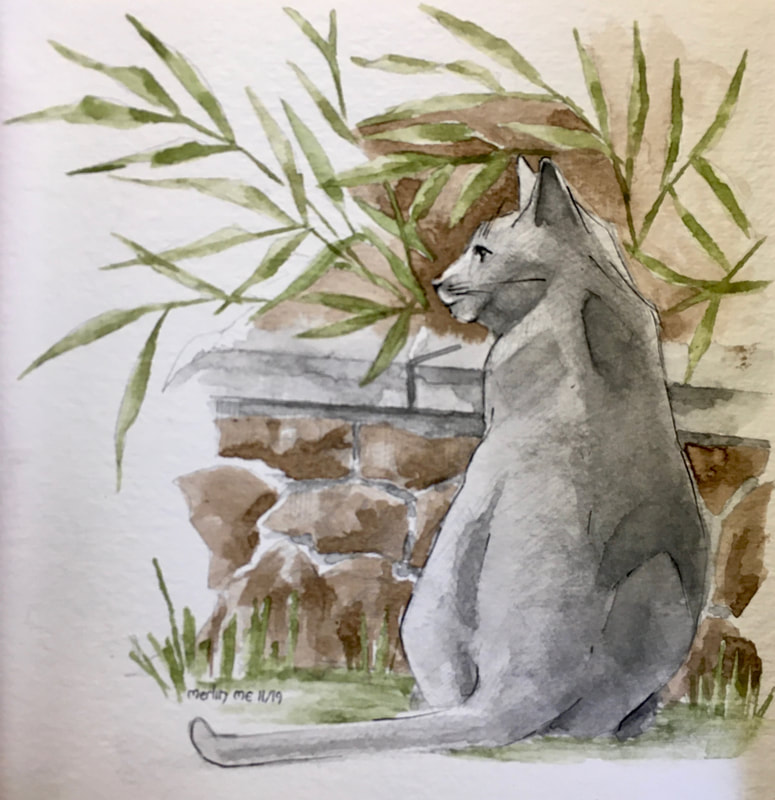
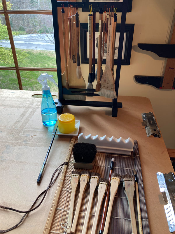
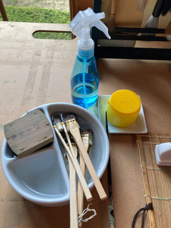
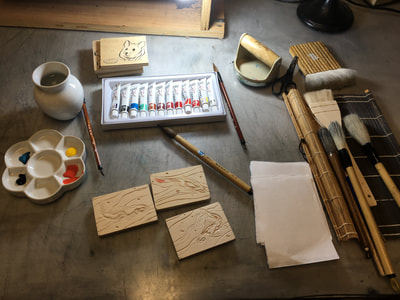
Here are a few of my latest experiments. I started with homemade black walnut ink and quickly started to expand into sumi ink and watercolor. Sometimes I find India ink a bit too direct and I tend to keep it only for distinct hard line and details to create emphasis in the drawings. For subtle values, its really hard to beat sumi ink and the incredible flexibility and control you can get by working directly from the suzuri stone (the grinding stone for the ink solid stick). Shown here are my tools and media as well as my experiments below. |
Recently, one of my students asked me why I taught them how to prepare their own drawing surfaces and why artists would go to the trouble of making their own pastels and paint? Good question. Purchasing prepared media is a lot easier and quite a time saver. And I’ve learned that not everyone shares my love of falling down esoteric rabbit holes and hands on making. So that leaves me with my student’s question, “Why bother?” I suppose you might be able to argue that you could save money. But, I think the indisputable reason is quality control. The more I know and the more I can do, the more control I have of the final product of my art work. If in saying that my classical realistic art ardor of a petticoat is showing, so be it!
When it comes to making media, I think my favorite would have to be the annual ritual of making black walnut ink. Long thought to be the ink of the Great Masters, e.g. da Vinci, Rembrandt, Raphael, new conservation studies of their drawings in the British Museum cast doubt upon this. Most likely any confusion is due to the similarity of the warm, deep sienna brown tones of both black walnut ink and various varieties of iron gall inks. Indeed, black walnut ink does have a high iron content. Despite this, I think it is likely that those Great Masters must have used it due to how common black walnut trees are in Western Europe and the ease of which one can make a generous quantity of a stable, archival ink which offers a wide variety of values, and works easily with pen as well as brush.
Its botanical name, Juglans, is a reference by the famous 18th century taxonomist Carl Linneaus to the Black Walnut tree being one of the oldest fruit trees known to man. For it was a favorite of the Romans, who called it Jupiter's nut. Beyond the art and culinary worlds, Black Walnut Ink was used extensively as a dye in Europe during the Middle Ages and in colonial America. Itwas even documented to have been used to stain the hands of convicted thieves among the ancient Romani peoples. The plant contains high content of juglon, which is a chemical that is highly toxic to many plants and animals. The ancient historian Pliny noted that the black walnut tree often stands alone. This toxic effect however is reserved only to the greenish leathery husk which covers the hard shell of the nut.
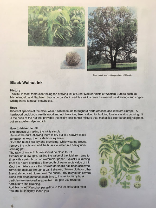
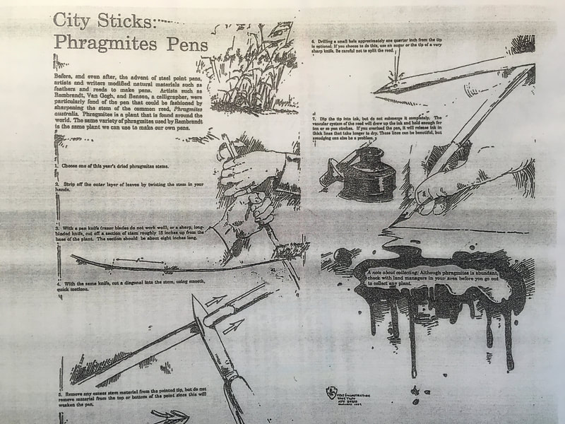
I suppose you may be wondering about how to make this wonderful black walnut ink. If you are very patient and dedicated to both the visual and culinary arts and you wear gloves, it is possible to remove the husks from the nuts and then keep this gourmet gem for pies and preserves. Below I have two reference sheets to help you if you are interested in making your own ink as well as pens (from easy to find reeds). One Inktober, I have promised myself I am going to draw everyday using only homemade ink and handmade pens and bake a black walnut pie on Halloween to celebrate!
Summer Wood Block Printing Final Works
Above you have a kind of "best of" gallery of my four wood block projects this summer. As I reflect on these images, I realize that there is so much I learned both technically and aesthetically. I think the first thing that leaps to mind is the incredible amount of color theory knowledge I gained by experimenting with mixing inks and through conversations with my studio colleague, Kimberly. I truly challenged my compositional skills through intense study the works of late 19th and early 20th century masters of the medium. The combination of working in both the etching studio and the wood block print studio gave me new knowledge of editions and monotype. I have found that the freedom of summer and having no pressure for product allowed me the luxury to experiment with brushes and printing techniques that otherwise I would not have tried and there is still so much more I have yet to try!
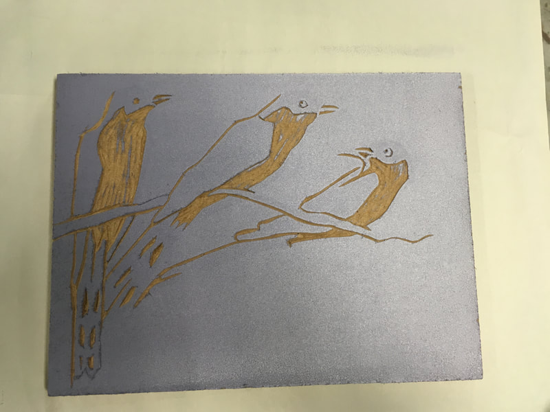
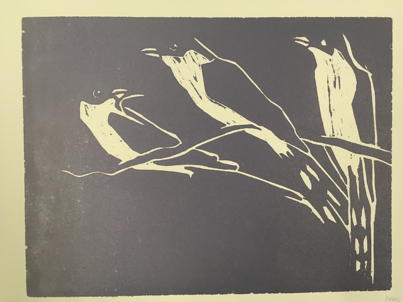
I worked large this year, excepting the cuckoos which is 8x10 inches, the other blocks are all 22x30 inches. I now have a much better idea of how long it takes to carve, a better knowledge of mark making with the various chisels, much better carving skills, as well as timing of planning the printing and drying of multicolored prints. Sometimes I regret attempting so many large multi colored reduction prints at once, but I'm filing that under lessons learned. All in all I'm super excited to buy some frames once everything is dry!
I worked large this year, excepting the cuckoos which is 8x10 inches, the other blocks are all 22x30 inches. I now have a much better idea of how long it takes to carve, a better knowledge of mark making with the various chisels, much better carving skills, as well as timing of planning the printing and drying of multicolored prints. Sometimes I regret attempting so many large multi colored reduction prints at once, but I'm filing that under lessons learned. All in all I'm super excited to buy some frames once everything is dry!
The Final Exam in Book Binding
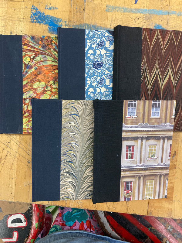
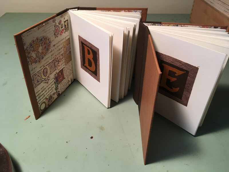
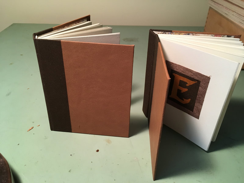
In order to be sure I had down all my basic skills and was ready to bring book binding back to my students in the studio at school I devised a final exam for myself. This exam consisted of two parts: the first was to make two identical books and the second to design and make my own sketchbook for the up coming start of the school year. The ability to create things in a consistent manner I have found is for me a good indicator that I have indeed mastered a skill. The two small books I designed specifically for my son and his girlfriend, both scholars and constantly in need of small blank books to take notes. I wanted to go for the scholar look so they have leather covers and Florentine medieval manuscript patterned endpapers. Because I know they are students carrying about their books in rucksacks, each book has a heavy duty book cloth edge to the binding.
I wanted to try to create a personalized book that was "off template." Also, I have found it a valuable experience to live with one's own designs because it is one of the best ways to discover ways to improve. I regret that I did not take a picture of the signature sewing stitch that I used which was a combination of a straight stitch and a kettle stitch which connected each signature to the other through the spine. That being said, I was pretty happy to discover that the stitch I happened on was indeed a standard of book binders. To me this was a good indication that I "got' the logic of the craft and the materials. My sketchbook is a unique size, 5x8 inches, and in landscape orientation. This meant I needed to considered the tightness of the binding so the top cover would flip open and remain open while I was sketching without flopping to the back and hanging. I also used some heavy duty Japanese paper and book cloth for the wear and tear I know it will be enduring. Both books are filled with Strathmore ivory colored acid free drawing paper, with five four paper signatures bound with unwaxed linen thread. You might notice the I added small calligraphic insignia for all three books which was painted with an acrylic gold paint (which I learned earlier this year is an excellent substitute for gold leaf) and a small piece of book cloth. I hope you enjoy seeing the products of my final exam as much as I enjoyed making them. I feel ready for my students!
I wanted to try to create a personalized book that was "off template." Also, I have found it a valuable experience to live with one's own designs because it is one of the best ways to discover ways to improve. I regret that I did not take a picture of the signature sewing stitch that I used which was a combination of a straight stitch and a kettle stitch which connected each signature to the other through the spine. That being said, I was pretty happy to discover that the stitch I happened on was indeed a standard of book binders. To me this was a good indication that I "got' the logic of the craft and the materials. My sketchbook is a unique size, 5x8 inches, and in landscape orientation. This meant I needed to considered the tightness of the binding so the top cover would flip open and remain open while I was sketching without flopping to the back and hanging. I also used some heavy duty Japanese paper and book cloth for the wear and tear I know it will be enduring. Both books are filled with Strathmore ivory colored acid free drawing paper, with five four paper signatures bound with unwaxed linen thread. You might notice the I added small calligraphic insignia for all three books which was painted with an acrylic gold paint (which I learned earlier this year is an excellent substitute for gold leaf) and a small piece of book cloth. I hope you enjoy seeing the products of my final exam as much as I enjoyed making them. I feel ready for my students!
Hand Made Through and Through, Almost!
|
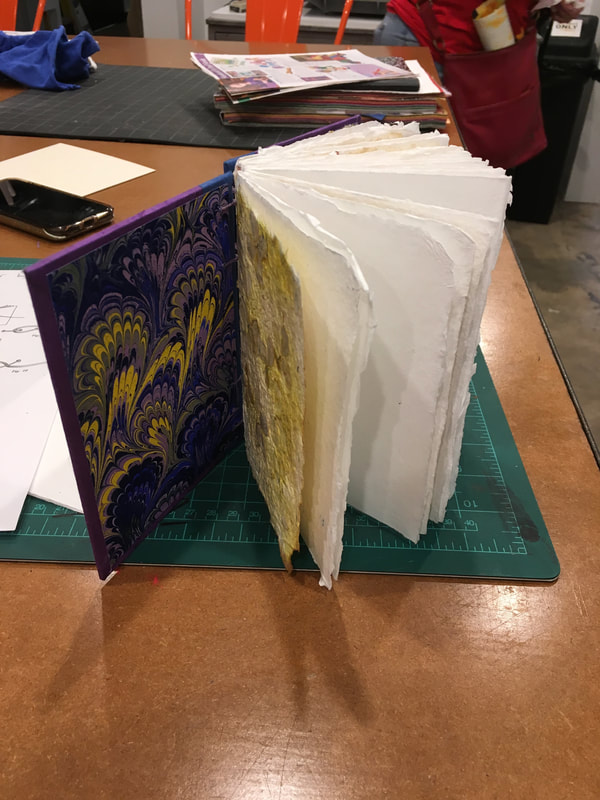
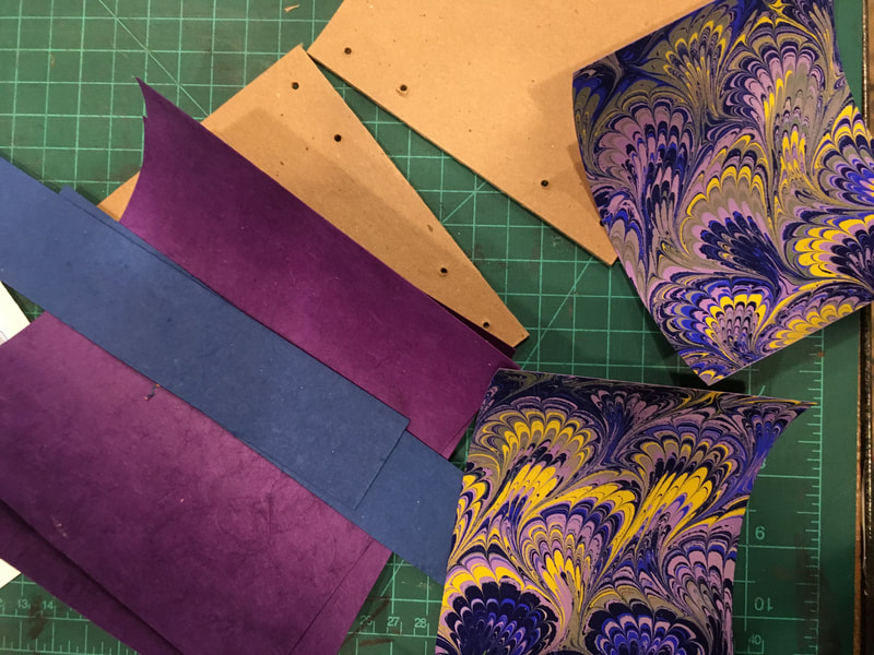
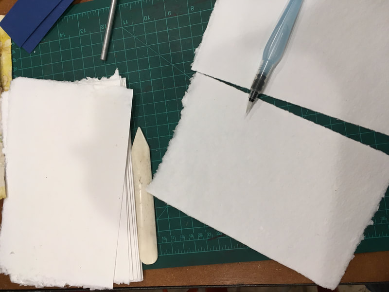
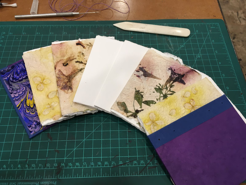
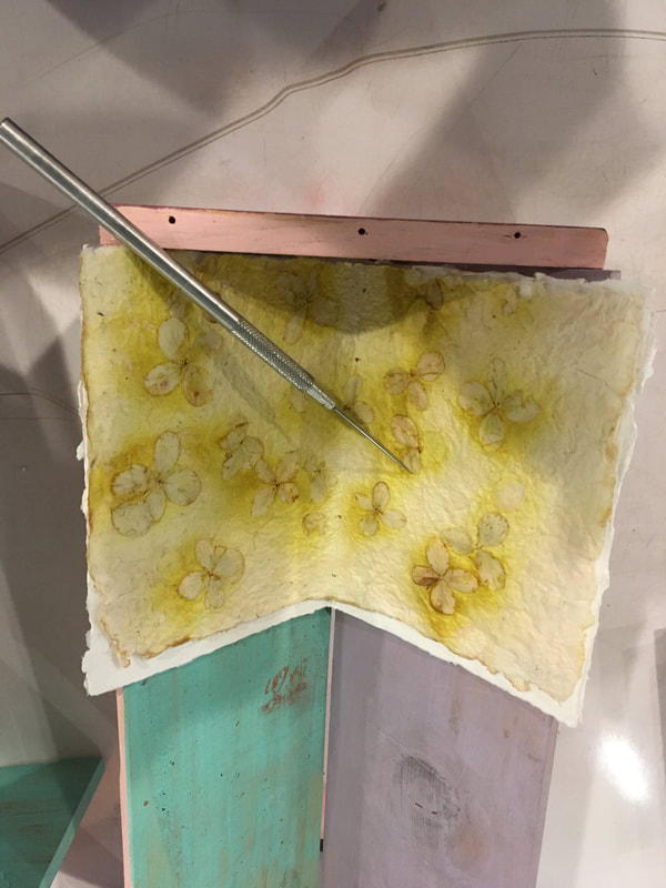
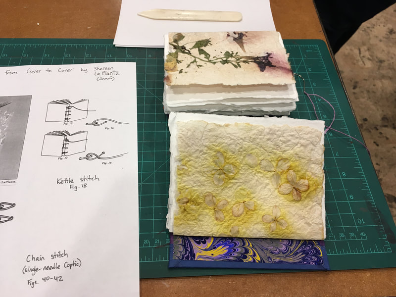
It was pretty exciting to arrive at class last Tuesday evening to be greeted by my instructor's smiling face and a neat stack of pristine white handmade paper with my name on it. I could hardly believe that the majority of pages had perfectly deckled edges and were of consistent thickness, no doubt beginners luck! In anticipation of this night, I brought with me some decorative paper, including some of the marbled papers and handmade with flowers embedded in the fibers papers that I created last fall. I decided that in keeping with the spirit of the project I would use as much hand made paper as possible. A quick trip to the local art supply store for acrylic medium and I was able to coat the papers embedded with flowers. Thankfully it dried quickly and with a little help here and there with a sharp craft knife it was possible to fold and tear them without losing the integrity of the fiber structure and keep the flowers in place. I used those flower sheets as "signature covers," a lovely addition to the basic book structure that gives the give the book sections and more character. You will notice too that I used the marbled papers as the end sheets. So basically most of the book I crafted excepting the book board, book cloth, thread and the cover stock (which actually is hand made paper from Nepal).
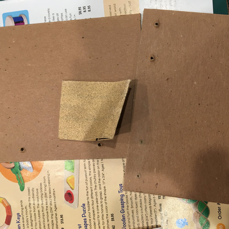
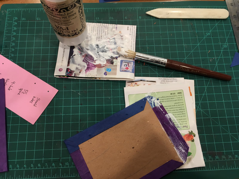
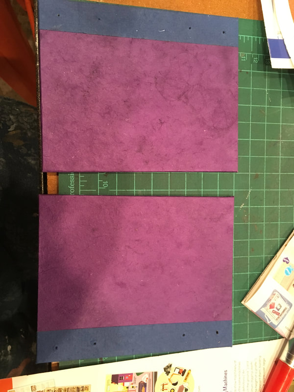
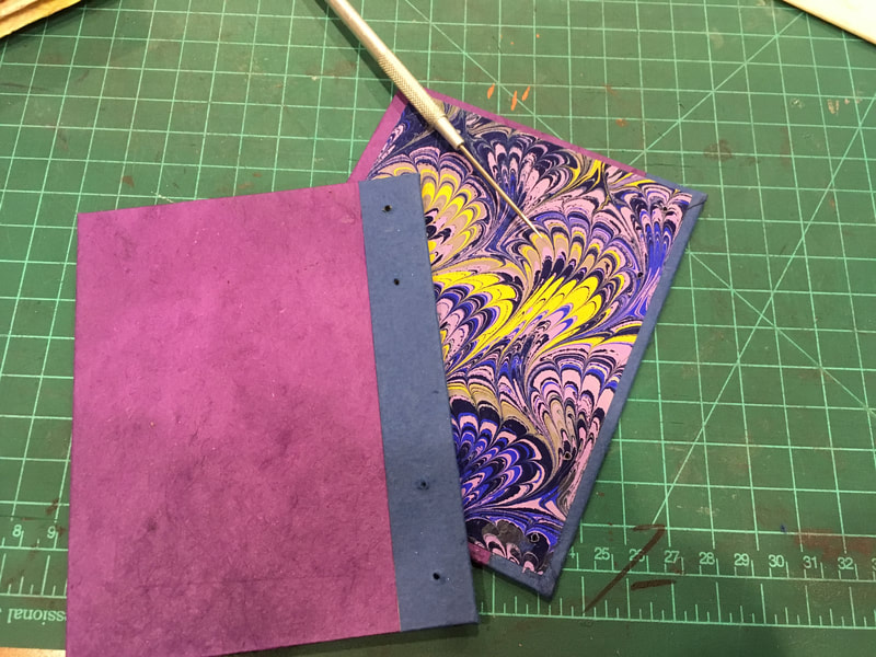
We began by sorting the paper and carefully folding, wetting and tearing for a soft edge. I tried to arrange the pages in a pattern of thicker pages to the outside of the signatures and thinner inside. I also flipped the torn edges with the deckled edges so that the edges of the signatures had a consistent texture around the entire book block. The covers were glued up and pressed in the usual way with one exception. The holes punched for the binding. It was important to sand the cardboard so dimples would not telegraph through the cover paper and cloth. It also was necessary to re-punch the covers through the decorative paper using a template as soon as possible after printing so as not to lose track of their location. You might notice too that I used the book cloth as a contrasting color for the thread. I also chose to design the cover this way because of my experience making the standard book with leather and book cloth cover last Sunday. The book cloth is much tougher than paper and it seems to me will with stand the wear and tear of opening and closing of the book much better than the paper alone. |
I was truly pleased when I laid out the signatures and covers to see how well the flowers and color scheme worked together. It is interesting, way back in the fall when I made the flower paper I had no idea what I would use it for and my colleague said, "Oh don't worry about that, projects just show themselves!" How right she was!
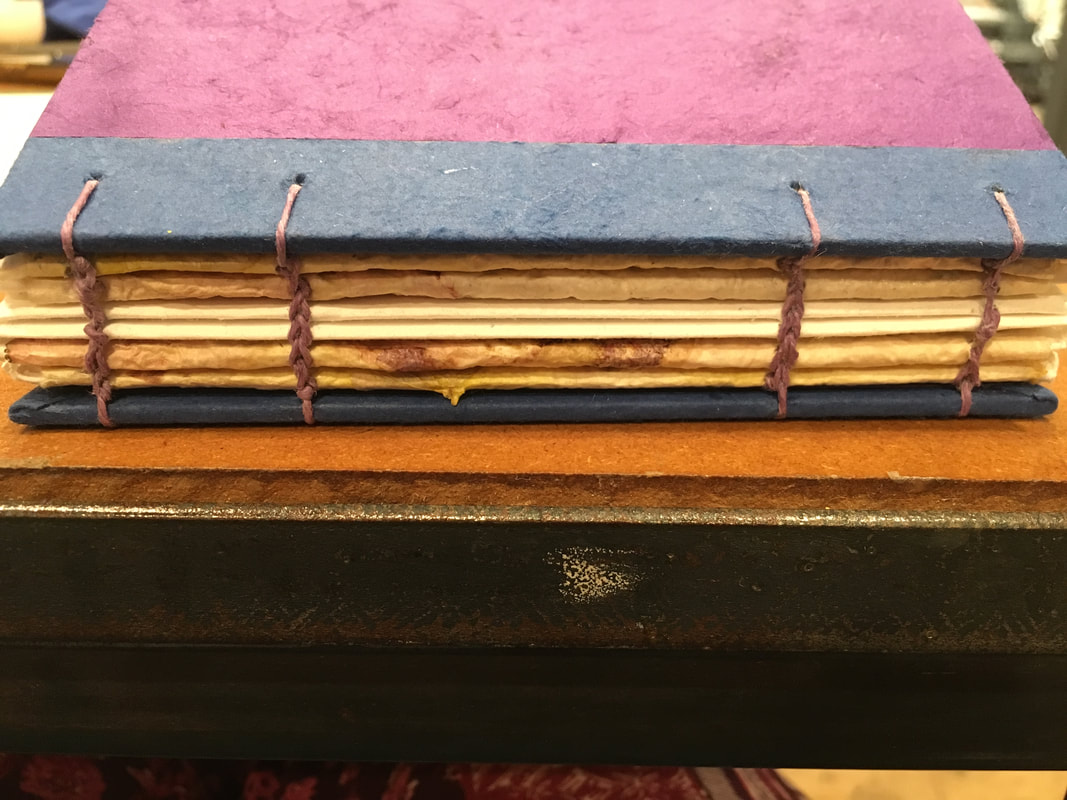
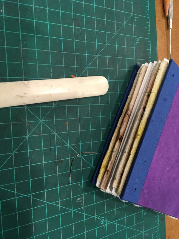
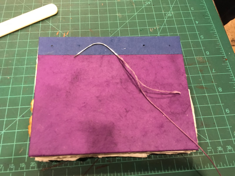
The signatures were punched in the book cradle and then the careful task of sewing the beautiful chained binding began. We used waxed thread and a curved needle for this. The pattern is created by using two stitches: the chain stitch and the kettle stitch. Our binding was a simplified version of what can be a far more complex endeavor involving two to four needles in use at the same time. It took a great deal of focus to get even this simplified version of the pattern and rhythm of sewing down, but I truly enjoyed it. I am hopeful to try a more complex coptic binding in the near future.
The signatures were punched in the book cradle and then the careful task of sewing the beautiful chained binding began. We used waxed thread and a curved needle for this. The pattern is created by using two stitches: the chain stitch and the kettle stitch. Our binding was a simplified version of what can be a far more complex endeavor involving two to four needles in use at the same time. It took a great deal of focus to get even this simplified version of the pattern and rhythm of sewing down, but I truly enjoyed it. I am hopeful to try a more complex coptic binding in the near future.
Bookbinding and Wet Shoes
|
|
When I signed up for my second workshop in book binding for this summer, I suppose I didn't read the description closely enough. I was excited about the opportunity to learn a new, more complex binding stitch, coptic binding. I reread the workshop description more closely when I received the introductory email from my instructor advising that we wear shoes that can get wet and old clothes...for book binding?!
What I didn't realize that this was "hand made" and I mean handmade, from paper to binding! |
So began my second adventure in paper making. Those of you who follow my Works in Progress and Blog (and thank you fro doing so!) may remember that this is my second time making paper. The first was last fall at St. John's College. That day we made paper out of scrap paper and experimented by adding other elements, botanical material, threads, dyes, glitter, etc.
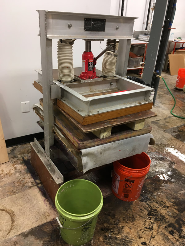
I entered the Pyramid Atlantic studio last night finding several large vats of 100% cotton fiber and water in a large studio that had floor drains. Now, I should mention that I usually have my doubts about the what goes on in rooms designed to have floors drains. Some fairly unsavory activities usually leap to mind. Fortunately, this is just to control the incredible amount of water involved in the process. Water in the vats, large sinks, draining deckles, damp felts, and interfacing fabric, the list goes on. The full technique for making the sheets of sketchbook paper is documented in the video to the left of this text. However, I feel I'd be remiss if I didn't mention that I practiced making paper sheets for a good 45 minutes to an hour before we shot the video. To say there is a "knack" to evenly distributing the fibers on the screen under the deckle (frame) is an understatement.
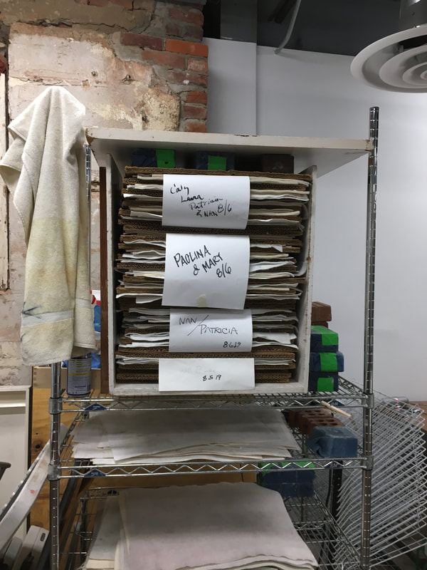
In the picture gallery above, you can see how the wet sheets were then carefully and neatly stacked. They were then pressed to flatten and remove the excess water for 15 minutes. After that the sheets were carefully laid on dry felt (another knack, believe me you will ruin a few wet sheets in this transfer!) and again carefully stacked in layers of felt, blotter paper, and cardboard in a drying rack. By next week the paper should be ready to be folded and sewn into my own sketchbook!
It's funny the little unexpected things you learn about yourself while learning other things. This workshop definitely appeals the the "homesteader/pioneer spirit" in me. But, to be honest, I have discovered that interest stems more from a romantic admiration from a far and a fascination with process and basic engineering. I can watch Forged in Fire and How It's Made for hours on end. I can even tinker around with the various techniques and processes, building for a pleasant and fun evening or afternoon even when its hard work. Working hard when learning is fun to me. I have throughly enjoyed learning paper making, and in the past ceramics fundamentals and basketweaving. But, when I think of commitment to those art forms I know they are not for me. I would love to espouse some high minded sounding reason here but alas, they all have one thing in common that I have discovered I dislike: having wet hands and often wet feet for hours on end. Give me dry shoes and to quote Joni Mitchell "my clean white linen and fancy French cologne." Alas, so ends my career as a homesteader/outdoors woman, I will happily return to my watercolors and printers block where my hands and feet stay dry!
All that being said, the thought of holding in my hand a book entirely handmade by me gives me the tingles! Stay tuned for next week's summary on the book making itself.
|
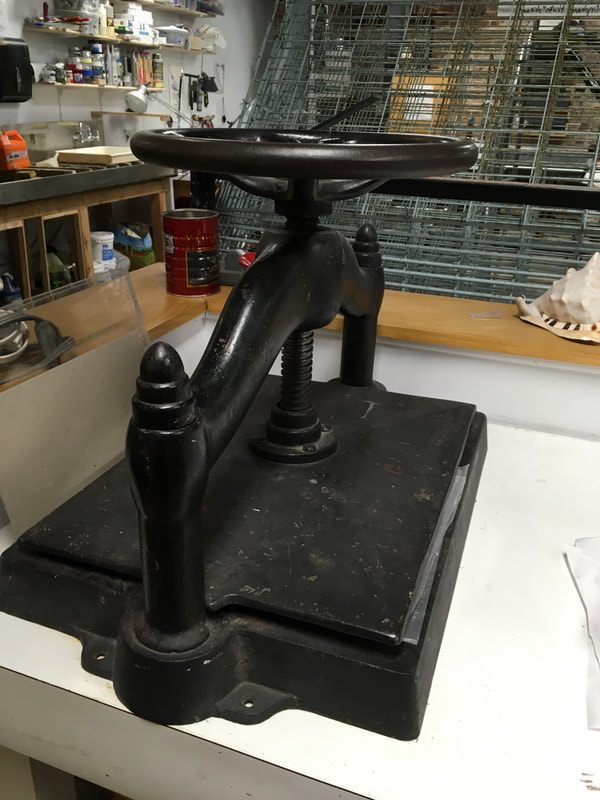
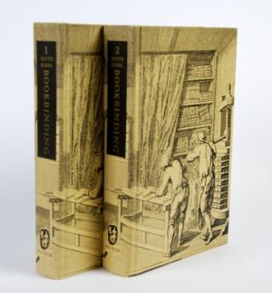
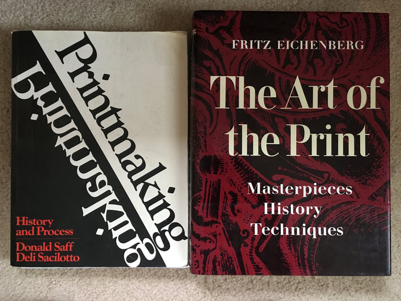
On a final note, thanks to my son, I was able to read the definitive text on the history of the book and bookbinding techniques: Bookbinding: Its Background and Technique, volumes 1 and 2 by Edith Diehl. It can be a bit tricky to find both volumes at an affordable price, but there are on line dealers, like Abe Book, where it is available. I recommend the hard back 1976 edition for condition and affordability as a library copy. That is what is shown in the image on the left. If you are collecting, the first edition set can be in the hundreds of dollars. However, if you are just looking for a copy to knock around the studio with, thankfully Dover has the text in a paperback reprint. Keep in mind though that I am not sure if the Dover edition has the full contents of both volumes of the original. Books about books, that's when you know you have bibliophile fever bad!
|
Printing Charette
|
Charette is one of those fun words that has an "insider" meaning. In the business world, it is defined as a long and intense meeting aimed at conflict resolution and brainstorming solutions. But, most artists and designers, especially architects, know its code for an "all nighter" in the studio. This word has a terrific etymology. (Those of you who have been reading my blog know my love of words is only exceeded by my love of art) In late Medieval French a charette was a small cart. This cart went out at the end of the university term to collect the projects of the students. The centuries have not altered the nature of college students so then as now, the students would work up to the last possible moment. The moment the charette showed up at their door to collect their work. Fortunately, the limitations of age, and responsibilities in my life and those in my life make all nighters no longer feasible.
|
I also like to think that life experience has given me the good sense not to put myself into that position any more. But, unfortunately, that's not always the case. Take last night. I have four large woodblock projects I have been working on. All are multicolored prints. I thought I had it all planned out, but unfortunately, I realized about half way into my evening of printing that I neglected to take home one of my blocks for a multi colored reduction print last week.. This meant last night was a charette of printing and carving.
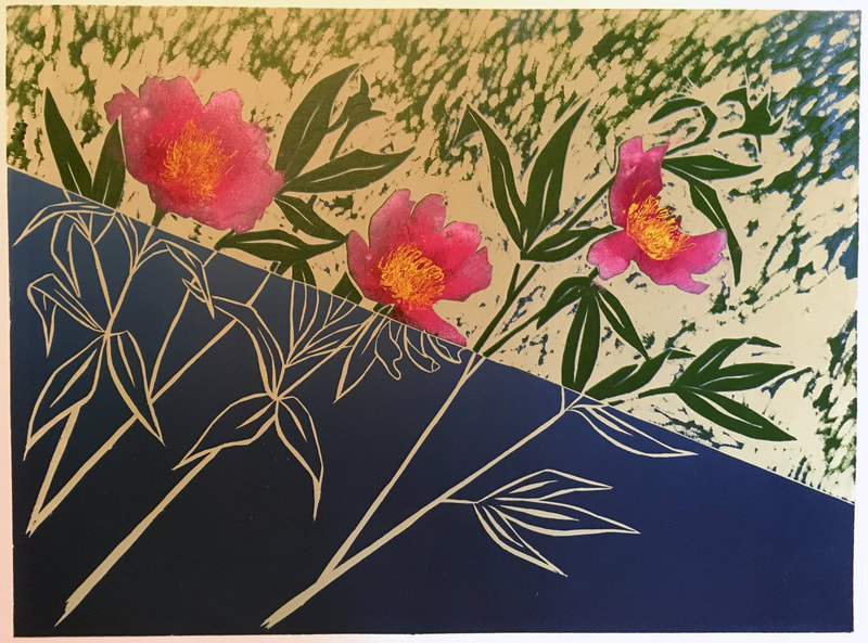
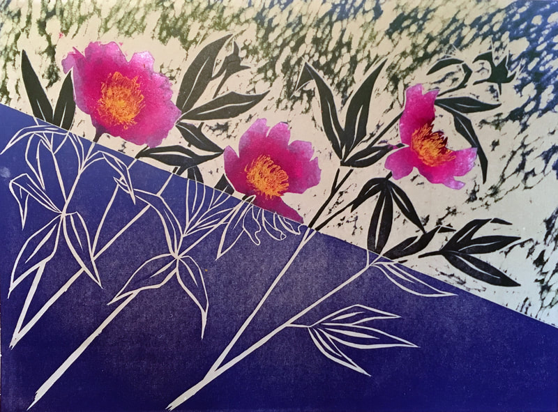
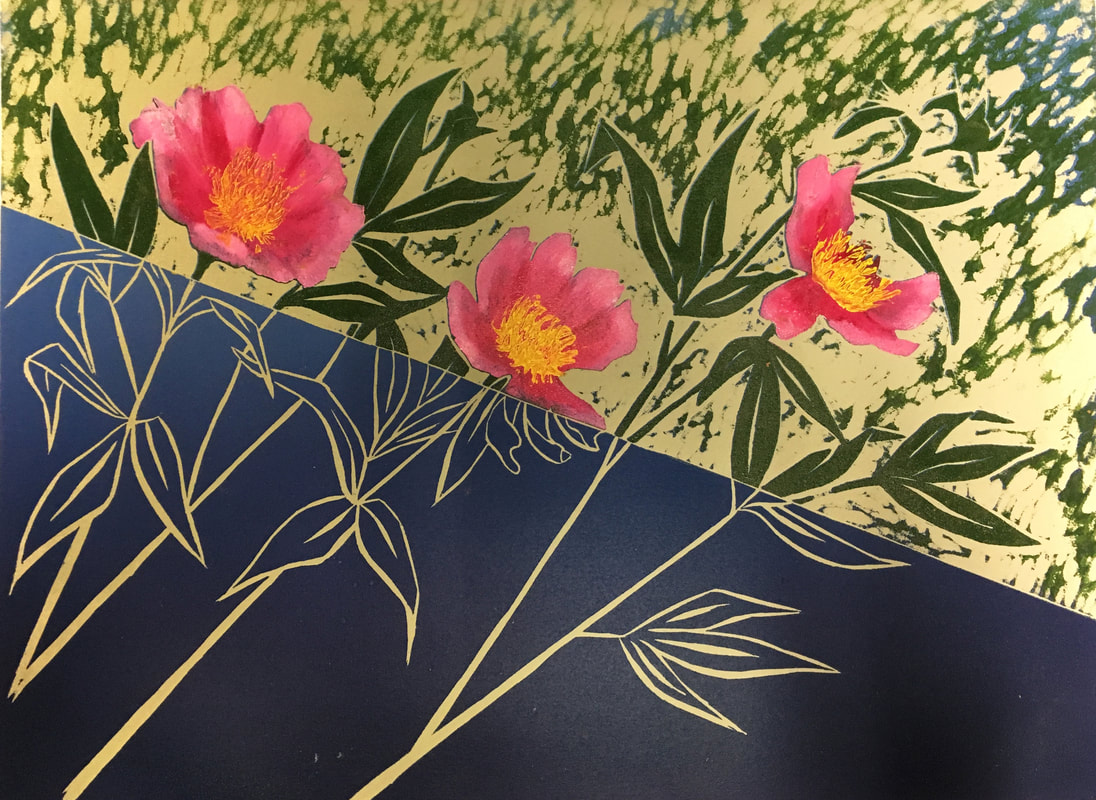
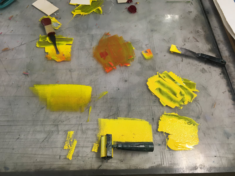
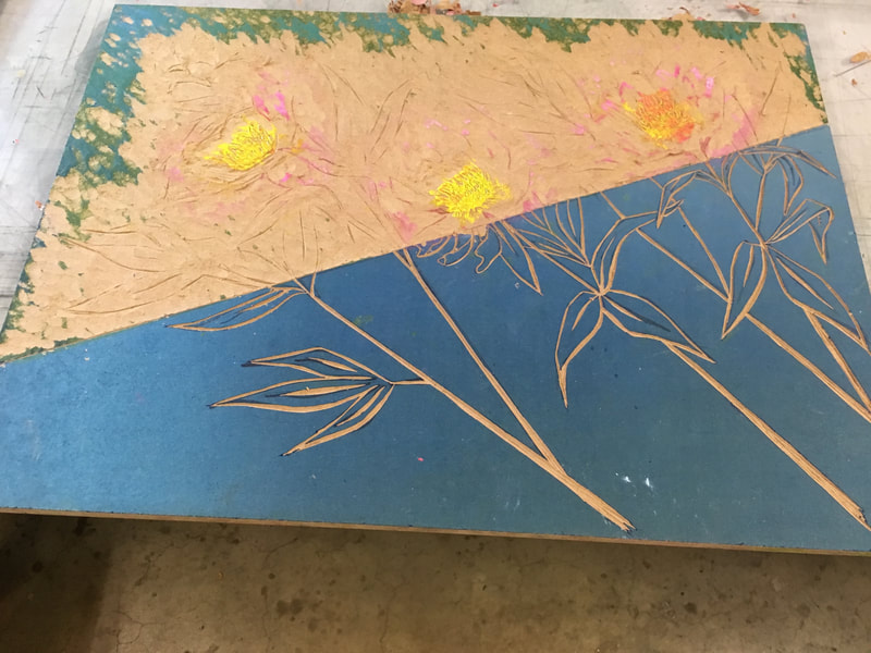
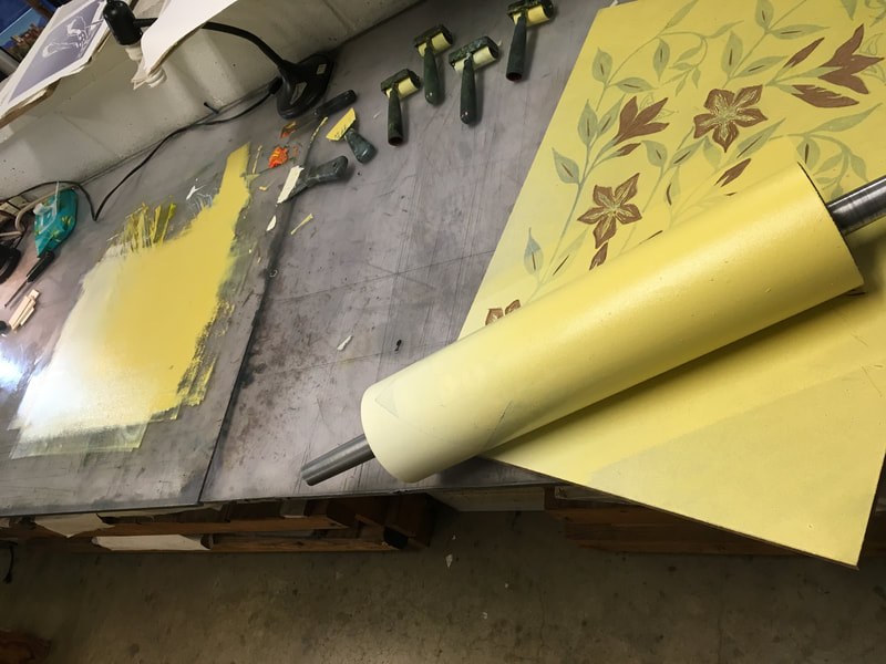
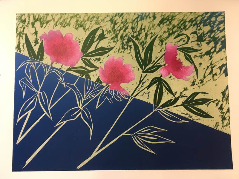
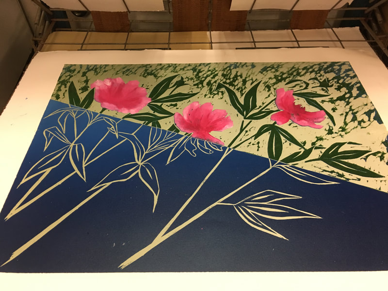
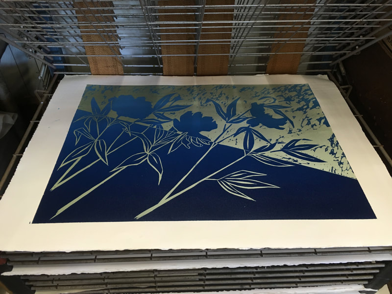
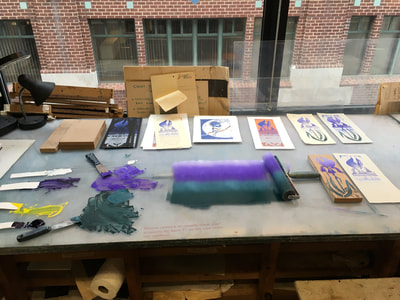
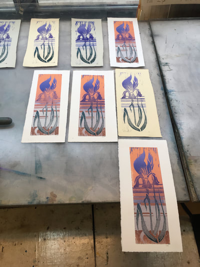
It felt good to complete one project: The Peonies, seen above with process below. There were some tricky aspects printing the final part, the center of the flowers. This was due to some undesirable chatter (which had to be carved away), the transparency of the yellow (which was resolved by adding a bit of white and the tiniest amount of magenta). Other complications included the petals on some prints not being completely dry from the previous week, as well as my own heavy handedness in applying the yellow. My instructor recommended dry rolling after the yellow was applied to the block to pull out some of the excess ink. This worked very well and I was able to preserve the details of the tiny pistols and stamen of the flower center. Overall, I'm pretty excited by the results. I promise to repost a better picture of the finished project, studio lighting doesn't always makes for the best portfolio shots!
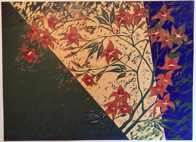
The next project, is the two color mandevilla. The first print was both background (notice the gradation of value is angled, this again was one of my instructor's wonderful suggestions) and the foreground flowers. I work very hard on my carving technique this past week to maintain very sharp edges for clean lines in the print and directional chatter that enhanced the petals sense my palate would be purposefully limited. My fussing seems to have yielded good results. I also felt a bit brave, now that I had experimented with the dry rolling technique, and tried subtly changing the values around and within the flowers themselves. Now, I need to carve the background away so next week I can print the vines. I am really excited to see how my experiment in minimalism turns out.
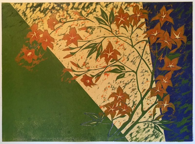
The last image was the toughie: the four color print, aka the block I forgot to carve this past week. Ugh! what was I thinking?! But, you can't turn back the clock so I chose to race the clock last night. I knew if I didn't this would remain an unfinished project and frankly, like most artists I'm betting, I have enough of those! Also, I have so much work in the the initial carving and planning that I was unwilling to let it go with out a fight. So I spent the most intense studio hour I have had in years carefully carving in the shadow lines and carving away the blue background in order to get the tri-color geometric background I planned in the original composition. Then printed the green on my six prints. It was quite literally a mental and physical workout, but I'm so glad I did it! Looking forward to the final color print next week, the flowers. Needless to say, I won't forget to carve the block!
Oh yeah, and then I made another book...
I have been thinking that you never really learn anything until you try it on your own. That being said, I decided a few weeks ago that I would order a few supplies and dive right into making a traditional hard leather covered book with standard signatures and sewn binding. It seemed to me that mastering this basic book structure was a necessity in my education in book bonding. With a little research, I was able to pull it off in one Sunday afternoon. The binding is a tad looser than I'd like it to be, but I am excited to use it as a sketchbook as I used a light weight watercolor paper for the pages. Now, my brain churning and I'm planning to make another sketchbook or two with different kinds of papers inside to accommodate different media. But, this may have to wait till after next week's workshop on Coptic bindings as I return to Pyramid Atlantic so there's more to come!
8 Down 2 to Go for Woodblock
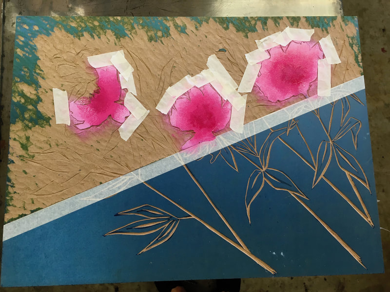
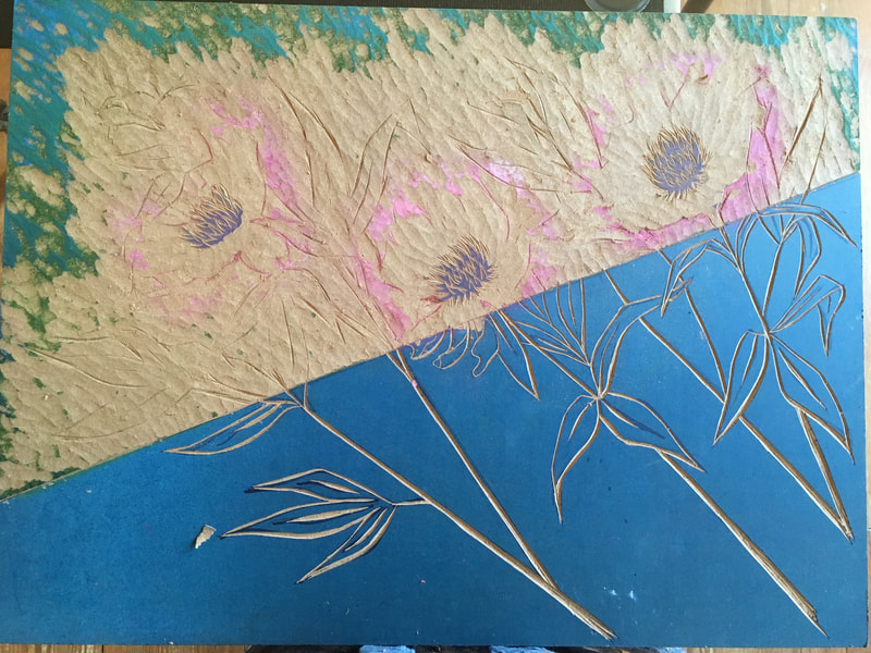
I'm not sure why it is that I get all my best ideas as a deadline draws near. Maybe it's that way for everyone. It takes time to get in the grove but then once you are the ideas start coming despite a looming deadline. At the end of last week I had three projects on the go for woodblock class, but then of course, I got an idea. This is making for lots of homework and busy printing sessions for me. But, I can't say that I'm not loving every minute of it! Even with only two classes left. This meant that I had to rethink some of my plans regarding how many colors I could actually print since returning this fall to the Torpedo Factory to print is impossible with my teaching schedule. But, that's ok, this rethink was a valuable learning experience and of course has the added benefit that the fewer print runs, the less chance for mistakes...at least that's my hope and I'm sticking to it! The project below will no doubt look familiar to you if you've been following my progress (btw Thanks! if you have!). It's the Peonies. This week I employed a new kind of brush, not shown here, a round stencil brush. The heavy stiff boars hair and wide diameter (1-1.5 inches) truly helped create the soft painterly value effect I wanted for the flowers. As I mentioned in a previous post, I wasn't sure at first if I liked this or not in contrast to the flatter portion of the composition, but that goes to show the value of walking away from your work for a time and revisiting it with fresh (well rested) eyes. You will notice that some masking was necessary. Too much chatter from too many different colors competing with the subject was my concern here. Regular masking tape worked like a charm! I am pretty excited about the results and have the block already prepped for next week's final run, the flower centers, so stay tuned!
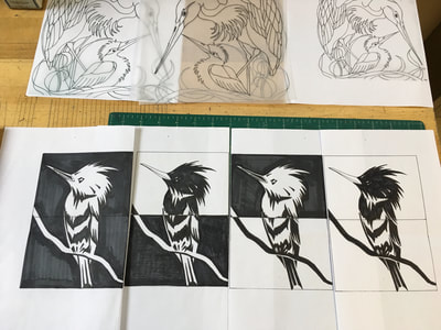
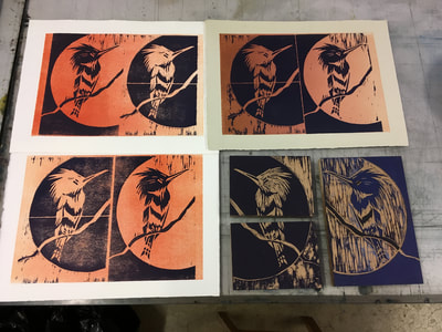
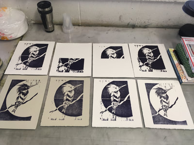
My second project is The Cuckoos. Initially, I thought of this as purely a reduction print. Once I saw the proof though, I starting experimenting with the background value to get a strong dark to light movement. The next thing I decided to do was to begin to carve directly into the wet block adding lines. I was feeling particularly brave because I had already made a mistake carving this block by "popping" out one of the eyes of the upright bird. This means that each print I have to hand paint in the tiny eye. I am planning on keeping some single color, as I sort of enjoyed the minimalist look of the first few. Others I plan to print a second color, a dark charcoal grey for the wings and the head. Lastly, I plan to make some single color prints of the reduced block. If you look closely you will see that I designed a geometric background, very much in the tradition of the Japanese artist Seeka, using the chatter. I'm excited to see how this prints.
The next project is probably my most complex. This project is a four color reduction print. Originally, I planned it to be six color, but as I mentioned before, time is running out so it will call for some hard work and fancy carving on my part. You can see the first color peeking through. I decided to take advantage of this yellow and carve into my block and change my original color plan (see in post below) and make the center of the flowers the background yellow. Next, I changed one of my geometric fields to a deep blue so that next week I can carefully carve back some of the branches that will be printed in a green that fades from olive green to a bright sap green so that there will (hopefully) be a shadow line below chosen branches giving the print a more dimensional quality. The final color will be the flowers...right now I'm thinking orange, but that's two weeks away so who knows what will happen!
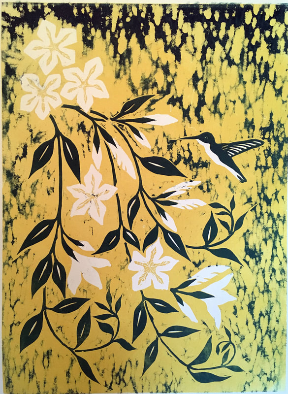
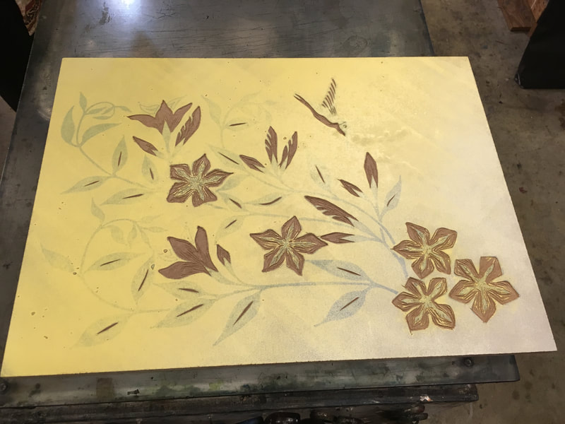
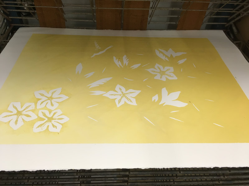
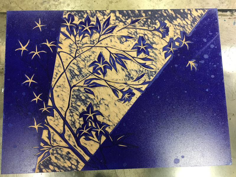
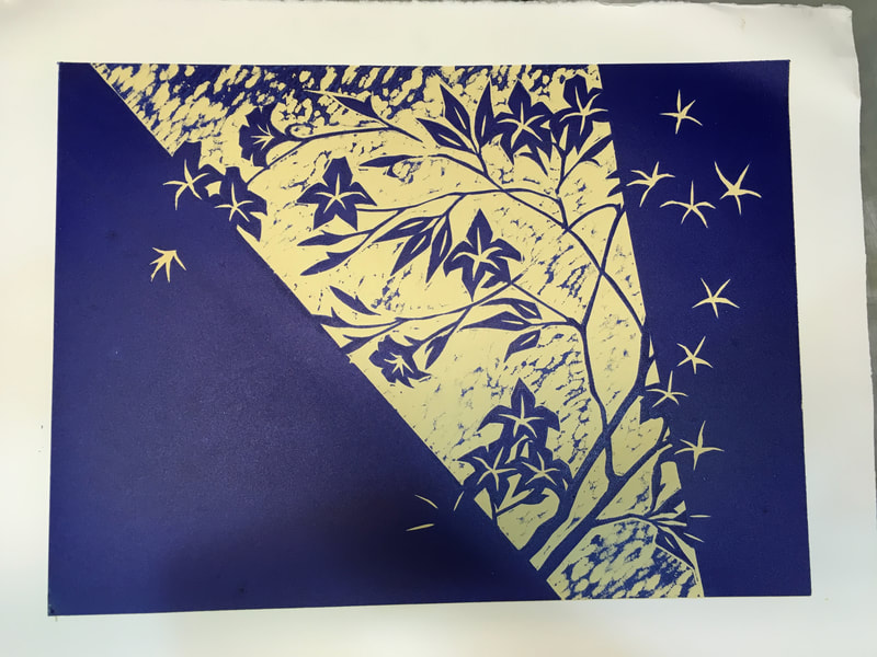
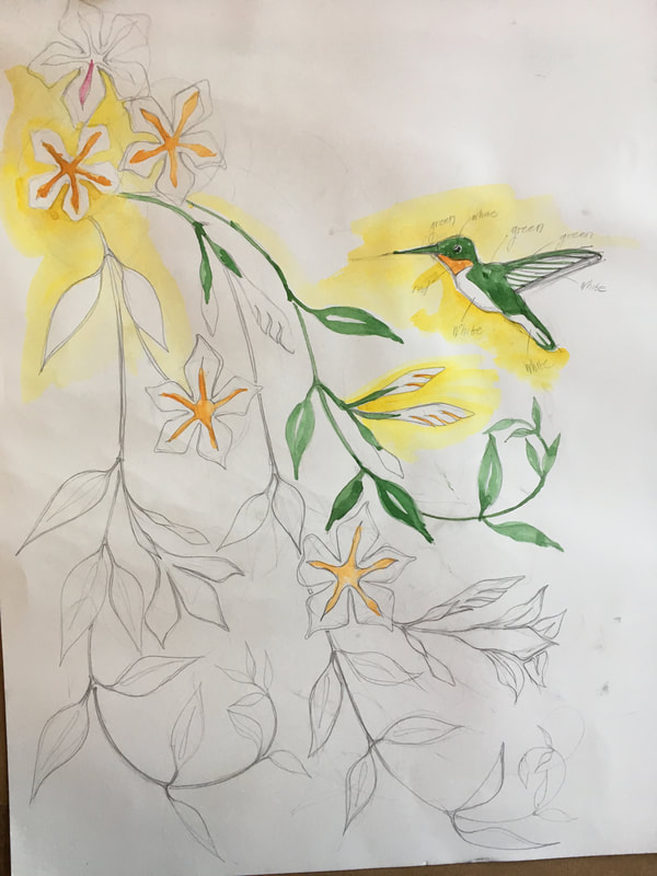
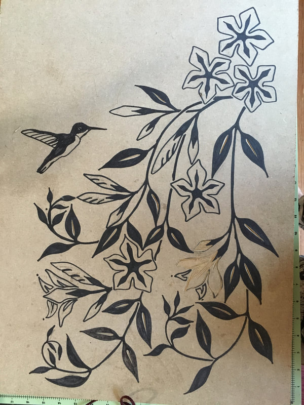
Last but not least, I was walking back to the car one evening and literally got hit in the face with my next subject, a mandevilla vine. I have long loved these vines and the graceful flow of its tendrils down from the high porch box it occupied made it irresistible. Of course the shortness of time was immediately an issue. Then I got to wondering how I could use the white of the paper as a color? The white of the paper in watercolor is so important and I had begun to notice how many of the great Japanese woodblock masters make use of it as well. So this is my attempt. Here is the sketch and the block with the carving away of the white areas started. At the last minute, I added the hummingbird. The composition seemed to need it for balance and it made a lovely homage to my husband, who dutifully tends our hummingbird feeders throughout the summer because he loves these little birds so much.
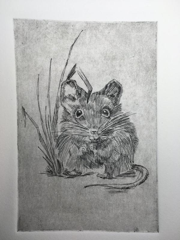
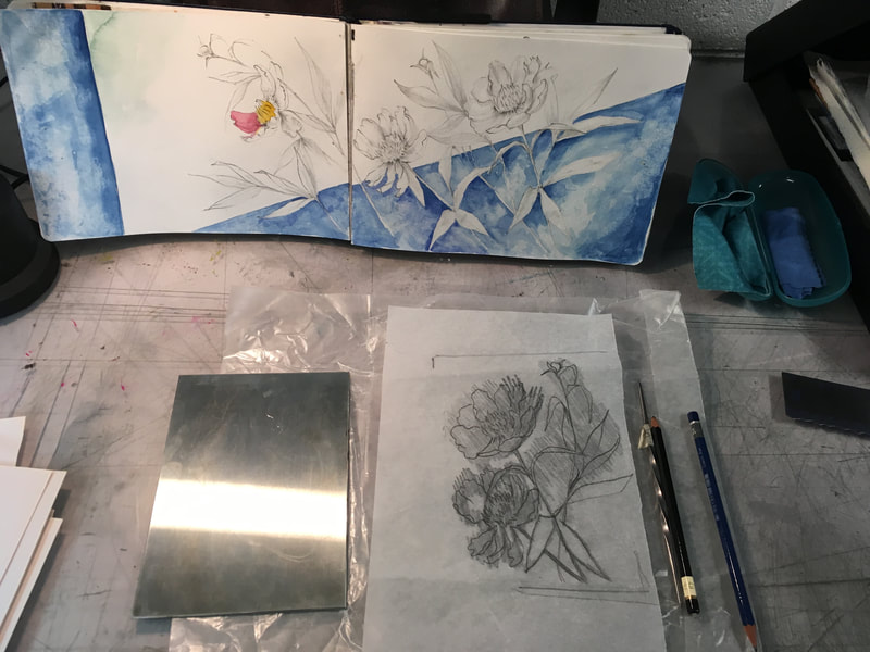
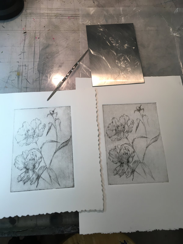
Final Etching Class: Etched Mouse and Drypoint Peonies
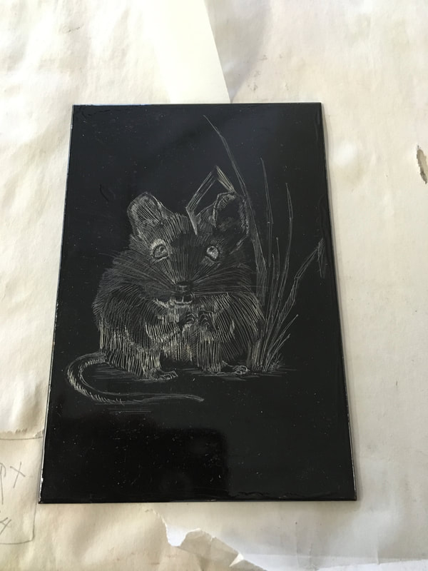
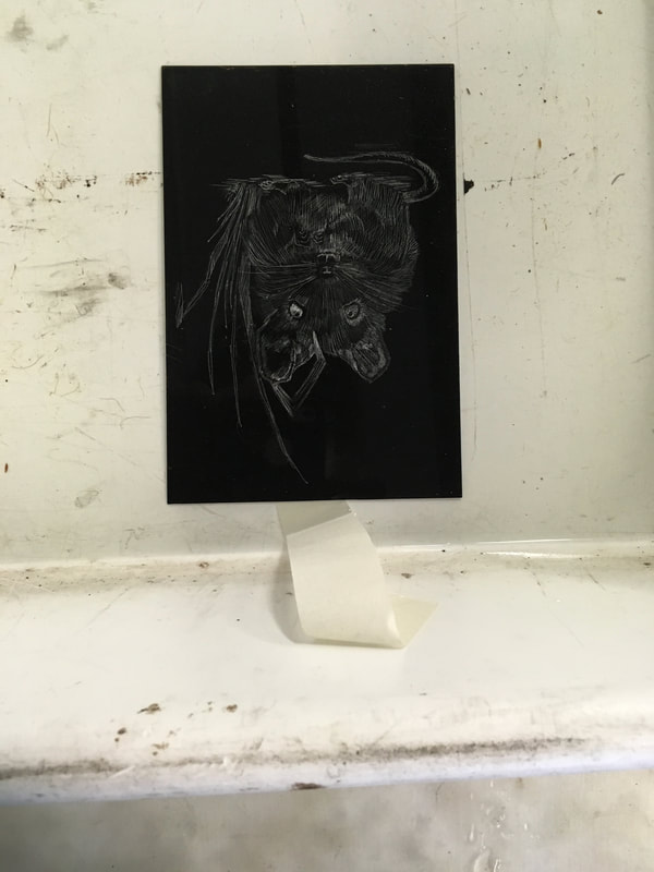
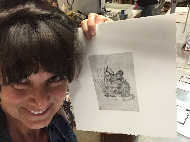
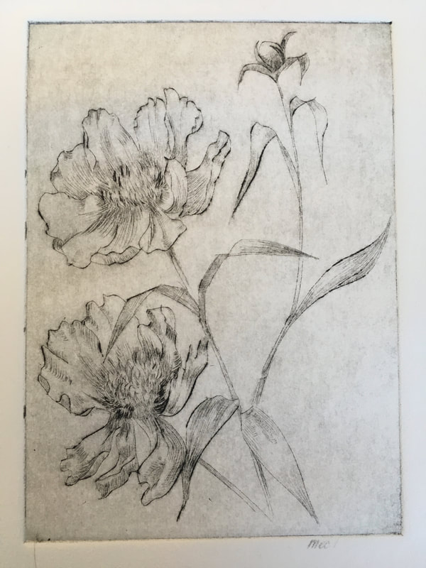
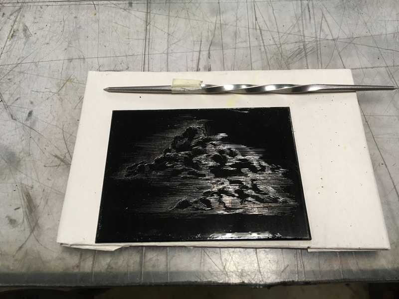
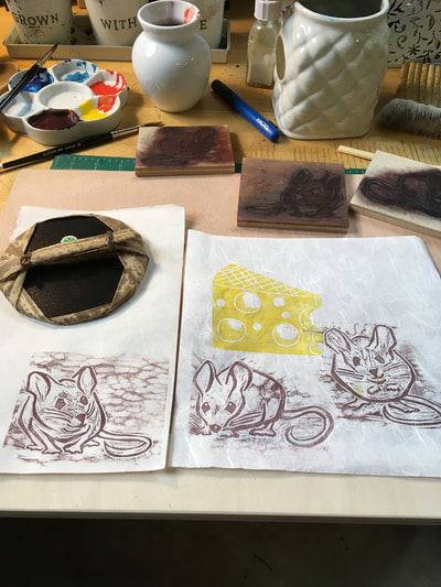
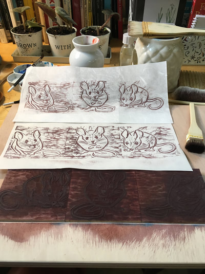
Above you can see the process for my last two pieces in etching class. The first was my etched mouse based on a sketch from earlier last spring of a little fellow I startled under some flower pots, I chose a mouse to experiment in using the stylus to capture a fuzzy texture and a wide range of values to smoothly run into each other without using aquatint which creates discreet area of value. It occurred to me that the actual drawing on the bitumen ground is like ink drawing only in reverse, it that makes any sense. More shiny lines, the darker it will print.
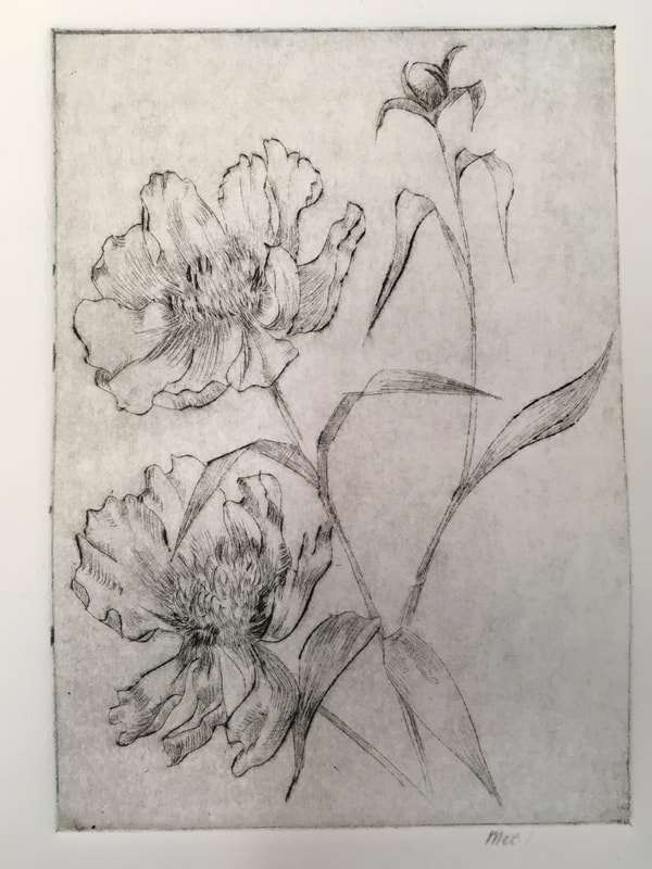
The second series of pictures are a project I did not expect to do: dry point. I had an extra zinc printing plate and my instructor demonstrated how I could directly sketch/scratch the image into the plate. Having a small table lamp set up for a raking light across the plate helped me see the image as I drew. I truly enjoyed this technique and look forward to doing more.
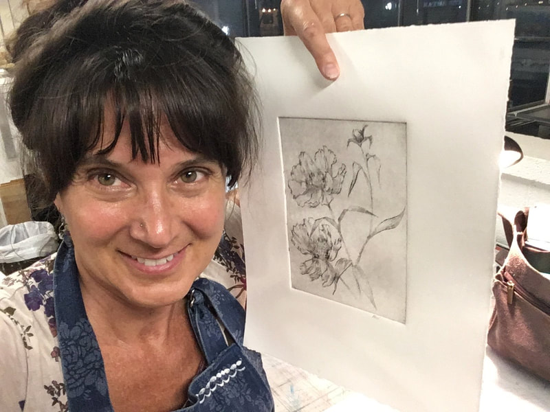
Below is the final gallery of all my works from class:
The Peonies and Birdie Get Printed!
I spend so much of my time, particularly during the school year working on my own. This past week I was reminded of the wonderful gift of like minded colleagues to bounce ideas off of and get frank creative feedback. In both etching and woodblock studio, I received excellent suggestions that truly helped me learn more about how to expand the techniques within these disciplines.
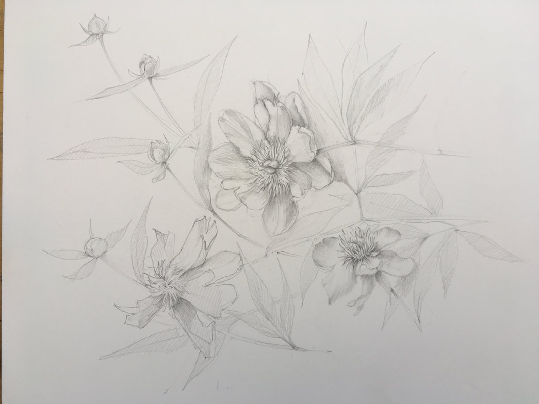
Initially, I was planning to create three discreet shades of pink within each peonies flower for the woodblock. This would mean more careful and laborious carving and printing. Thankfully, my table mate, Kimberly, who is a much more experienced printmaker than me and does fantastic complex work, suggested that I try applying the ink using a stiff brush in a painterly fashion and printing each. This gives each print more of a sense of depth and a somewhat monotype quality.. I was very pleased with how the flowers turned out. I am a bit concerned that the more graphic aspects of the work may not marry well with the more realistic, softer flowers which are more dimensional than the flatter pattern potions of the work, but we shall see. It was a great time and effort saver as well as the opportunity for me to employ my painting skills in a way I had never done before in print making. This makes me excited to explore monotype further. I am looking forward to adding the centers of the peonies in a similar way.
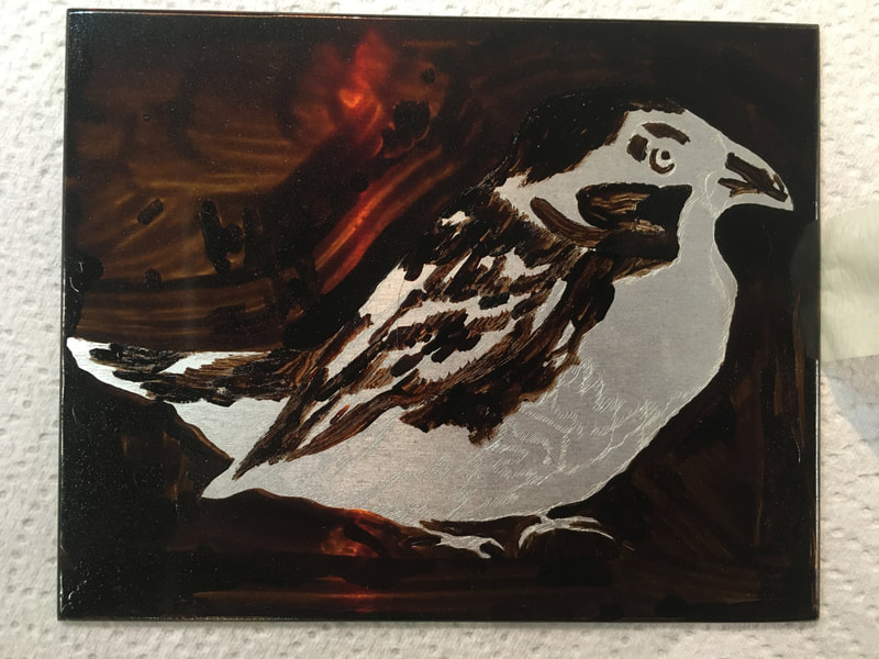
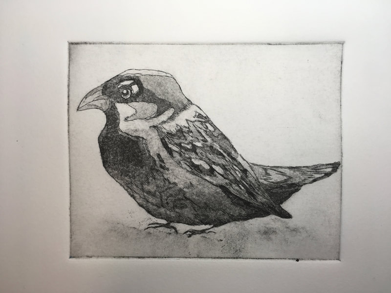
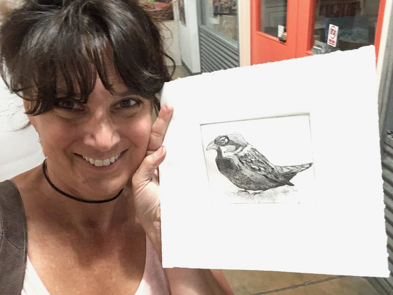
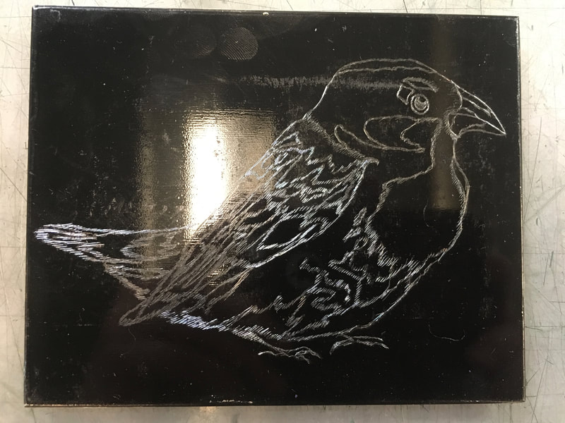
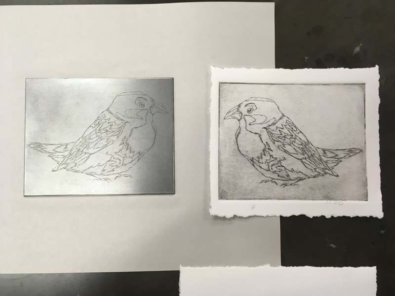
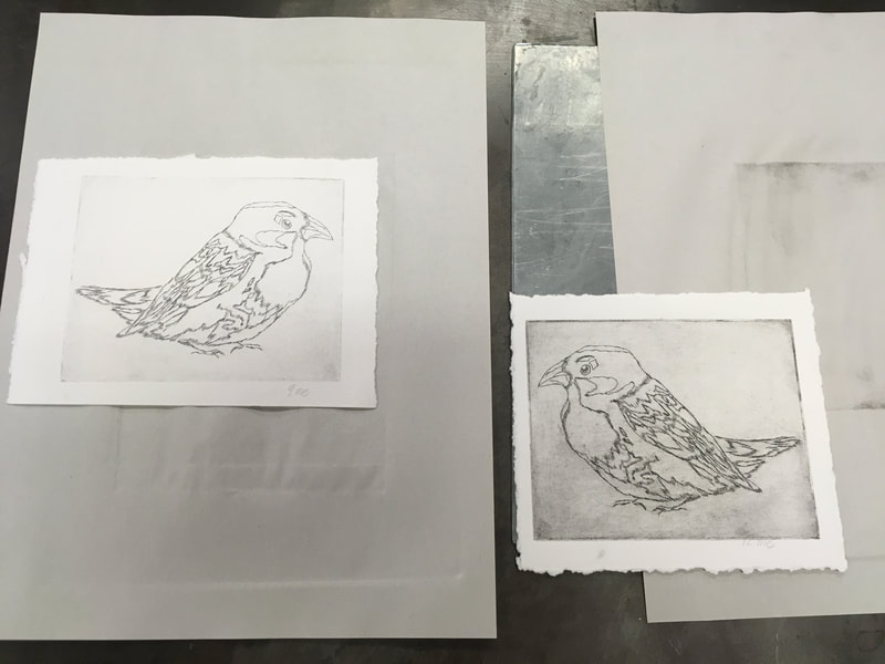
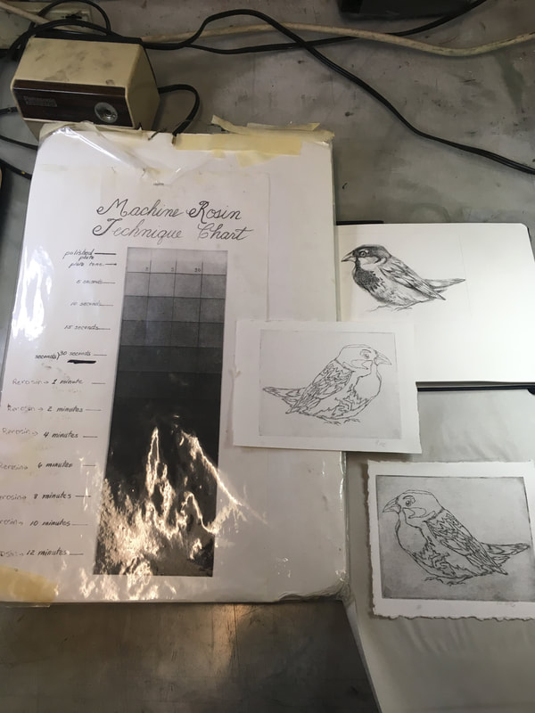
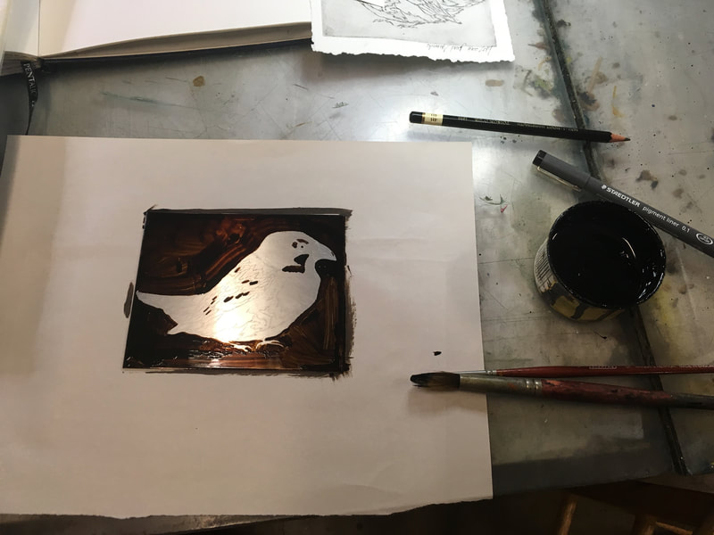
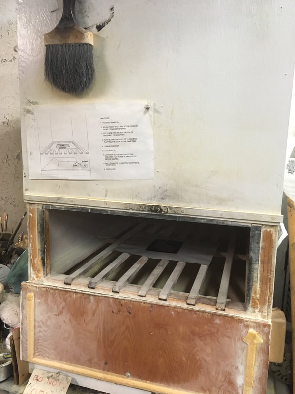
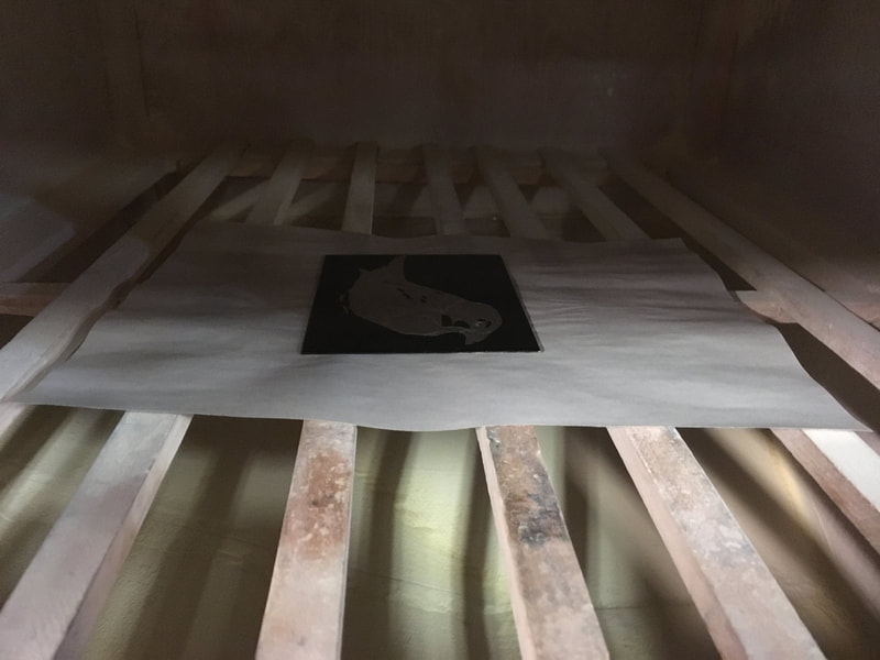
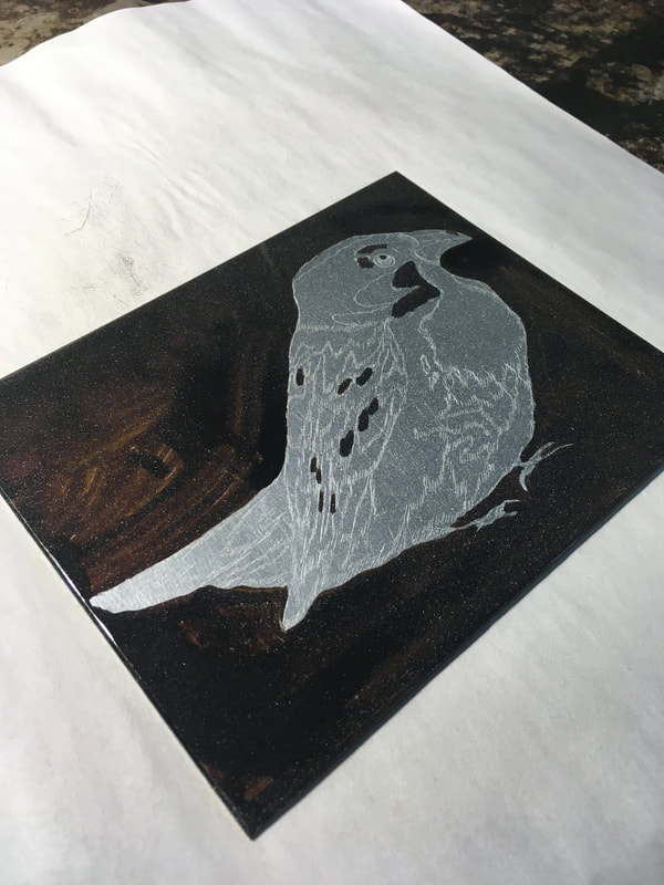
Next, came Birdie. What you see above is just one of over a dozen masking phases that when necessary in order to get the range of values I needed for my subject. When I went hunting for a subject with a wide range of values and selected the sparrow, I don't think I really knew what I was getting into. Each value section carefully mapped out involved masking, drying, etching, repeat. Until the plate had been exposed to the acid for at least one minute than it needed to be re-rosined and the cycle began all over again until the darkest values were achieved. I enjoyed this intensely detailed time consuming process. However, this experience taught me that this is not for everyone. With this and the concern about working with acids (even mild ones as in this case), I know I will not be introducing this technique in print making to my students this year. But, I intend on continuing to explore this vein, especially dry point, which involves no acids.
I can thank my etching colleagues for their suggestions regarding manipulating the ink on the plates to get shadow and texture effects.
On my own, more Bookbinding: Linen Tape Binding and Japanese Bindings
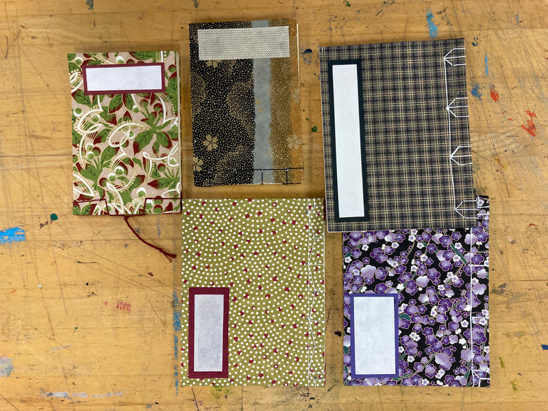
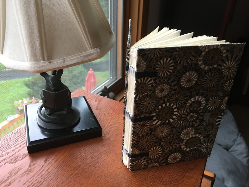
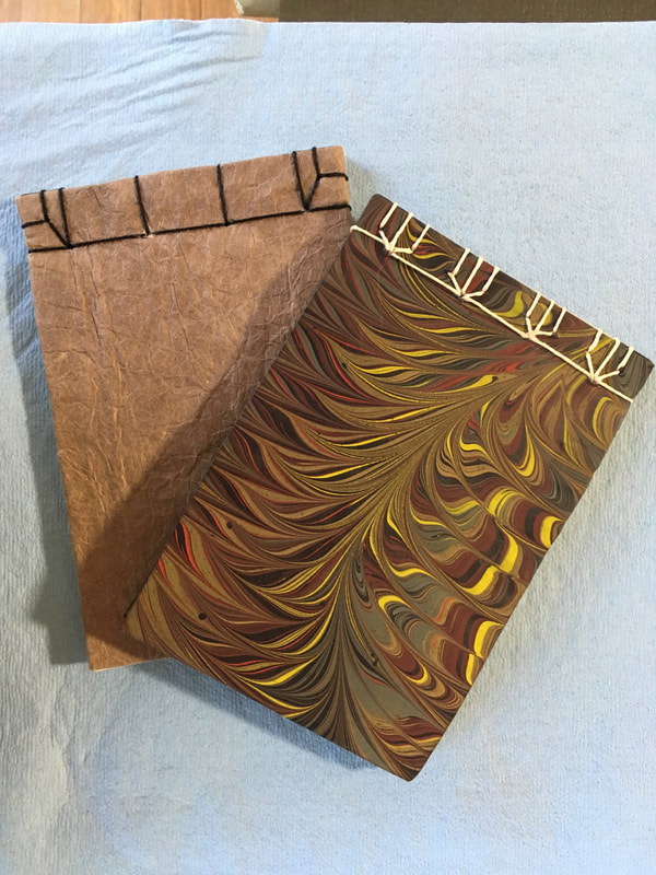
In my spare time, I decided to try my hand at some bookbinding own my own. I research a few different simple bindings and chose the ones that I could find explicit instruction for. This I found was very important because I tried one or two that I had to abandon because there was some "assumed knowledge" born of experience on the part of the person who wrote down the instructions. Unfortunately, I don't have a lot of experience, so two of my projects were not successful. On the bright side, I did learn a lot about the "logic" of assembly a functional and long lasting book as well as finer book craftsmanship. Above are my final products that worked out: a linen tape bound blank book with Japanese decorative paper cover and two smaller Japanese style bound blank books (Tortoise style stitch binding and Nobel style stitch binding). One book I used a Nepalese handmade paper cover and the other is a cover of paper that I marbled myself with my son last fall. It was a little exciting and a a bit nerve racking to final decided to cut one of the marbled sheets. Somehow that paper seemed more precious than paper I purchased. I'm already looking forward to another upcoming bookbinding workshop in August. That one will be focusing on coptic binding.
Summer Coursework: Week 5
Gently I stir a white feather fan,
With open shirt sitting in a green wood.
I take off my cap and hang it on a jutting stone;
A wind from the pine-trees trickles on my bare head.
-In the Mountains on a Summer's Day by Li Bai
Despite being written in 8th century China, the great poet Li Bai certainly captured that timeless feeling of a breeze stirring the still, moist heat of a summer's day and bringing with it gentle cooling relief. I have been thinking much about summer since we are now just past the cusp of blooming where I live. During my morning walks, I have watched Nature growing into maturity and blooming. Now she is tipping into a sweet exhaustion: her blossoms tousled, her fruits ripened and flushed with the sun.
I can't say that when I begin a work I set out to create a "mood" or even a message. However, as I reflect on my works in progress I certainly can see how my surroundings and the immediate experiences of my morning walks have shaped these works. I think my work may then be becoming a barometer for me, indicating those subjects and themes that are truly important to me. In considering how I might present my work either through the writing of an artist's statement or even showing it to another person, I become keenly aware of the intentionality in the act of crafting and shaping of that mood/message into the presentation. This statement making, I think can misrepresent the work. Making it something it is not or ever was out of a sense of necessity for proper presentation and clarity of explanation. But, if a picture is worth a thousand words, then I say to you: just look at my work, what it is and what I am is there.
I have been on a week hiatus from working in the printmaking studio, blogging and writing about my process. This was mostly due to one of my most favorite summer obligations, all be them few in number : teaching one week of middle school summer art camp. From this annual week of youthful exuberant creativity and silliness, I become recharged and brave again in my art. After all who among us cannot recall that wonderful experience of just diving into paints and pencils to fill a page with no worry what so ever of making "something good." So now that I'm recharged, I am only a little daunted at the task of reporting what I have been working on.
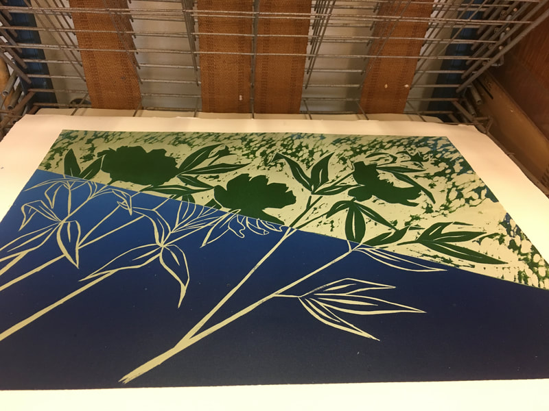
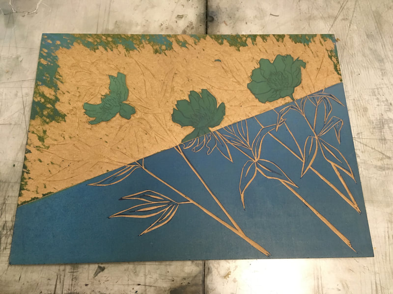
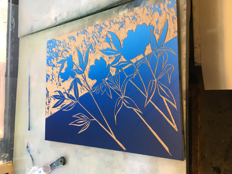
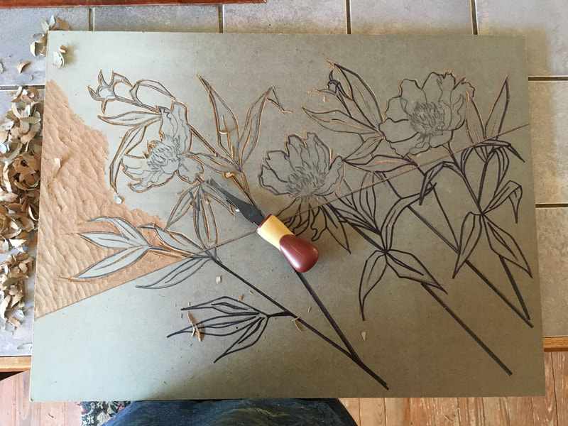
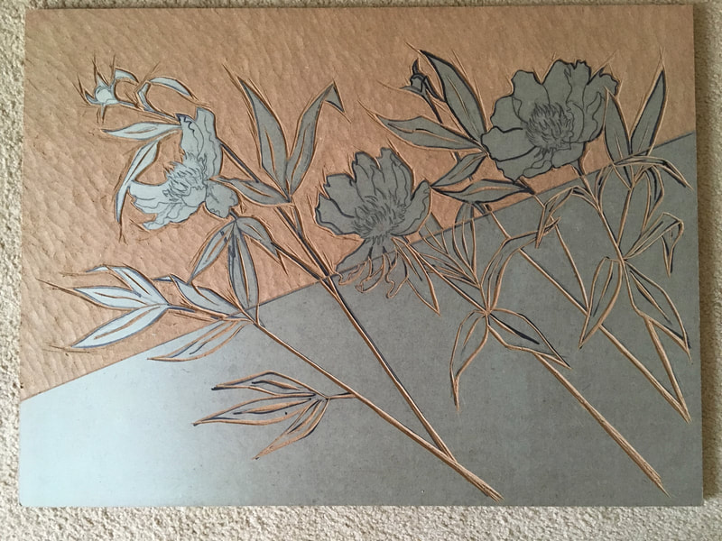
In the gallery above you can see the continuation of my first large woodblock reduction print, the Peonies. The second color was quite easy to add because of the design of the work. You will note that instead of carving away the lower half of the block I simply did not ink it. At times I did use tape to insure a perfect line, but if I kept a steady hand it was not necessary. All seven prints seemed to turn out well, although I still find the careful hand (or rather finger) registering to insure the proper alignment of the various colors within the image to be nerve racking. The last image shows the leaves removed and the blossoms remaining, so the first of the pinks will be the next color. I have to admit to feeling a bit of a pit in my stomach, carving away all those leaves that I so carefully drew on and shaped with the chisel. But, so much of making art is about letting go and trusting in the journey.
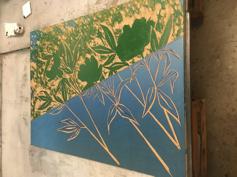
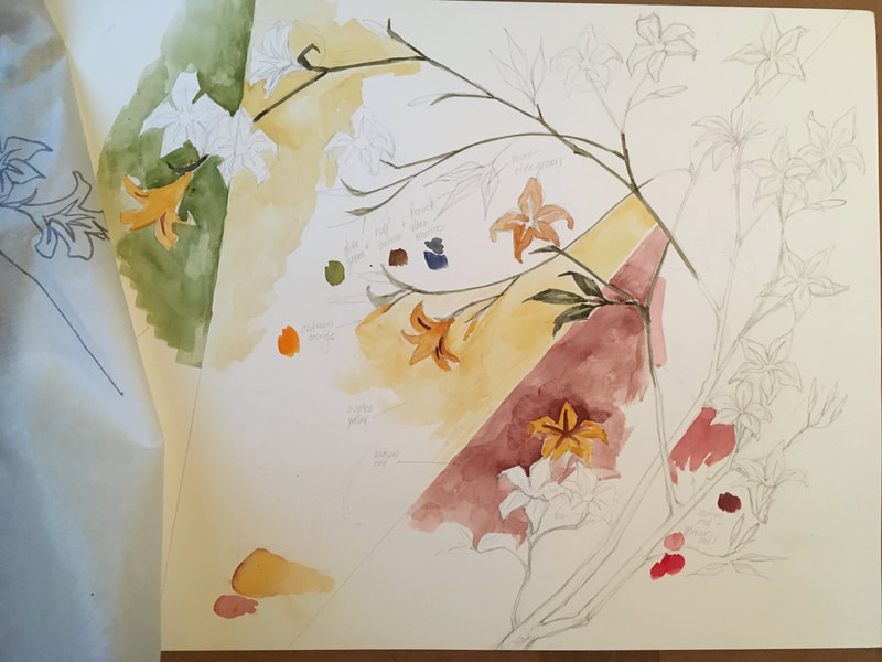
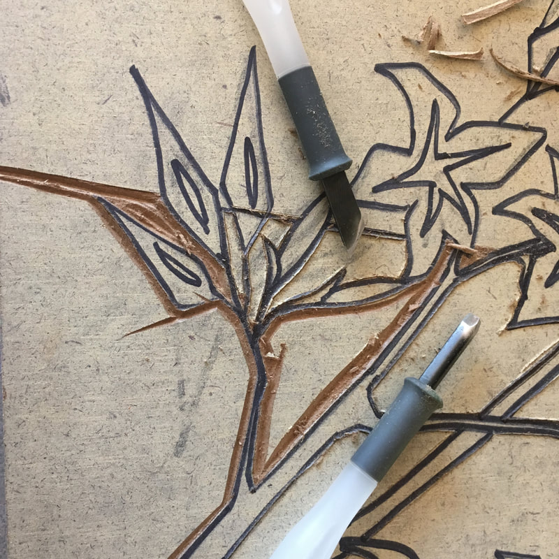
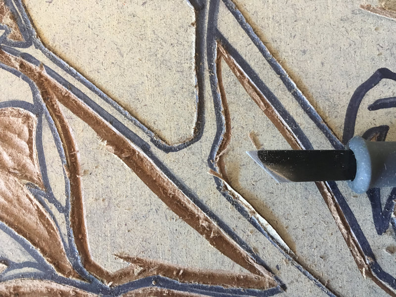
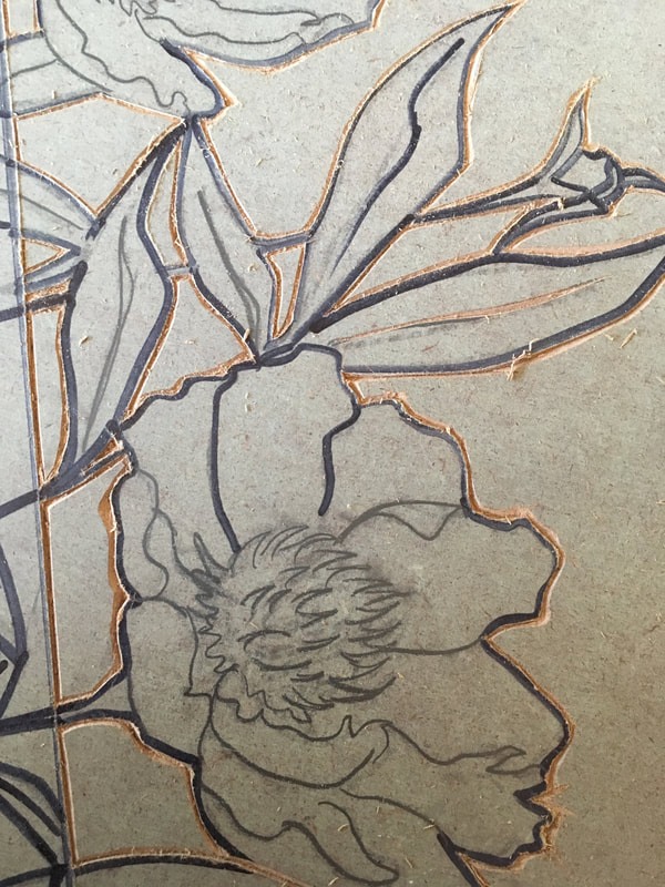
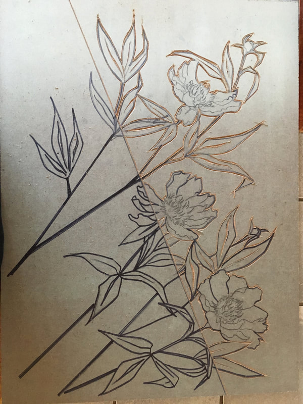
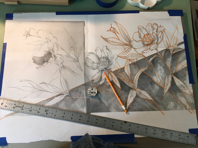
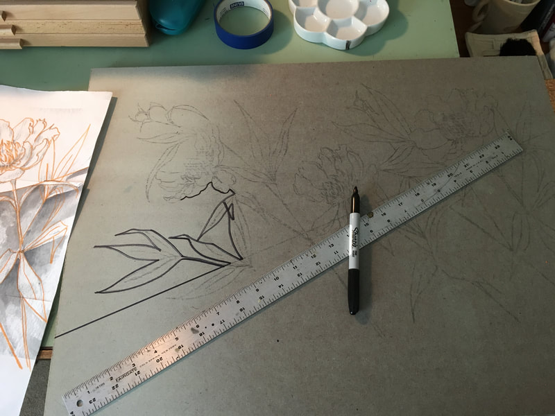
Above you can see the continuation of my work for the second large woodblock reduction print I have been working on. This time I decided to do the sketch on watercolor paper so I could easily experiment with different color palettes for the work. The peonies when originally drawn in my watercolor paper sketchbook and I was happy that i was able to add color with those, so I decided to expand upon that happy accident. You might notice that I have several close up images of the actual carving. I wanted to document this because learning this particular carving technique of outlining the line work edge with a knife and then coming back to cut a small "trough" at an angle with the same knife not only creates a sharp edge for clarity in printing, but also helps protect the printed image when removing the extra wood from around it. I am excited to print the first green of this image next class.
Here are a few of my favorite inspirational texts:
Here are a few of my favorite inspirational texts:
And then there was etching class and the start of my first aquatint:
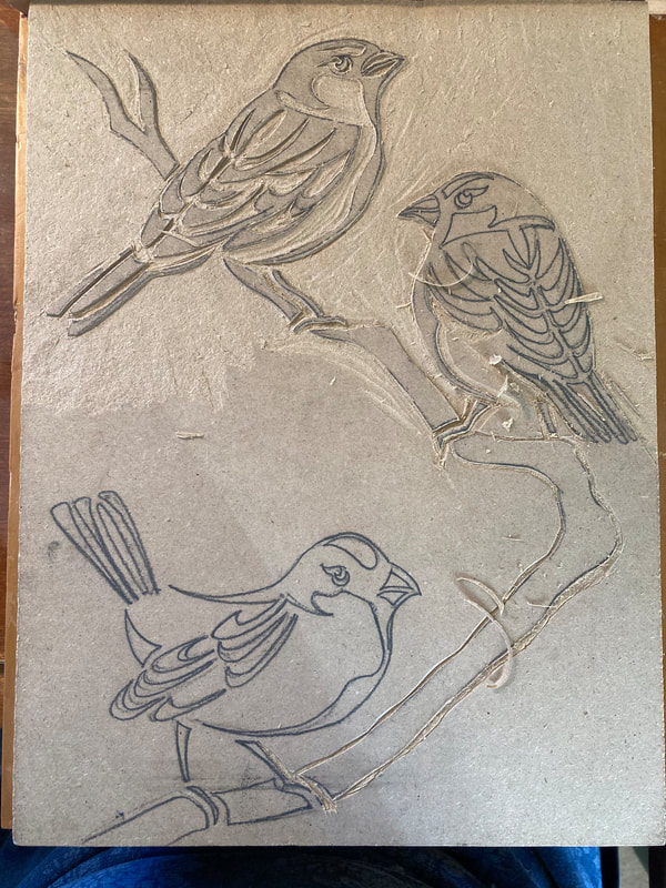
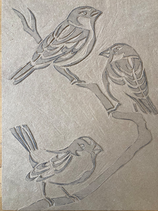
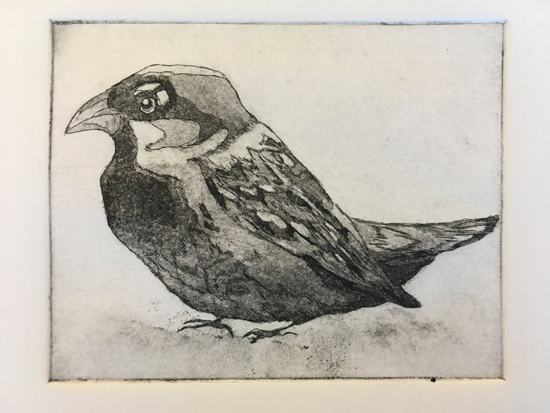
I debated for a long time what the subject for my first aquatint would be. I looked at a number of my teacher's examples and examples on line. I noticed that this technique allowed for a wide range of subtle transitioning values. So I decided on one of my favorite subjects: the house sparrow. I have a particular fondness for the small, so common they are often overlooked little creatures that lack "showiness." The dusky browns, grays, and blacks within the intricate pattern of the sparrow's feathers made the male of the species an excellent subject I thought.
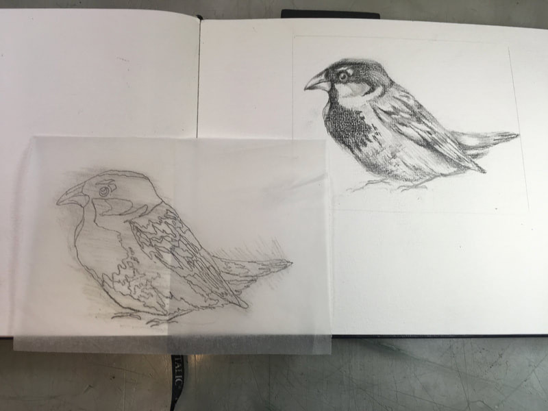
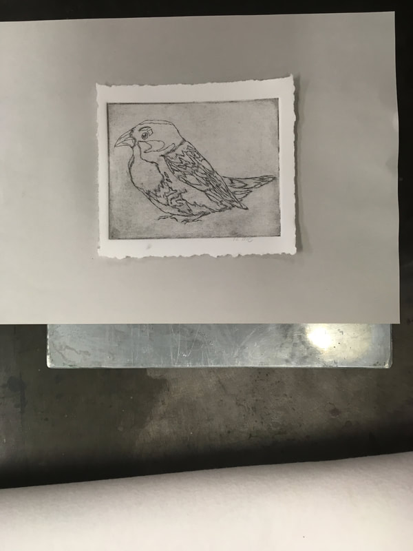
I began with a fully tonal pencil sketch. I then created a tracing paper overlay of the value patterns, kind of a "paint by the numbers" value map. The soft graphite transfers easily to the bitumen covered zinc plate with gentle rubbing. Using the line drawing as my guide, I then scratched the image through the bitumen and etched it for 15 minutes in the nitric acid solution. It is important to note that I used a very light broken line in my initial scratching on to the plate. At this point I'm not sure, since I have no experience in this technique but, I wanted to be cautious with the use of line because I did not want the line work in the end to over shadow the tones created by the rosin masking. After removing the bitumen, next came the first print. It was fun to see my cute little birdie buddy appear on the page! I then made a counter print by placing fresh paper on top of the the wet print with a spacer plate below the print "sandwich." The counter print is so that I could more easily reference my original drawing and then begin to map out the tones. Once this map was complete, I applied varnish to the areas of the plate that would be my lightest values. I then applied the rosin in the rosin box and baked it on. This will be the first light grays. Next class, I will begin the rhythmic process of etching the plate for 5 seconds at a time and then masking, rosining, and etching again until I have the full value range...at least that's the theory and the hope!
In between the reduction prints and the etching...there was bookbinding!
Pyramid Atlantic Art Center is a nonprofit contemporary art center focused on printmaking, papermaking, and book arts. This was my first visit to Pyramid Atlantic and I took Bookbinding I from a wonderful a wonderful book artist, Aubrey Dunn. To learn more about Pyramid Atlantic and Ms. Dunn check out the links below. Also, while at the book binding workshop I learned about the Washington Rare Book Group. It seems to be a group of bibliophiles who organize themselves for tours of libraries, collections, and various lectures on all things book related. I am am currently on their facebook feed and have been checking their website in the hopes of perhaps join in on a tour or lecture with this group.
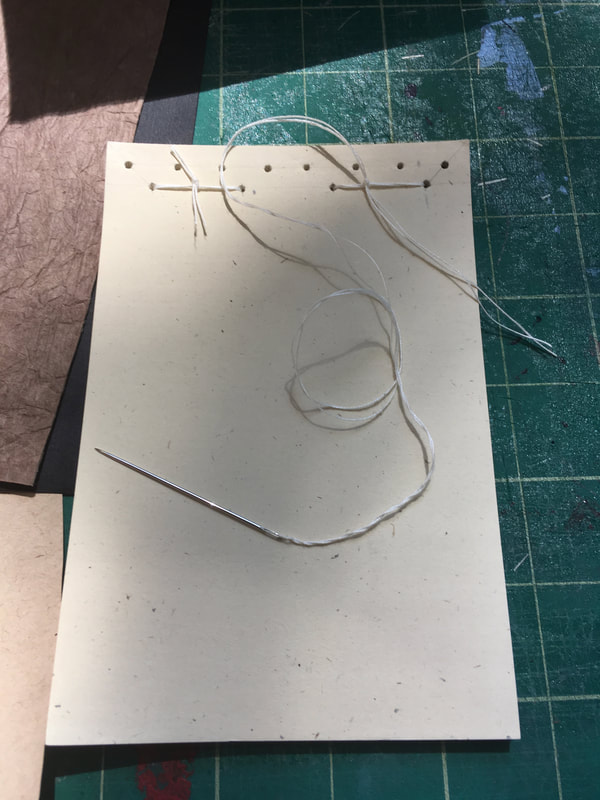
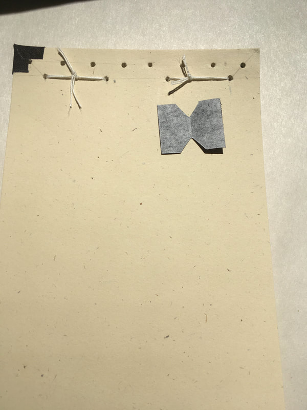
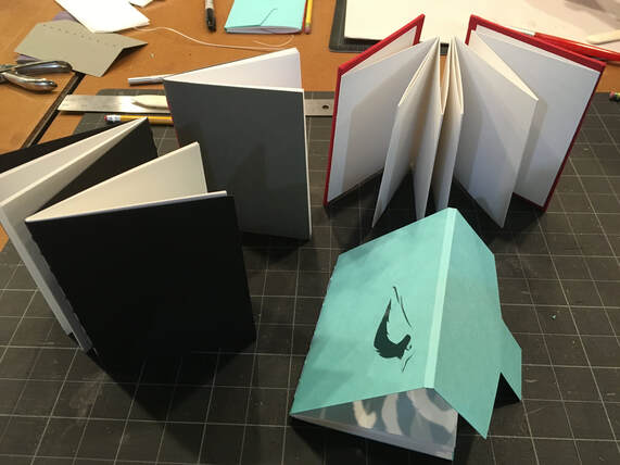
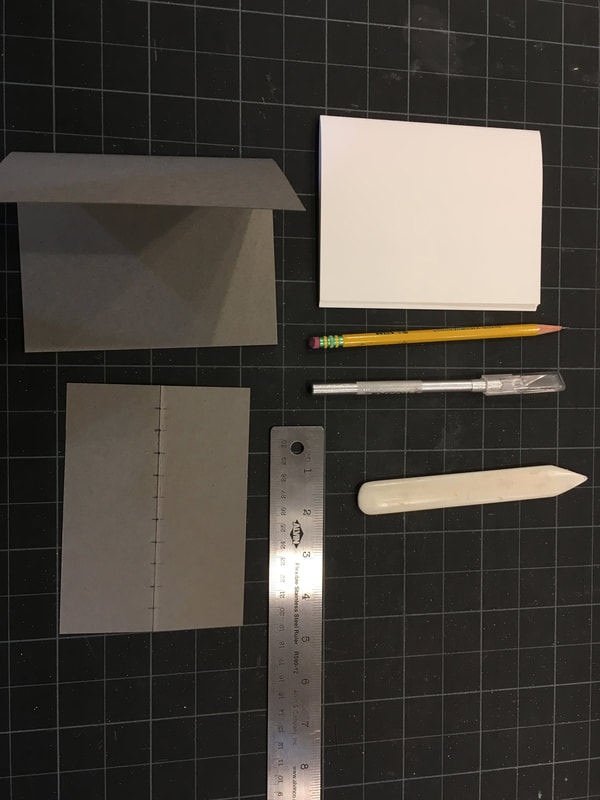
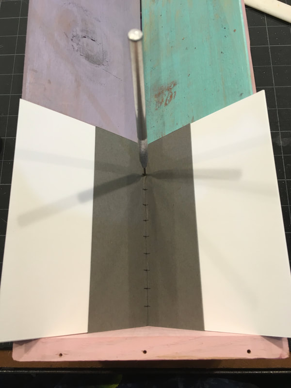
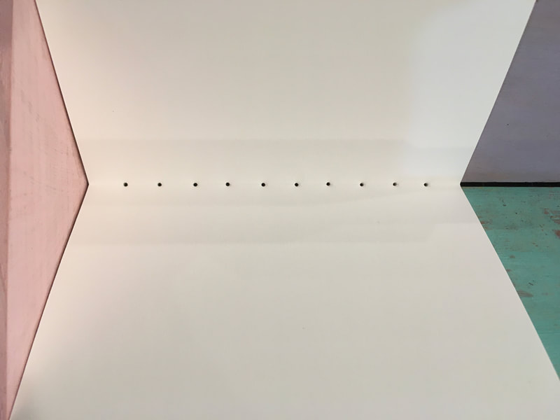
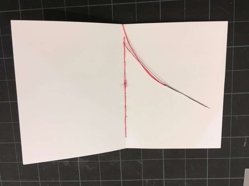
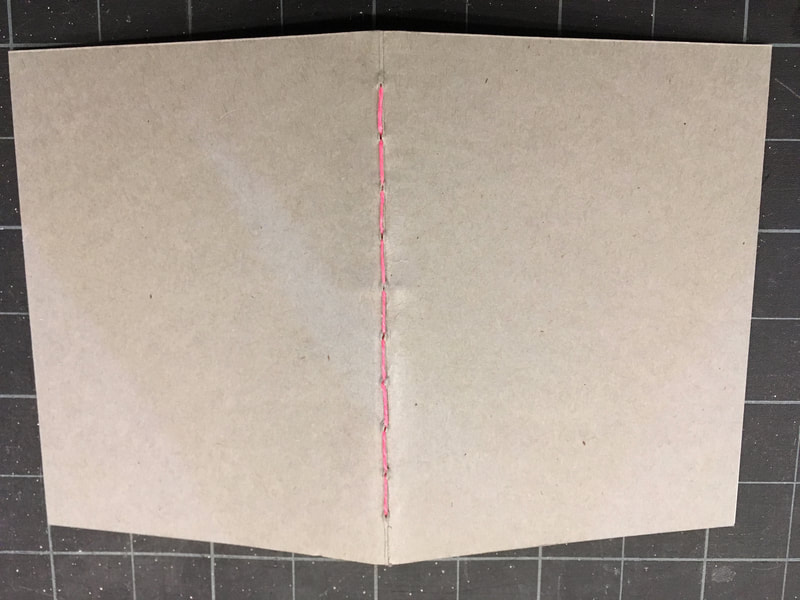
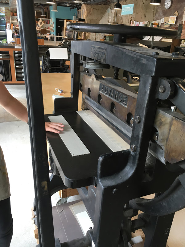
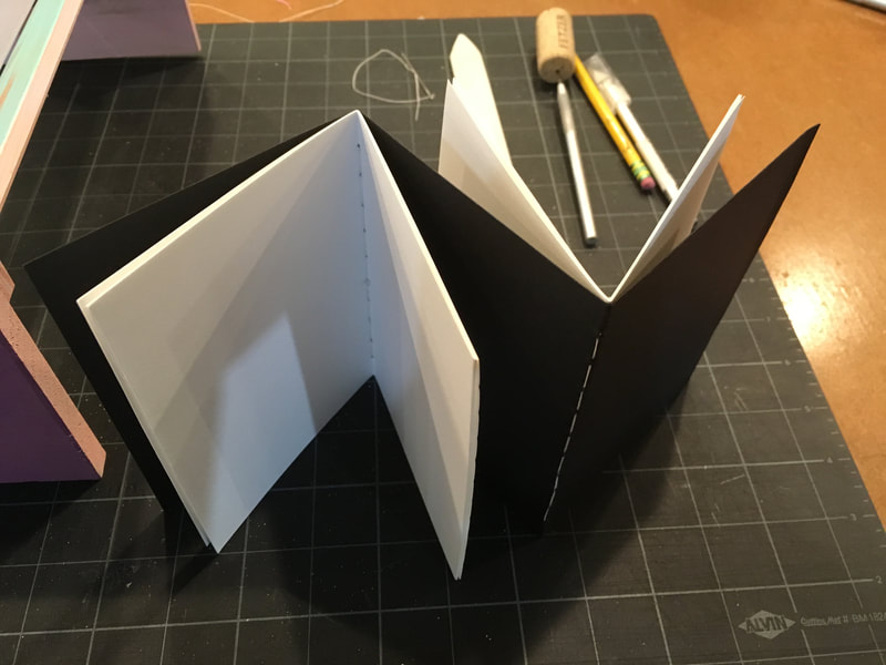
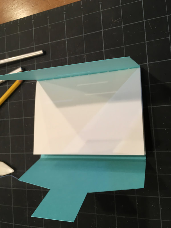
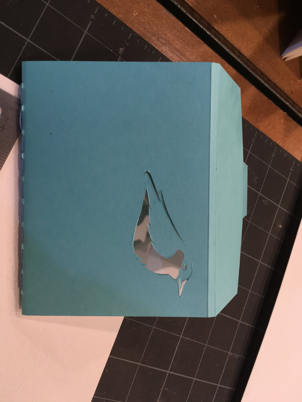
The basics of book structure and materials, some history, and the fundamental tools and their proper use were covered. We had the time, space, and guidance to create four books: a basic stitched journal, a dual stitched journal with single folded cover, an envelope folder stitched journal, and lastly an accordion book with book cloth cover. Below I've documented many of the key tools, materials, and steps in creating these journals. I was so excited to share this new knowledge and my nascent skills that I had my summer campers make accordion books! Since then I have been experimenting with creating some books of my own, so check back to see those.
Summer Coursework: Week 3, July Already???!!!
|
|
I suppose time does fly when you are having fun. It is already the third week of my summer printmaking extravaganza! So here is where I'm at. In my woodblock class, I have completed the first layer of carving and printing for my large (18"x24") reduction print. You can see the process pictures above and I have a short video to the left showing the second pressing pull off the block. I'm trying hard not to be nervous about this because there are only 7 of these in this edition, but I'd be lying if I didn't admit that it weighs on my mind every time I try to register the block on the page! |
So far, I'm pleased, but this is only two colors down and at least four more to go! Please don't think me a glutton for punishment, but I had another idea for a second large reduction print so I decided to dive in and print the background color even before I've finished the final sketch. You can see this start below. I'm far more pleased with these than my first backgrounds for the reduction print above and feel like I am getting more comfortable working large and with the big rolling pin style roller for inking the block. If all goes well this week, for homework along with the final sketch for the second large reduction print I'm hoping to create a relief print plate as well. Stay tuned for more about this project and cross your fingers for me for the rest!
Last week I gave my copy of the book The Invention of Clouds (check my blog post on this from last year) to my Dad to borrow. A devoted student of history and science, my Dad shared my delight with this little book on Luke Howard, the Father of Modern Meteorology,
and the story of how the clouds got their names. This conversation sparked an image for me. So one evening after a summer storm, I sat on the couch and tried my hand at direct sketching on to a prepared etching plate. You might recall, the prepared plate has had its edges file beveled (a tedious process that is my least favorite part of this printing technique) and been coated with asphalt/bitumen and rosin mixture. For my second intaglio project, I wanted to practice direct drawing so I could "get the feel" for the stylus and pressure needed to create a clear image on the plate. It was fun to work small and have the chance to experiment with manipulating the ink on the plate to get different effects and moods for the sky. Here are the results below. The third image below is one of my "lessons learned." Look carefully and you will notice a dark line just to the right of center running through the image. This was from a very small wrinkle in the press blanket, the middle blanket of the three that are between the roller and the paper. I was amazed that the pressure is so great that the ink registered this anomaly. Needless to say, I'm double checking the blankets now before I go to press! For homework this week, I'm trying to come up with an image for the aquatint technique. So I am thinking a great deal about values for this class which is a quite different mindset than that of the woodblock world.
and the story of how the clouds got their names. This conversation sparked an image for me. So one evening after a summer storm, I sat on the couch and tried my hand at direct sketching on to a prepared etching plate. You might recall, the prepared plate has had its edges file beveled (a tedious process that is my least favorite part of this printing technique) and been coated with asphalt/bitumen and rosin mixture. For my second intaglio project, I wanted to practice direct drawing so I could "get the feel" for the stylus and pressure needed to create a clear image on the plate. It was fun to work small and have the chance to experiment with manipulating the ink on the plate to get different effects and moods for the sky. Here are the results below. The third image below is one of my "lessons learned." Look carefully and you will notice a dark line just to the right of center running through the image. This was from a very small wrinkle in the press blanket, the middle blanket of the three that are between the roller and the paper. I was amazed that the pressure is so great that the ink registered this anomaly. Needless to say, I'm double checking the blankets now before I go to press! For homework this week, I'm trying to come up with an image for the aquatint technique. So I am thinking a great deal about values for this class which is a quite different mindset than that of the woodblock world.
Summer Coursework: Intaglio Project 1 Complete!
I was so excited to go to class Tuesday night since I was pretty sure that I would be able to print my first project. The zinc plate had already been etched in the acid once and I had spent the week adding some more detail lines with the stylus. If you look below you can see the complete drawing on the ground covered plate. The next step was to remove the ground with a mild solvent (we used "Barsol") and then to gently scrub the ground away with a soft toothbrush until the plate is shiny clean. Inking the plate is a messy affair. First the plate is completely, but thinly coated with ink. Using a fabric called tarletan, which is a thin cheesecloth like fabric with a great deal of sizing so it is stiff, the ink is spread into the etched lines and progressively and gently wiped off. I was surprised at how little ink actually appears to be on the plate. The lines are distinct, but it hardly seems enough to make an image. But, the great pressure of the press and the softness of the damp paper (with was soaked and then rolled out under a towel to remove excess water) insure that the small amount of ink is indeed enough! If you look at the images below you can see the pressure of the press gives the paper the classic etched plate impression.
The was a bit of a mishap. While I was spreading the ink on my plate something sharp, possibly a metal filing, got caught in the ink and made a small scratch on my plate. No worries though! There is .solution for that: carefully using a flat stylus, small barren, and a "steel wool" swab with some 3 in 1 oil, it was possible to polish out the line. I was actually pretty happy to learn this technique, not only because it will be handy in the future for repairs, but because this opened up and entire world of mark making on the plate. I am looking forward to experimenting with the next project already!
Lastly, but certainly not least it was exciting to discover that the ink could be manipulated to create different effects. By using my fingertips, heel of my hand, cotton swabs, and the tarletan I was about to create different values in specific areas on the plate. You notice when you look and the pictures below that I also experimented with making the prints themselves darker, but leaving more ink on the plate. Our teacher explained that when each print is manipulated by hand to this degree that the etched work is really considered more of a "monotype" since every work is completely unique.
Summer Coursework: Advanced Woodblock Printing, Project 1, Phase 2
Carve, carve carve, that's what this week has been! I've learned a lot about carving techniques, wood and mark making with the chisel. Even starting to choose my tools based on the knowledge. Looking forward though getting to print the next phase!
Summer Coursework: Introduction to Intaglio, Project 1, Phase 1
I guess if I had to give one piece of advice to give a student I would say, " Draw, and draw more." This is because throughout the school year my time is so limited that it is difficult for me to engage in long term projects, so I draw and draw more. Then comes summer and my sketchbooks become a veritable treasure trove of source material for me to run with. Thank goodness, because this summer I really need them!
Returning to the Torpedo Factory in Alexandria, VA on Tuesday night, I began my study of intaglio, that is etching techniques. So printmaking is rife with "backward" or "mirror" thinking because everything you do prints the other way around from how you are looking at the work as you prepare it. As if that not being enough, I'm taking woodblock on Monday nights where the raised surfaces of the block print and now on Tuesday night everything that is scratched into the plate prints. Left is right and up is down, literally! Fortunately, I get a full day in between to shift gears!
Above is my first intaglio project. We are working on zinc plates. The first step was to bevel all the plate edges to a neat 45 degree angle with files to protect the press blankets and printing paper from being cut by sharp edges. The second step was the coat the zinc with a ground and bake it on a hotplate till it was smooth and hard, about 3-5 minutes. Once the plate, is cool we used the press to transfer a sketch in soft graphite on tracing paper on to the plate. Using the shiny graphite lines as a guide we then gently scratched through the ground to reveal the surface of the zinc.
You can see I started with a sketch of my cat, Merlin, to create a simple line drawing. I then added more lines to the figure and the background to create values. I feel a bit like I am working in the dark here because I don't have a sense for how deep is too deep or how much line is too much line. Once I felt like the drawing was complete, I varnished the edges of the plate to keep the acid from seeping in below the ground from the edges. Next week I'll begin to place the plate in the acid bath for timed "dips" to allow the acid the etch the lines into the plate and then print. One truly interesting thing I learned this week was like mokuhanga, etching requires that the paper you print on be damp. This is easily the most technique heavy art process I have ever done and I am so curious to see how it turns out. Stay tuned!
Summer Coursework: Advanced Woodblock Printing, Project 1, Phase 1
I was so excited to return to the Torpedo Factory/Art League in Alexandria VA for another summer of printmaking thanks to the continued professional development support from my school. It was such a pleasure too to see so many familiar faces, including that of my instructor in woodblock, Jennifer Dunbar. As I walked from my car to the studio, my head was literally spinning with ideas. What to do first? Then, of course, as is the usual way with me something caught my eye and all those ideas spinning in my head were out the window and I was on a new, completely unexpected path. What caught my eye was a large piece of MDP board 18"x24" and the large detailed works of fellow students with far more experience than me. So I decided Big was the way to go!
Beginning with an unfinished study of peonies from my garden in my sketchbook, I began to consider what would be the palette for this large format reduction print. In studying Jennifer's work, I have been fond of her naturalistic and subtle palette so I settled on a sea foam green of the background for this reduction print with a slight light to dark variation across the canvas of Rives BFK paper. I printed seven backgrounds the first night.
Such a large block demanded that I get started right away on planning the final composition so I could begin carving as soon as possible. Employing a bit of scanning and Photoshop magic (with the help of my husband) I was able to hash out the final composition, transfer it (the old fashion way) to the block.
My reading on printmaking (see gallery photo for my two favorite references) and practice this past academic year on my own with Mokuhanga techniques has taught me the advantage of taking the time to create a very clear and distinct drawing on the block. I am fond of using Sharpie marker. I find that it is really difficult with my skill and tools to carve a line thinner that the Sharpie can draw on the wood, so not only does it help me create a bold, clear image, but it helps me gauge my line thicknesses in a realistic way. Lastly, I use the thinner Micron pens to help delineate the different parts which will in fact become different carved layers of the block. The composition and drawing completed, I'm sharpening up my chisels!
An Oldie but a Goodie: Spring Bulb Progression
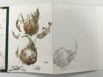
One of my favorite project to help hone not only my students' eyes, but my own eyes to truly seeing is to draw a force spring bulb over the course of about two weeks. Watching and recording the changes in form, color, line, and texture I find really is an artistic sensory "tune up." This year I decided to combine my foundling book making skills and I am creating a handmade according book along with my students.
I am truly looking forward to sharing my students' completed work as they have been a true inspiration to me in developing many innovative techniques with color, texture and collage. Here are a few images of my project so far. Feel free to email me if you have any questions about this project.
An Altered Book Project
I was introduced to the concept of the altered book by my friend and colleague Kourtney Stone and the Maryland Institute and College of Art's Artist's Book Collection. Although, special arrangements must be made to access this collection, I encourage anyone interested in the book arts to do so. for it is an inspiring, beautiful collection filled with ingenious texts that break the boundaries of what most of define as "book." Being an avid advocate of the sketchbook habit and long time carrier of a sketchbook, I decided it was time to change things up.
Recently, I purchased a text of Sappho's poetry fragments pictured here. It is a beautiful book providing both the original Greek (not that I am capable of checking the translation!) and the English translation of the fragment on the opposite page. I have begun by altering the cover. I wanted the cover to reflect the fragmentary and broken nature of the the poetic works of art that remain beautiful despite this which are contained within the covers of the book. The calligraphic forms of the Ancient Greek I always find intriguing. The small fragments of text make of a great deal of white space in the book, perfect for sketching! Although the quality of the paper is somewhat challenging for wet media, the pages can act as foundations for better paper to be attached. I have also introduced this as a start up project with my Advanced Drawing and Painting students. Here is my start, stay tuned for more!
Recently, I purchased a text of Sappho's poetry fragments pictured here. It is a beautiful book providing both the original Greek (not that I am capable of checking the translation!) and the English translation of the fragment on the opposite page. I have begun by altering the cover. I wanted the cover to reflect the fragmentary and broken nature of the the poetic works of art that remain beautiful despite this which are contained within the covers of the book. The calligraphic forms of the Ancient Greek I always find intriguing. The small fragments of text make of a great deal of white space in the book, perfect for sketching! Although the quality of the paper is somewhat challenging for wet media, the pages can act as foundations for better paper to be attached. I have also introduced this as a start up project with my Advanced Drawing and Painting students. Here is my start, stay tuned for more!
Woodblock Alphabet
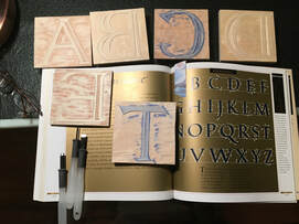
One of my latest projects is carving each letter of the alphabet in the Renaissance font. I chose this font because it has a distinct orientation for each letter. My hopes is that this becomes a teaching tool for my students. These letters in this style will help them see the "flip" and hopefully help them visualize how images and objects need to be reversed when printed. I am also hoping to create a large printer's block so I can demonstrate simple type setting as well.
This exercise is helping me improve my wood carving skills as well.
Dog Walking Sketches
Sketching during dog walking makes for a challenge at times but, I find that it forces me to keep it simple and direct. This can be helpful when you are detail oriented in your work like me!
Latest Silk Painting
This is the fifth and final piece, a framing element in a large silk wall hanging triptych I am working toward completing. The color shift toward cooler tones in this piece was a bit unexpected, but nonetheless works well with the overall composition. Stay tunes for the entire work!
Continuation of My Mokuhanga Accordion Book Project
This accordion book began as an "Inktober" project with my students, but has taken on a life of its own! The background was prepared with a combination of watercolor wash with tea and homemade black walnut ink staining. The plants are printed from carved blocks of shina plywood with traditional Chinese watercolors. Lastly, the little birds are drawn in a combination of India and Black Walnut inks using a crow quill pen and wash color brush. Slowly, but surely I'm making progress through the little book.
More Mokuhanga
Here are some images of my current printmaking project. As part of the "Inktober" Project that I encourage my students to participate in, I have been creating this according book employing printmaking and ink drawings. I am using both Chinese watercolor, handmade black walnut ink, traditional Sumi ink washes with India ink line work.
Teaching myself more about Mokuhanga
Portrait of a New Neighbor...in mixed media
Final Printmaking Extravaganza!
If you have been following my progress in class, you might recall the above left image of the Kingfishers. It was pretty exciting last night to see the final product emerge after much drawing, planning, carving, learning and practicing masking, and the art of making a good clear print. Not everything happens as planned in printmaking. images seem to somehow develop a new and different life as they move from the sketchbook page to the wooden block and then ultimately to being printed. For me, (and I am sure this is my inexperience speaking) I was surprised at the printed image. It was never quite what I expected. Sometimes that was pleasant, sometime disappointing, but every time I learned. I was particularly excited that I learned to use the block carving gouges not only with a bit of skill, but also I came to understand how they can be employed through direction, depth and pressure to create negative space or a kind of language of line through the "chatter" of the remaining wood. And most of all, I had an infusion of patience, because nothing...not...one..thing...in block printing is without effort and time.
So maybe you are wondering about the prepared papers and the heron. Through sketches the bird became more of a Bittern than heron. It was seeing an American Bittern in the marshes near Cape May, NJ that launched me on a life long love of birding. And it seems apropos that it would be this bird that was part of the beginnings of my woodblock printing study. carving the block itself was demanding at times, particularly in keeping the smooth curves. But, I found that tracing the drawing carefully with my trusty carving knife went a long way in keeping the gouges channeled along the lines I had drawn. It was also really timely to read about this very carving technique in the Japanese Woodblock Printing Workshop text the evening I started the carving! Below are the results.
So maybe you are wondering about the prepared papers and the heron. Through sketches the bird became more of a Bittern than heron. It was seeing an American Bittern in the marshes near Cape May, NJ that launched me on a life long love of birding. And it seems apropos that it would be this bird that was part of the beginnings of my woodblock printing study. carving the block itself was demanding at times, particularly in keeping the smooth curves. But, I found that tracing the drawing carefully with my trusty carving knife went a long way in keeping the gouges channeled along the lines I had drawn. It was also really timely to read about this very carving technique in the Japanese Woodblock Printing Workshop text the evening I started the carving! Below are the results.
Last, but certainly not least was learning the watercolor printing technique. Carving in the Shena plywood, as opposed to the heavier and denser MDP particle board, was a joy. I also appreciated how the medium was both easy to cut and retain tiny details. Because of this I created a number of images based on some of my favorite subjects: fish, flowers, and mice. It was also a great gift to be able to use some of the tools in this process which had been a gift to me many years ago from one of my father's colleagues in Japan. I find it is always a reassuring affirmation somehow when old becomes new again. I enjoyed this technique probably the best of all despite the fact that it was certainly the most challenging. There was not nearly enough time (or energy!) last evening to do everything I wanted to do with these little blocks. I plan to do much more, so stay tuned for additional works! Below are my first attempts.
And finally, a few other works completed in class.
Prepared Papers for Woodblock PrintingAnother suggestion from my teacher, prepared papers for printing. So I went ahead and prepared six sheets in a technique that I have been fond of in the past for its soft atmospheric effects. Here I've shown 90 lb. Arches brand watercolor hot press, stretched, with a watercolor wash that was "mopped" with a watercolor stained paper towel, and then tea stained. I am hoping to print the drawn block shown here, with the bittern, on these backgrounds.
|
July 30th's printing class was a busy session of printing my Kingfisher Project and learning the ropes of mokuhanga, that is the Japanese technique of woodblock printing with water based inks. Unfortunately, I did not have my camera, so the pictures from that printing session will have to wait till our final session. I was pretty excited about learning mokuhanga because all of the works of woodblock that I love so much (e.g. Hioshige, Hokusai, and Utamaro) are done using this technique. These works also were a major influence, particularly in color, line, and the compositional principles governing the use of negative space upon many artists I love, particularly William Hamilton Gibson, Vincent Van Gogh, and late 19th century illustrators in both Europe and America as well as the Art Nouveau movement.
Last week we had a hiatus from class, but I had plenty to do for homework. Specifically, designing and carving our mokuhanga blocks of Shina plywood. Above you can see that I decided to create linearly linked images of fish. I also took a chance and carved the back (to be thrifty) of the blocks since they do not have to go through the heavy pressure of the printing press, only a hand barren. The back of the blocks have an "above water image of dragon flies and water lilies. I haven't yet tried printing them, I am thinking to wait until class this Monday to do this with my teacher. But, I'll see if my curiosity gets the best of me. Also, shown here are some of my reference texts. Both are excellent step by step guides, which is just what I will be needing once our class ends. They are also filled with wonderfully inspirational reproductions of masterpieces of printing both historic and contemporary.
Last week we had a hiatus from class, but I had plenty to do for homework. Specifically, designing and carving our mokuhanga blocks of Shina plywood. Above you can see that I decided to create linearly linked images of fish. I also took a chance and carved the back (to be thrifty) of the blocks since they do not have to go through the heavy pressure of the printing press, only a hand barren. The back of the blocks have an "above water image of dragon flies and water lilies. I haven't yet tried printing them, I am thinking to wait until class this Monday to do this with my teacher. But, I'll see if my curiosity gets the best of me. Also, shown here are some of my reference texts. Both are excellent step by step guides, which is just what I will be needing once our class ends. They are also filled with wonderfully inspirational reproductions of masterpieces of printing both historic and contemporary.
Building a Beetle
I took a hiatus last week from working in the printmaking studio and tried my hand at sculpting. I attend my illustration Guild's workshop on how to sculpt a beetle. It was fun, but a good deal of mental work to shift gears to thinking simultaneously in the round. Michelangelo said that sculpture was the most challenging of the visual arts and I think he was right! It definitely had it's frustrating moments when after carefully sculpting one side of the beetle and being satisfied with that work, I would turn it to discover that 50% or more needed to be redone because I had not considered the form from another side. The workshop was taught by long time Guild member Karen Johnson. She provided some wonderful handouts as well as step by step instruction. See the gallery below for my beetle building!
Fourth and Final Step in the Reduction Print Project
|
One of the more nerve racking things I have ever done in art is to carve away all my careful work from the previous week take was the printed surface of the water/fog element from this block. The work was slow because I had to be very precise and double check my drawing constantly to be sure that I was not carving away some portion of the surface of the block that was essential to my flower image. Then came the decision regarding how to achieve the two different colors of the flower and the leaves. I did consider the possibility of an addition step of printing only the leaves last (thus having to carve away the flower because the leaves were a darker value.) . Thankfully, I had a bit of a brain wave and opted to experiment with transitioning the colors from light blue violet to dark green directly on the block. I was pleased with the results and probably more importantly I learned a lot. What did I learn:
1. sketch out my ideas ahead of time 2. experiment! 3. how to adjust the pressure of the press and what a difference it can make. 4. don't throw anything away, even your scraps...it might suit another project/color way/composition or be made into something else. 5. listen to your teacher and look at your classmates work. 6. accidents Are opportunities 7. chisels are Really sharp, I have become the class band-aid queen! |
So now I have this really nice block with an iris flower and bud on it and I'm thinking about the famous folding screen with irises by the artist Korin...not sure where I'm going to go with this, but going to start by visiting the art supply store to look at papers!
Kingfisher Block Print Revisited
This week I opted to simply print the kingfisher block with one color. I wanted a strong dark value so I chose black with a strong ultramarine blue component in the hopes of giving the very dark a bit of life and dimension. I also increased the pressure on the press in order to pick up more "chatter" from the block itself. This was an unforeseen and unintended compositional element that I really like, so I wanted to emphasize it more. I like the reading of the bird in the moonlight or in the sun so I began to prepare a background color, the orange/red you see on the table behind me and then next week I will print the blue/black kingfisher on that. The last image shows the next block I intend to carve. I will carve a negative of the kingfisher, but note that the block has been split. I am hoping to use a masking technique that will allow me to mix and match positive and negative halves to create a visual rhythm as see in my sketch on my blog from earlier this month.
A New Block Print: The Kingfisher
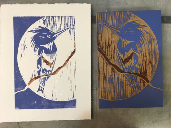
Here is my second project in my printmaking class. A traditional block print derived from one of my many sketches of kingfishers. The unexpected surprise here was the "chatter" that is, the carved lines that print. The other surprise was how the addition of the dark contrasting framing element outside the circle. I had initially always thought of the bird sitting on the branch with the sun on its back, but here the reading completing change for me. It looks to me now as if the bird is sitting in the moonlight and the chatter leaves or delicate branches hanging down.
My teacher encouraged me to try a two color print by carefully inking the branch and the bird breast a different color. It was difficult, but fun to try. The results have me looking forward to attempting a multi colored block print.
Third Step in Reduction Block Print
So here I began by carving away all the areas of the background which I wanted to keep. It felt very counter intuitive. What is printed here is a fog/water element as well as the leaves and stem of the flower and the flowers itself. My teacher, Jennifer, encouraged me to go for a change in color and value with the flower and fog elements since this was a light value and future colors would be layered on top. It was interesting too to see how the results varied depending on the color and texture of the paper.
Coloring Book Work Continues
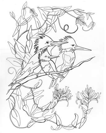
It was truly exciting to discover that I could continue my exploration of line and the expression of space through the hierarchy of line by creating a second work for the coloring book project. Sometimes too much choice can be a cruse and a limited palette for expression a gift. That certainly has been the case here. Inspired by another favorite local bird, the kingfisher. I love they way they live in cavities within the local cliffs which are often covered with honeysuckle. Such a beautiful contrast in curves and sharper lines in the forms of the two.
Like the herons, I have explored the kingfishers in sketch, silk painting, watercolor and now in line. Each time the composition changed, but one essential element for me was to always capture that keen, attentive eye with which these small but tough birds survey their surroundings.
I will be sure to announce the publication of the coloring book on my blog so stay tuned!
Reduction Wood Block Printmaking Technique
The above images represent Week One and Two of the Introduction to Woodblock Printmaking class I am taking. After selecting a block of MDF particle board for its attractive proportions, I began sketching an image that had a strong vertical motion as well as interesting organic shapes. The iris flower is a classic block printing subject in Japanese works especially those by the artists of the Ukiyo-e and Rinpa traditions. My teacher pointed out that I am fond of negative space in my work. I never really thought about it before, but it seems that in reflecting on my process , I do consider the shapes of the the voids a great deal as well as the balance of solid and void. I then considered color. Knowing that the iris would be cooler blues/violets, and greens I decided to go with a contrasting warm background. By creating a smooth tradition from a visually heavier darker warm hue at the bottom to a lighter warm hue at the top, I am hoping to reinforce that vertical movement inherent in the shape of the overall composition.
In the third picture, you can see how my sketch developed to include at "fog element" depicted with a strong geometric style. In order to print this element it was necessary to draft out my entire idea for the block in correct size and proportion (see tracing paper). Because this is a reduction print, I then had to carve away the background the I want to be visible in the final work, thus the printing area will get progressive smaller as I add more colors to the works. I am printing on Rives BFK paper.
In the third picture, you can see how my sketch developed to include at "fog element" depicted with a strong geometric style. In order to print this element it was necessary to draft out my entire idea for the block in correct size and proportion (see tracing paper). Because this is a reduction print, I then had to carve away the background the I want to be visible in the final work, thus the printing area will get progressive smaller as I add more colors to the works. I am printing on Rives BFK paper.
An Unexpected Project: Participating in a Coloring Book
I always start summer with a plan. But, it seems that it is the very nature of art to be a journey that digresses. The Bauhaus Master Painter, Paul Klee (that's pronounced "Clay" for my less experienced students) said, "A line is a dot that takes a walk." That quote seems particularly apropos in this specific case. I planned to be doing a great deal of color work this summer, from my own painting to a printmaking class I am taking for professional development (see my blog). And then this happened:
|
A talented and energetic colleague of mine from the Guild of Natural Science Illustrators, Cordelia Norris came up with this:
"A coloring book of North American nesting birds and their young featuring work by talented illustrators from around the country. This is an educational coloring book about nesting birds showing parents with their hatchlings. Much like human children, nestlings need their mothers and fathers to care for and protect them. Designed to have broad appeal, this anthology will also serve as a fundraiser for an aid group like the Florence Project (or similar) that provides legal and social services to migrant families and helps reunite families that have been separated. We're planning on donating 20% or more of the proceeds, depending on printing costs." Excited by the possibility of being able to make a small difference with my art and inspired as I always am by the natural world that surrounds me, I submitted the image to the left. The original drawing was much more simple, a single heron from a sketchbook that was four years old. (Remember save your sketchbooks, I was glad I did!) . Below is the evolution of the image. Notice that I changed from a landscape orientation in composition to portrait. It was refreshing to focus solely on line and creating a hierarchy of line by playing with the width and movement. I'm hoping to use the landscape image for a silk painting so stay tuned for further developments both on the coloring book and the silk painting! |
Summertime Inspiration!
As summer draws closer, it's time to consider changing gears and sketchbooks. Be sure to check this space often for ideas and inspiration for a summer filled with artmaking! Also, be sure to check out the recommended reading list under the "References" section of this website. If you are an AP Drawing student or considering building a portfolio for school this summer, be sure to also review the Summer Portfolio Checklist to help you in setting and achieving your creative goals for this summer. You can find that in the Reference section as well.
Springtime Sketching
Mid-Winter Project for Botanical Art Lovers
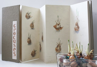
Mid-Winter can be a tough time for botanical artists to find inspiration!
Looking for a project to get rid of those winter blues and to keep you drawing everyday?
Try forcing bulbs and drawing and painting them daily!
The Subject:
Any spring or fall bulbs will work. However, keep in mind that taller growing flowers may eventually need support. I prefer using glass beads in a glass container, but you can use a regular pot and soil or pebbles and stones. The glass beads make it possible to keep the entire affair clean and easy to care for. Also, the beads allow you to observe the bulb growth both above and below. Keep enough water in the beads/stones so that the bulbs always have "wet feet." If using soil bury the bulbs only half way and keep the soil moist, but not soaked. Be care to avoid submerging or soaking the bulbs completely, they may rot instead of bloom in those conditions. Note the photo where the bulbs are buried only enough to support them (just less than half the entire bulb).
The Approach:
There are two ways you can approach this project. The first is to use each daily drawing or painting as an opportunity to explore a single subject in a variety of media or techniques. If this appeals to you, then I suggest you purchase and prep a variety of papers for different wet and dry media that have a variety of textured finishes.
The second approach to this project can be seen above. Here I have chosen this time to document the growth process through a single medium (hard lead drawing pencil with watercolor, a favorite of mine) in a single sketchbook. I was particularly excited to find this Japanese made folded sketchbook shown here. My plan is to display the finish work on a table top, like a Japanese screen.
One word of caution, I am finding that the Japanese paper, although wonderful, gets saturated easily and I have to give washed areas additional dry time before I can go back into the work and add detail.
Whatever approach you take do consider the ultimate sizes and composition for displaying your works as a single group. Your growth process artistically is being documented along with the growth of the flowers, embrace it, celebrate it and bloom together!
Houseplant Studies
|
I've heard it said that there are no boring subjects only dull ways of visualizing a subject. Houseplants offer a great challenge for me in this, in that I try to find something extraordinary in the everyday.
Here are some examples of an orchid and begonia for home and work respectively. The forms of the orchid are just as engaging at times as the blooms themselves. |
Silk Painting: The Final Stages
|
For the past year, one of the projects I have been engaged in is creating a triptych, that is a three part painting. These paintings share a common theme of moths (one of my favorite of subjects in the natural world) and their related host plants. Inspired, by the compositions of altarpieces of the Netherlands in the 15th and 16th centuries, I composed three "framed" works. Here you see the last in the series during its final layer of dye and still on the stretcher. Stay tuned for the uniting of the three works.
|
Working with Taxidermied Animals
Taxidermied animals often make students, particularly younger student, uncomfortable. On the one hand, they are a fantastic opportunity to discover the beauty of an animal in detail. On the other hand, they are dead. While visiting a lab at North Carolina State University, I encountered this beautiful Peregrine Falcon. Being one of the fastest flying birds on the planet, I figured I better take advantage of this opportunity to study it closely. As I sketched my goal was not only to create a likeness of the bird, but to capture something of its speed and spirit in the looseness of the watercolor and the splashed tea stain technique. I will be sure to discuss tea staining in future posts, so stay tuned!
Field Sketching Field Trip: US Botanic Gardens
|
How wonderful is it that crowds of people will flock merely to see a flower blooming? I think this alone is evidence that the human spirit is alive and well. This past August, crowds filled the US Botanic Gardens to see the rare Corpse Flower, Titan arum, bloom. This particular time was even a more rare event, not only one flower was blooming, but three. The largest flower in the world is a this member of the arum family, whose cousins we more commonly encounter as houseplants. Blooming only once every three to five years the flower grows from six to eight feet in height and produces and remarkable stench in order to attract pollinators. Despite the crowds, I was able to slip around take reference photos and do a bit of sketching in a quiet corner. Want to witness this amazing brief growth and bloom cycle? Check out this video from the Chicago Botanic Garden below: |
New School Year, A New Sketchbook
|
It seems that the start of a new school year brings the necessity of starting a new sketchbook. I have always loved keeping a sketchbook. I find it a beautiful tactile mnemonic. I have been experimenting this past summer with print making and exploring combining those works with other media. Handmade papers, pattern, and sumi style composition and use of line continue to fascinate me. The architecture of plants and themes from poetry are constant sources of inspiration.
|
Summer Sketchbook
My Artist's Statement:
This sketchbook is a record of the landscapes and sites surrounding my home that I experience on my bicycle rides this summer. It is my hope that these images can be seen as Vincent Van Gogh described painting: "It is not the language of painters but the language of nature which one should listen to, the feeling for the things themselves, for reality is more important than the feeling for pictures." I hope to learn to listen better to the language of nature through this exercise and become a better painter in the process.
This sketchbook is a record of the landscapes and sites surrounding my home that I experience on my bicycle rides this summer. It is my hope that these images can be seen as Vincent Van Gogh described painting: "It is not the language of painters but the language of nature which one should listen to, the feeling for the things themselves, for reality is more important than the feeling for pictures." I hope to learn to listen better to the language of nature through this exercise and become a better painter in the process.
Summer Experiments
This section is to document my experiments this summer.
The first are two boxes I designed and printed out on the school laser cutter during a professional development with Ms. Kapsos and Ms. Wilson.
The first are two boxes I designed and printed out on the school laser cutter during a professional development with Ms. Kapsos and Ms. Wilson.
Summer Projects
This section is to document larger works that I undertake this summer.
The first is part of a botanical commission of three different flowers I am working on, it is a work in progress, stay tuned for updates on that!
The second is a silk painting of moths I completed today.
The first is part of a botanical commission of three different flowers I am working on, it is a work in progress, stay tuned for updates on that!
The second is a silk painting of moths I completed today.


